Understand customer portal's sign in, sign up and reset password pages
Similar to every application, online service and website, your Creator application's portal has four assets that are essential to your customer's lifecycle — the sign in, sign up create password and reset password pages. Zoho Creator offers a default and robust design for each of these pages, which you can further customize using the portal page designer. Refer to:
The Sign in, Sign up and Reset Password pages can be accessed from the Page Customization tab.

The admin can click on a portal page, which will open the respective page in a new tab in your browser.
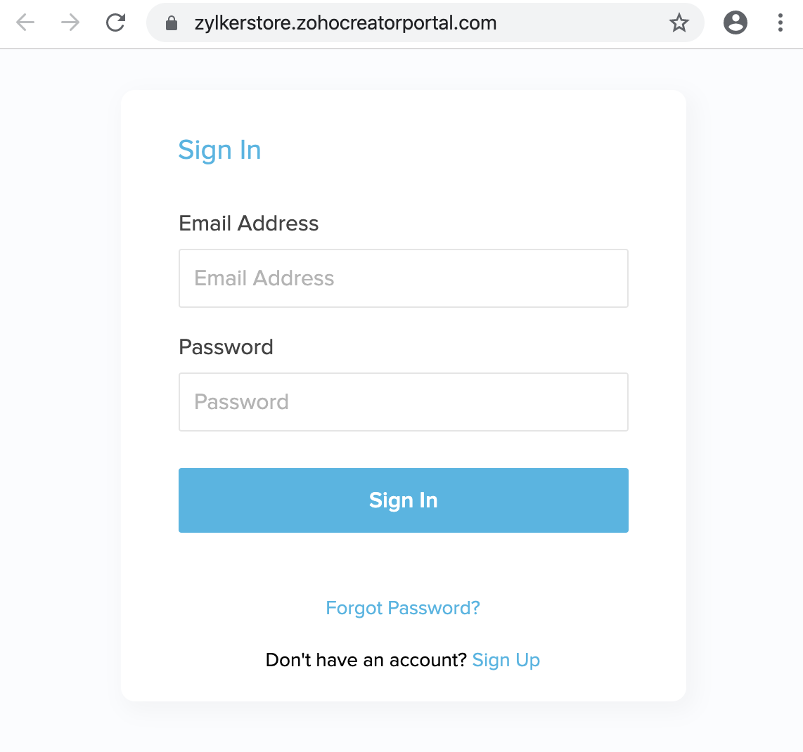
Sign in page
This is the page where your customers will have to enter their credentials to access your Creator application's portal. By default, this will appear as follows:

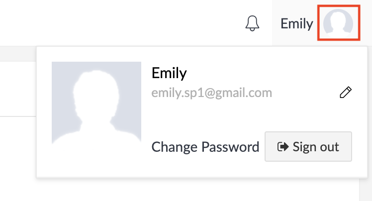
To sign out of your portal, click on your profile picture, and then click on the Sign out button.

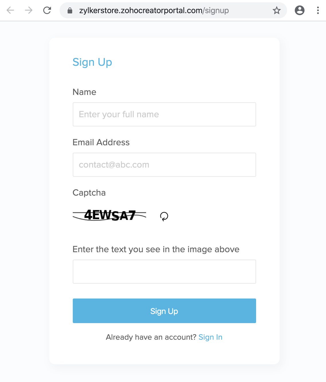
Sign up page
This is the page where end users sign up for your Creator application's portal. In case your portal is private or restricted, your approval is required to complete the signup process. Below is how the signup page looks by default:

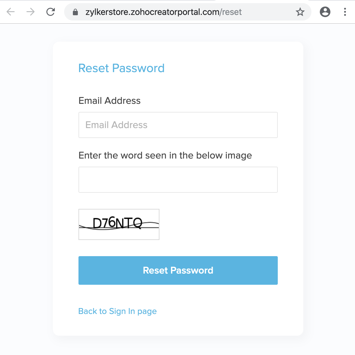
Reset Password page
This is the page where your customers can reset their password for accessing your Creator application's portal. By default, this will appear as follows:

Create Password Page
This is the page where the portal users can create a password to access the Creator application's portal. Upon signing up, portal users will receive an email containing a link that directs them to this page to set their password.
Portal Page Customization
Zoho Creator offers an intuitive designer for customizing the design of your portal's sign in, sign up, and reset password pages. This sophisticated designer is common for all four portal pages and allows you to customize all their components.
Playing around with the designer helps you achieve maximum resemblance between your portal page and your application. Each portal page has a set of general properties, and properties specific to the components that the page holds. The three components (portal backdrop, Portal Column, and Portal Form) which are discussed in detail below.
Components of a Portal Page
A portal page has three components that contribute to the user interface design in different ways. They have properties of their own which can be utilized to design a very distinct user interface layout. The components are:
- Portal Backdrop - You can customize the portal backdrop by editing the page width, padding, background color, background image, and by adding more elements (headings, tables, spacers, etc)
- Portal Column - The portal column holds the portal form within it and has excess area that can be customized to suit your needs. You can choose to edit the alignment, spacing, background color, and background image.
- Portal Form - The portal form contains the input fields for the credentials. Every element inside the portal form can be customized such as the background color, the font of the buttons and field names, the color of the buttons, the color of the links when hovered over, etc.
The properties specific to the portal backdrop helps you design the prefixed and custom elements of the portal page. These properties appear by default when a portal page is edited.
| Property | Icon | Description |
| Page Width |
Note : Default value will be set to 100% capacity.
Note : The pixel range within which you can adjust the page width is 790-1500. | |
| Padding | The space between the content and the border of the portal page can be customized in pixels. Note : The pixel range within which you can adjust the padding is 0-100. | |
| Background Color | The background color of the portal page. The available options to choose from are:
| |
| Background Image | An image that fills and makes the background of your portal page. This can be uploaded using File manager or a Web url.
| |
| Elements | The elements column situated on the left side of the designer features predesigned elements. You can add them to your portal page's backdrop:
The builder offers element-specific toolbars that allow you to customize their display value, appearance, insert system variables, and much more. | |
| Undo & Redo |
Note :
|
The properties specific to the portal column that helps you customize the panel that encapsulates the portal form. They can be accessed by clicking on the portal column.
| Property | Icon | Description |
| Alignment | The alignment of the portal form in the portal column. the available options are:
| |
| Spacing | The spacing between the margins of a portal column and the portal form that is situated inside it. The available options are:
Note : The pixel range between which you can set the spacing is 0-1400. | |
| Background Color | It is the color of the portal column. The available options to choose from are:
| |
| Background Image | An image that fills and makes the background of your portal page. This can be uploaded using File manager or a Web URL .
|
The Form Customization properties specific to the portal form helps you design and customize the portal form fully. They can be accessed by clicking Form Customization or by directly selecting the portal form.
Property
| Description |
| Background | The background color of the portal form. |
| Border |
Note: The pixel range within which you can customize the border width is 0-20. |
| Shadow |
|
| Typography |
|
| Field Input |
Note : These properties can be defined for both, their default display, and their appearance when hovered upon. This can be done by switching between the Default and Hover tabs. |
| Button |
Note : The properties can be defined for both, their default display, and their appearance when hovered upon. This can be done by switching between the Default and Hover tabs. |
| Link |
Note : The properties can be defined for both, their default display, and their appearance when hovered upon. This can be done by switching between the Default and Hover tabs. |
Points to Note
- You can make row and column-wise customizations to every element present in the portal page. The available properties are:
- Row - Spacing, Fill Color, Edit HTML, Border
- Column - Fill Color, Border
- The changes you make in the designer are automatically saved.
- You can set the width of all the columns in the portal page by dragging its borders.