
Step 1: Define the purpose of the dashboard
Before diving into design or data, start with clarity: Why are you creating this dashboard? Is it for tracking sales performance, monitoring website traffic, managing project timelines, or analyzing customer support efficiency?
When you define the goal, it becomes easier to choose relevant metrics, set priorities, and keep the dashboard focused. Avoid trying to display too much. A dashboard that tries to do everything often ends up being confusing and less actionable, especially when you’re aiming to build an effective data visualization dashboard that tells a clear story.
Step 2: Collect and prepare the data
Once the purpose is defined, identify where your data lives. This could include CRMs, marketing platforms, financial systems, spreadsheets, or databases. Bring all relevant data into one place.
Data preparation is just as important. Clean your data, remove duplicates, format values consistently, and ensure the data is up to date and analysis-ready. The quality of insights directly depends on the quality of your data.
Zoho Analytics supports 500+ data connectors including Zoho CRM, Google Ads, HubSpot, and many more. You can also use built-in data preparation tools to clean, blend, and transform data before visualization.
Step 3: Design the layout and structure
A well-designed layout helps users understand the information quickly.
List down the list of reports and KPI metrics that need to be added to the dashboard. Start by placing high-level metrics (like KPI widgets) at the top, followed by supporting charts and reports below.
Group similar metrics together. Choose the right visualization types: line charts for trends, bar charts for comparisons, pie charts for proportions, and tables for granular details.
Tailor the dashboard to suit specific roles, such as executives, sales reps, marketers, or support teams.
A logical and intuitive layout upfront saves time and reduces back-and-forth during the build phase.
Step 4: Create data visualizations
This is where raw data becomes insight. The goal is to answer a question clearly and quickly. Match the question to the visual: use lines for changes over time, bars for comparisons, scatter for relationships, and tables for precise values. Refer our guide on how to choose the right data visualization type.
Keep charts simple, label axes and units, and add context (targets, benchmarks, or notes) so viewers don’t have to guess what “good” looks like.
Be intentional with formatting. Limit the number of colors, sort categories logically, and choose scales that don’t distort the story. If a single chart starts trying to do too much, split it into two simpler views or use small multiples. When you expect people to explore, create interactive data visualization with features like tooltips and drill-downs.
With the data and layout ready, it’s time to build.
Create the reports and charts you’ve planned. Add forecast lines, trend analysis, or anomaly detection if needed.
Zoho Analytics offers three simple ways to create data visualizations
- Use the drag-and-drop builder
- Ask Zia, the AI agent, to generate charts for you
- Let Zia auto-generate contextual dashboards based on your data
Step 5: Build the dashboard
Think of the dashboard as a narrative that moves from “what’s happening” to “why it’s happening” to “what to do next.” Start with outcome metrics and KPIs at the top, then add diagnostic charts that explain movements underneath, and finish with detail tables for investigation.
Keep spacing consistent, use clear section headers, and add short descriptions where needed so first-time viewers can follow the story.
Plan interactivity deliberately. Create global filters (like date range, region, product line) so users can slice everything at once, and use local filters only when a specific chart needs its own scope. Enable drill-downs to move from summary to detail.
Now bring it all together into a single KPI dashboard. Use Zoho Analytics’ builder to:
- Add charts, KPIs, pivot tables, and custom widgets
- Apply filters for time ranges, geographies, or product segments
- Use conditional formatting to highlight values that need attention
- Set up alerts for metrics that cross a defined threshold
This step is where your dashboard starts to take shape as a cohesive, interactive tool.
Step 6: Embed or share the dashboard
A great dashboard only drives impact when the right people can see it (securely and in the flow of their work). Decide who needs view-only access and who should be able to explore or edit, and align permissions accordingly.
Think about where the dashboard will live. Embedding it in your internal portal, CRM, or customer-facing app keeps insights near daily workflows; sharing links works well for internal teams; Add a short “About this dashboard” note that explains data sources, refresh frequency, and whom to contact with questions.
Once your dashboard is ready, it’s time to share it.
With Zoho Analytics, you can:
- Share dashboards securely with teams or clients
- Schedule automated email reports
- Embed dashboards in websites, portals, or apps
- Control access with fine-grained user-level permissions
Each sharing option makes your BI dashboard accessible where it matters most.
Your all-in-one dashboard solution for faster insights
Accelerate your decision-making with Zoho Analytics, the complete dashboard software designed to transform raw data into clear, actionable insights. Build powerful business dashboards, unify all your data sources, and empower your teams with a truly modern self-service analytics experience.
Unified data preparation & integration
- Connect to 500+ data sources including business apps, databases, cloud drives, and custom APIs.
- Automated data sync & scheduling ensures your dashboards always reflect real-time or near-real-time data.
- Advanced data blending lets you merge data across systems like CRM, finance, marketing, HR, support, and more.
AI-powered analytics
- Ask Zia, the AI agent, lets you create a complete dashboard with a single prompt.
- Get AI insights instantly with Zia Insights. Auto-generated narratives explain trends, anomalies, and patterns in simple language.
- Predictive forecasting and what-if analysis to anticipate future outcomes.
Powerful dashboard creation
- Drag-and-drop dashboard builder with customizable layouts, widgets, charts, KPI cards, and pivot views.
- 50+ chart types and advanced visuals including geo-maps, funnels, heatmaps, and more.
- Cross-filtering, drill-down, drill-through, and contextual filtering for deeper exploration.
- Interactive elements like dropdowns, sliders, and date filters to personalize every view.
- Brandable themes and custom styling to match your organization’s identity.
Embedded & shareable dashboards
- Seamlessly embed dashboards into websites, apps, CRMs, and portals.
- Share securely with role-based access control and detailed permission settings.
- Publish publicly or privately, with options to export or schedule automated reports.
Collaboration-ready analytics workspace
- Enable team alignment through comments, annotations, and contextual discussions right within the dashboard.
- Schedule dashboards to be delivered by email at set intervals.
- Get data alerts when KPIs move beyond defined thresholds.
Dashboards work when three things come together: data that stays current on its own, visuals that answer specific questions, and access that reaches every person who needs them. Zoho Analytics covers all three in one platform, from the first data connection to the finished dashboard embedded where your teams already work.
That last part matters more than most teams expect. Here's how Ravi Kumar, Head of Finance and IT Operations at AQUAGROUP, describes it:
"Zoho Analytics seamlessly generated reports and dashboards that are embedded within our ERP system, offering robust functions that democratized access to insights across our organization. It became a crucial tool that provided tailored reports and dashboards. The support team played a pivotal role in ensuring a smooth experience for us, too. Their customer-centric approach showcased their reliability and commitment to resolving issues."
You can start the same way AQUAGROUP did. Sign up for the 15-day free trial, connect a data source, and build your first dashboard today.
Dashboard examples to inspire you
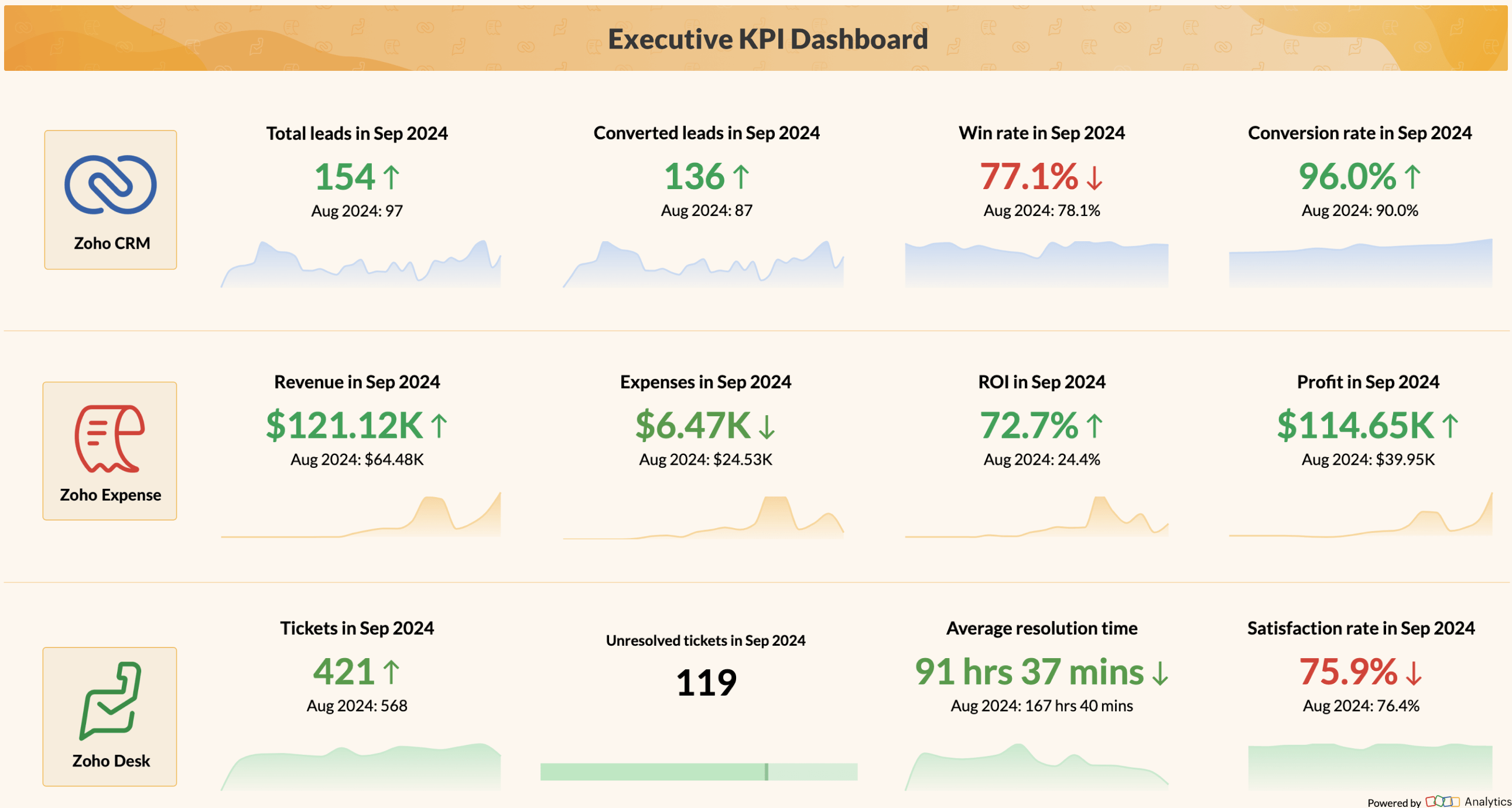
Not sure what your dashboard should look like? Here are a few real-world dashboard examples across different functions to get you started.


Frequently asked questions
How do I build a real-time dashboard?
- Connect your data sources directly instead of uploading files. A dashboard built on a static CSV is outdated the moment you import it. Zoho Analytics connects to 500+ business apps and databases, each with scheduled automatic syncs.
- Set a sync frequency that matches how fast the data changes. Pipeline data might need hourly updates. Monthly financial actuals don't.
- Build your reports, assemble them in the drag-and-drop builder, and add data alerts for metrics that cross a threshold, like daily sales dropping below target. That way the dashboard watches the data even when you don't.
How do I create custom data dashboards and reports?
- Start with the data. Connect every source that holds a piece of the answer, like CRM for pipeline, accounting for revenue, ad platforms for spend. Zoho Analytics blends data across systems, so you can build reports like cost per closed deal that no single app can show on its own.
- Then create reports. You can build visually from 50+ chart types or Ask Zia, the AI agent, to generate the chart from a prompt.
- Assemble everything into a dashboard, add filters for date range or region, apply conditional formatting, and set user-level permissions so each viewer sees only their data.
What are the steps to create a dashboard?
- Define the purpose: Decide what question the dashboard answers and who uses it.
- Collect and prepare the data: Connect sources, remove duplicates, standardize formats.
- Design the layout: KPIs at the top, diagnostic charts in the middle, detail tables below.
- Create the visualizations: Match each chart type to the question. Add targets for context.
- Build the dashboard: Add global filters, drill-downs, and conditional formatting.
- Share or embed it: View access for consumers, edit access for maintainers, scheduled email for everyone else.
Most teams get a first version live in under an hour with a builder like Zoho Analytics.
How do I create a dashboard in Excel?
- Organize your raw data as an Excel Table (Ctrl+T) so pivots update when rows are added.
- Build Pivot Tables for each metric, one per sheet.
- Create Pivot Charts from those tables.
- Arrange the charts on a dedicated dashboard sheet.
- Add slicers and timelines for filtering.
- Format for readability: remove gridlines, use consistent colors, add clear titles.
That gets you a basic working dashboard. However, the limits show up as you grow: refreshes are manual, sharing means emailing files and version conflicts, performance drops past a few thousand rows, and there's no row-level access control.
If you've hit those limits, Zoho Analytics imports Excel files directly and syncs cloud-stored spreadsheets on a schedule, so your data model carries over and the refresh and sharing problems go away.
Which platforms offer unified dashboard creation for both banking and sales reports?
The hard part is integration. Financial data lives in accounting software, sales data in a CRM. A unified platform needs connectors for both, plus the ability to join the two on common fields like customer name or invoice ID.
Zoho Analytics connects to Zoho Books, QuickBooks, Xero, and Stripe on the finance side, and Zoho CRM, HubSpot, and Pipedrive on the sales side. Cross-source blending lets you build financial dashboards that span both, like revenue collected versus deals closed by month.
Power BI, Tableau, and Qlik Sense also cover the same ground but typically need more setup through intermediate connectors or a data warehouse.
For banking data, check the security layer before choosing: role-based access so sales reps see pipeline but not bank balances. Zoho Analytics supports permissions down to the user, report, and row level.
Which trusted tools let finance teams build dynamic dashboards without code?
- Zoho Analytics: Drag-and-drop builder with direct connectors to QuickBooks, Xero, Zoho Books, and Stripe. Scheduled syncs, visual formula columns for margins and ratios, and Ask Zia for generating reports and dashboards from plain-language questions.
- Microsoft Power BI: Widely used in finance, especially in Microsoft 365 shops. Basic dashboards are no-code, but advanced calculations require learning DAX.
- Tableau: Strong visual analysis, priced and designed for larger analytics teams.
Is Zoho Analytics a dashboard software with the best prebuilt templates for sales and marketing?
Zoho Analytics generates complete, pre-populated dashboards the moment you connect your sales and marketing tools, acting as the best sales and marketing dashboard software.
Connect Zoho CRM, HubSpot, or Pipedrive and you get ready-made sales dashboards. Sales dashboard examples: pipeline by stage, win/loss analysis, rep performance, revenue trends. Connect Google Ads, Google Analytics, Meta Ads, or Mailchimp and you get marketing dashboards for campaign performance, cost per lead, and funnel conversion. All built from your actual data, and all fully editable.
Does Zoho Analytics support collaborative dashboard building across teams?
Yes, and collaboration is built into the workflow rather than added as an afterthought. Team members can comment and annotate directly on dashboards, tag colleagues, and discuss findings in context without switching to a separate messaging tool. Role-based permissions let you decide who builds, who explores, and who views. Dashboards can be scheduled for automated email delivery, and KPI alerts notify the right people when a metric crosses a defined threshold.
Which embedded visualization tools help product teams avoid maintaining custom dashboards?
Embedded analytics platforms let product teams place ready-made, vendor-maintained visualizations directly inside their own applications, which removes the need to build and support custom dashboards in-house. A BI platform with embedded and white-label capabilities, such as Zoho Analytics, delivers branded, interactive business dashboards and dashboards inside your product, while the platform maintains the underlying charts, data refreshes, and scaling.
What is the best retail dashboard for analytics?
The best retail analytics dashboard unifies sales, inventory, and supply chain data in one place rather than spreading them across separate reports. Zoho Analytics connects to retail data sources, blends them automatically, and lets store teams build dashboards covering the metrics that matter: sales by location, stock levels, margin performance, and customer behavior. KPI alerts notify the right people when numbers cross defined thresholds, and scheduled reports deliver updates to stakeholders without anyone pulling data manually.
What is the best software for creating and managing project dashboards?
The best project dashboard software gives teams a live view of progress, resource allocation, and timelines without requiring manual status updates. Zoho Analytics connects to project management tools like Zoho Projects, ClickUp, and Jira, blends data across tasks, milestones, and team performance, and lets project leads build custom dashboards with a drag-and-drop builder. Role-based access ensures each stakeholder sees their relevant view, and automated reports keep leadership informed on schedule.
What is the best tool for building custom ecommerce dashboards?
The best ecommerce dashboard tool lets teams go beyond pre-built views and build exactly what their store needs. Zoho Analytics connects to major ecommerce platforms, offers a drag-and-drop builder with 50+ visualization types, and keeps data synced automatically. With Ask Zia, ecommerce teams can ask data questions in plain natural language and get answers in the form of reports and dashboards, uncover seasonal trends, and predict future performance.
What are the best no-code dashboard tools for tracking store KPIs?
The best no-code dashboard tools for store KPIs let retail managers build and update their own views. Zoho Analytics delivers this through a drag-and-drop builder that requires zero coding. Connect your data source, drag metrics onto the canvas, and your dashboard builds itself. KPI widgets, threshold-based alerts, and automated report scheduling keep store teams on top of performance without manual refreshes, while role-based access ensures each team sees only their relevant metrics.