Deliver high-performing emails with right designs
Use different features, colors, images and fonts to maximise the appeal of your emails. Design email campaigns as a part of forging a healthy marketing relationship.
Sign up for free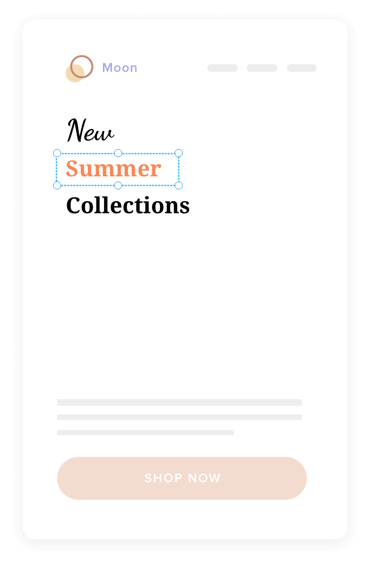
It’s time you design effective email campaigns
Drive recipients to read your email
Write a clear and precise subject line. Make it short and compatible with all platforms and devices. Approach your subject line with a hint of humour or surprise if appropriate, otherwise adopt a more formal tone.
Welcome to Zylker
LineLineLineThanks for shopping
LineLineWelcome to Zylker
LineLine
Make every email a
‘one-to-one’ conversation
Personalize your emails using ‘merge tags’ and ‘dynamic content.
Merge tags
Personalize your email based on the fields of your contacts. Address them by their names or surnames. Transform your email into a conversation and spur action from the recipient.
Learn moreDynamic content
Build targeted and personalized engagement by crafting email content that changes based on recipient behavior, interests, and preferences. Use dynamic content and deliver different versions of your email to recipients who meet the conditions you specify.
Learn more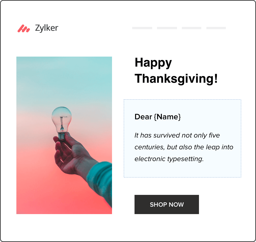
Make your email layout visually enticing
Format your email in sync with the visual hierarchy of readers.
- Pyramid
- Inverted pyramid
- Z pattern
- F pattern
- Division
Pyramid
Craft an email template by putting the most important content, your hero image or a button right at the top. Gradually increase the width of your email template towards the bottom to accommodate additional content.
Inverted pyramid
Begin your email content with words and images and narrow it down to the bottom. Put a CTA button or any other important content at the bottom of your email template.
Z pattern
Design a Z pattern template to house images in between important passages. You can drive the readers to spend time on the paragraphs and also view the images while jumping from one paragraph to another.
F pattern
Create an F pattern email by slowly narrowing down your content in the shape of letter F. Keep your contacts' the attention by giving them a brief taste of what you have on offer.
Division
Help the readers associate the images with the content by putting them in divisional structures. This will let your contacts make quick decisions when purchasing something from your brand.
Design the perfect email for your subscribers and different platforms
Craft emails that are compatible with different devices and platforms. Include elements like colors and images to bring your message to life for subscribers.
Prioritize
the various parts
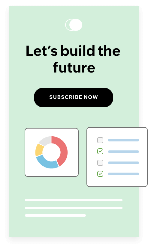
Convey your message right away and keep your readers from venturing elsewhere. Design or use an email template which takes your contacts to the vital section of the email without forcing them to scroll.


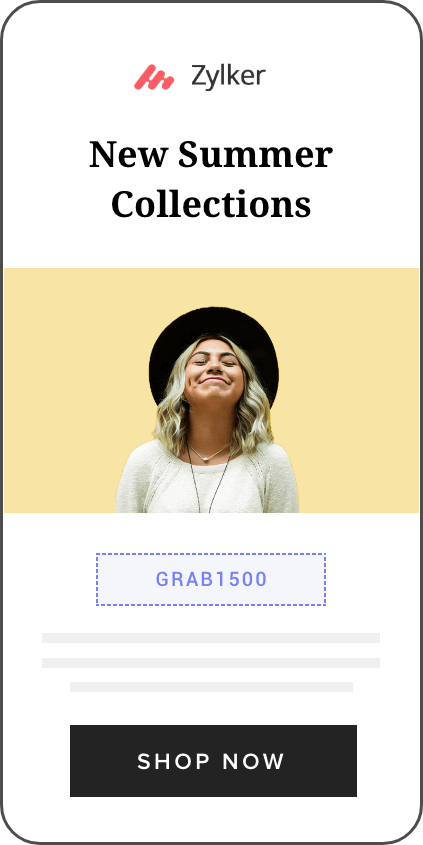
A good email width
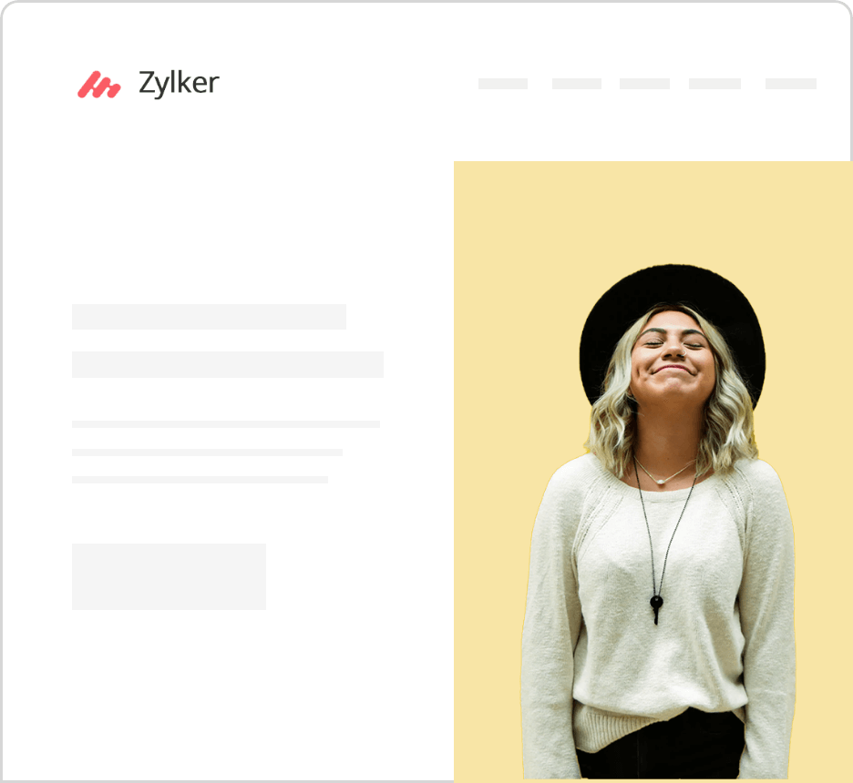
Opt for an email width of around 600 pixels so that it is compatible for all devices. Using the correct email width will eliminate header misalignment and other compatibility related drawbacks.
Mix and match your colors
Use colours to make the content less monotonous, but be careful of overdoing it. A moderate use of cold or warm colors (or both) makes the content feel more inviting. Follow the rules of the color wheel to add the right mix of colors into your templates.
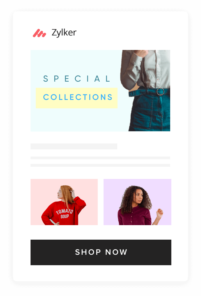

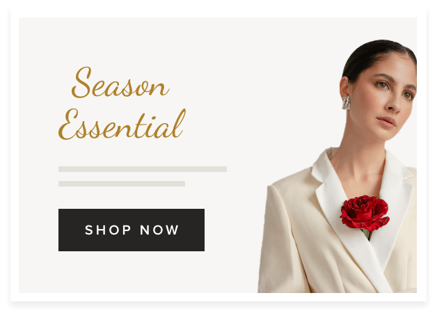
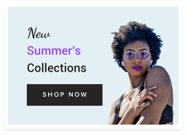

Images to blend in the message
Incorporate images in your email templates to heighten the level of interaction. Include JPEG images when you want to use smaller files with minimal compression. Use GIFs in place of videos as they take less time to load. Judiciously use images in your templates to connect with your recipients, but watch out about increasing the size of the email too much.
Put your best (type) face forward
Work with different fonts to create different moods for your email. Pick from web safe fonts so that your email templates can be viewed in the original fonts, regardless of the device.
You can also go with purchased fonts, although they are less common. Always provide alternative web safe fonts along with purchased fonts. This will enable all contacts to view the email templates, even without the special fonts.
IconIcon