The power of connection: Best practices for a Contact Us page
- Last Updated : February 9, 2026
- 1.8K Views
- 9 Min Read
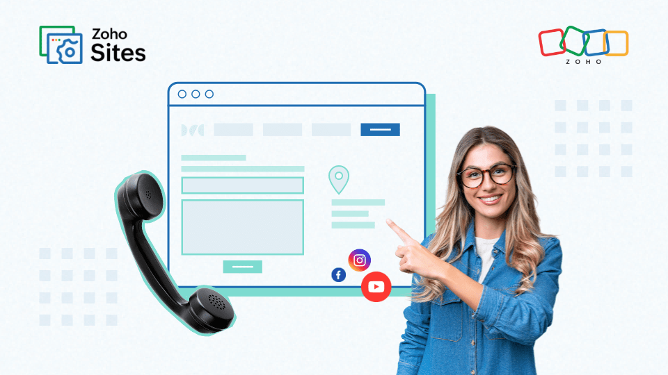
If you're in a bustling mall or marketplace and enter a store, even if the products look appealing and the atmosphere inviting, if there's no shopkeeper you can talk to, ask questions, and seek assistance from, you're likely to walk out. In the digital world, websites are like these shops, and the Contact Us page is the shopkeeper waiting to engage with you.
A Contact Us page is the virtual shopping assistant who will answer your customer's questions and lend an ear if they have something to share. It's the bridge between visitors and the creators of a website that establishes trust and connection.
More often than not, this page is overlooked when it comes to design or copywriting. Many even consider it a mere obligation. But make no mistake in understanding that this page is crucial to help a business understand customer expectations and improve its services. If you’re still deciding which platform to build on, here’s a comparison of the best website builders to help you create pages that convert and connect.
Just as a brick-and-mortar store gains your trust when you see a friendly face ready to assist, a well-crafted Contact Us page reassures online visitors that there's a genuine entity behind the pixels and code.
Why should a business create a Contact Us page?
The importance of a Contact Us page to a website lies in several key factors:
Communication: It facilitates direct communication between the website owner and visitors. Visitors can ask questions, provide feedback, request information, or seek assistance, allowing for a two-way conversation.
Trust building: A visible and easily accessible contact page adds credibility to a website. It reassures visitors that there is a real entity behind the website, making them more likely to trust the information and services offered.
Customer support: For businesses and organizations, this page serves as a customer support channel. Visitors can report issues, ask for help, or inquire about products or services, leading to better customer satisfaction.
Lead generation: Contact forms on the Contact Us page can be used to collect visitor information, which can then be used for lead generation and marketing purposes. This is particularly useful for businesses looking to expand their customer base.
Feedback and improvement: Visitors can use the Contact Us page to provide feedback, suggestions, and comments about the website's content, design, usability, and functionality. This feedback can be invaluable for making improvements.
How is a contact us page helpful to a website visitor?
A Contact Us page is immensely useful to website visitors just as much it is to a business. Here are some of the ways it helps:
Direct communication: It provides visitors with a direct means of getting in touch with the website owner, business, or organization. Whether they have questions, concerns, feedback, or inquiries, the Contact Us page offers a straightforward way to initiate communication.
Information access: Visitors can use the page to access essential contact details, such as email addresses, phone numbers, physical addresses, and social media profiles. Lack of contact information will make you look like a dodgy undertaking.
Clarification: If the website's content isn't clear or requires additional context, visitors can use the Contact Us page to ask for clarification. This can be particularly helpful for complex topics, products, or services.
Collaboration opportunities: Individuals and professionals can use the Contact Us page to explore collaboration opportunities, whether it's for partnerships, freelance work, or networking.
Accessibility and accommodations: Visitors with accessibility needs can use the Contact Us page to request accommodations or voice concerns if they encounter barriers while navigating the website.
In essence, the Contact Us page enhances user experience, fosters trust, and transforms a passive browsing session into an interactive and meaningful encounter.
How to create a Contact Us page
A well-designed Contact Us page should include essential information and features to make it easy for visitors to get in touch with you and address their needs. Here are the key elements to include:
Contact form: This is a convenient way for visitors to send messages without leaving your website. Include fields for their name, email address, and message. Don't have too many fields, like phone number or company name (unless it's relevant), in your contact form. It might either make your website user uncomfortable about sharing all the details or make them feel like it is a lot of effort. Make sure the form is user-friendly, easy to navigate, and mobile-responsive.
Contact information: A contact form helps establish communication, but that alone won't suffice. You should also prominently display essential contact details. This typically includes your business name, physical address, phone number, and email address. Ensure that this information is accurate and up-to-date.
Confirmation message: After a user submits a message through the contact form, display a confirmation message indicating that their message was sent successfully. You can also provide an estimated response time.
Location map: Embed a map with your business's location if you have a physical presence. This can be particularly useful for local businesses. It encourages website visitors to make a visit to your business location.
Business hours: Specify your operating hours, including the days of the week you're open and closed. If your business operates in multiple time zones, make this clear. This isn't only helpful for your customers but also for you since search engines like Google will pick this accurate information on operating hours, making it more likely to show your brand in local search results.
Social media links: Include icons or links to your social media profiles, allowing visitors to connect with you on platforms like Facebook, Twitter, LinkedIn, or Instagram.
FAQs or help center links: Direct visitors to frequently asked questions (FAQs) or a help center if you have one. You can also include a bunch of frequently asked questions (FAQs) at the bottom of your Contact Us page, addressing any information that your visitors might need right away. This can help users find answers to common inquiries without needing to contact you directly.
Specific departments or contacts: If your organization is large, provide information or links to specific departments or key contacts. For example, you might have separate contact information for sales, customer support, media inquiries, or employment opportunities.
Response time expectations: Set clear expectations for response times. Inform visitors about when they can anticipate a reply to their inquiries. This transparency helps manage expectations and build trust.
Privacy policy link: If you collect personal information through the contact form, link to your website's privacy policy to reassure visitors about data handling and privacy.
Call to action: Encourage visitors to take action by providing a clear and compelling call to action (CTA). For instance, you could prompt them to subscribe to a newsletter, request a quote, or schedule a consultation.
Accessibility features: Ensure that the Contact Us page is accessible to all users, including those with disabilities. Use alt text for images, ensure proper color contrast, and provide keyboard navigation options.
Best practices for a Contact Us page
Be mindful of the following points when you're building a Contact Us page.
Make your contact page easy to find
The link to your Contact Us page should be placed in a location that's easily accessible and highly visible to website visitors. Consider A/B testing different placements to see which one results in the best user engagement and conversions. Here are some common and effective placement options:
Navigation Menu: One of the most common locations for the Contact Us link is in the website's navigation menu. Typically, it's placed at the top of the page or in a prominent position in the menu bar.
Footer: Another standard location for the Contact Us link is in the footer of your website. You can include it along with other essential links like privacy policy, terms of service, and social media links.
Sidebar: If your website has a sidebar, you can include a link to the Contact Us page there. This is especially useful for websites with a lot of content, as it provides a persistent link that remains visible as users scroll through the page.
Feature a Call to Action (CTA) on your Contact Us page
Including a CTA on your Contact Us page can be highly effective in guiding visitors to take specific actions that align with your goals. Here are some CTA ideas for your page:
CTA design and messaging: Remember that the effectiveness of your CTAs depends on their placement, design, and messaging. Ensure that your CTAs are clear, concise, and visually distinct from other page elements.
A/B testing: Testing different CTAs and analyzing their performance can help you refine your Contact Us page and achieve your specific goals, whether it's lead generation, customer support, or engagement.
Different CTAs: Some of the CTAs that can be featured on the page include, "Request a quote," "Subscribe to newsletter," "Schedule an appointment," "Explore FAQs," and "Leave a review."
Enhance user engagement through multiple Contact Us options
Offering various contact options demonstrates your commitment to customer service and accessibility. When implementing multiple Contact Us options, it's essential to ensure that each method is actively monitored and inquiries are responded to promptly.
Accessibility: Multiple contact options make your website more accessible to people with different communication needs and abilities. Some individuals may have disabilities that make using certain contact methods more convenient, such as text-based communication for those with hearing impairments.
Convenience: Visitors often have different levels of urgency when contacting you. Offering options like a contact form for non-urgent inquiries and a phone number for urgent matters allows users to choose the most convenient method based on their needs. Adding social media links, an email address, and a physical address also help.
International audience: If your website attracts a global audience, consider that international visitors may prefer different contact methods based on cultural norms and regional preferences.
Design a beautiful and captivating Contact Us page
Crafting this page involves a combination of visual appeal, usability, and clear communication.
Clear layout: Maintain a clean and organized layout with ample white space. Highlight important elements like the contact form and key contact information.
Eye-catching design elements: Use visually appealing graphics, images, or icons that align with your brand. Employ a consistent color scheme and typography that matches your website's overall design.
Visual cues: Use arrows, icons, or other visual cues to direct user attention to the contact form or key information.
Language: Getting the spelling and grammar right is mandatory. Along with that, you can also bring out your personality on your Contact Us page, either through playful colors, language, or CTAs.
Inspiring Contact Us page examples
You are all ready, equipped with the knowledge of designing a great Contact Us page. Before you create or edit one, here are some Contact Us page that serve as great examples, from which you can take inspiration.
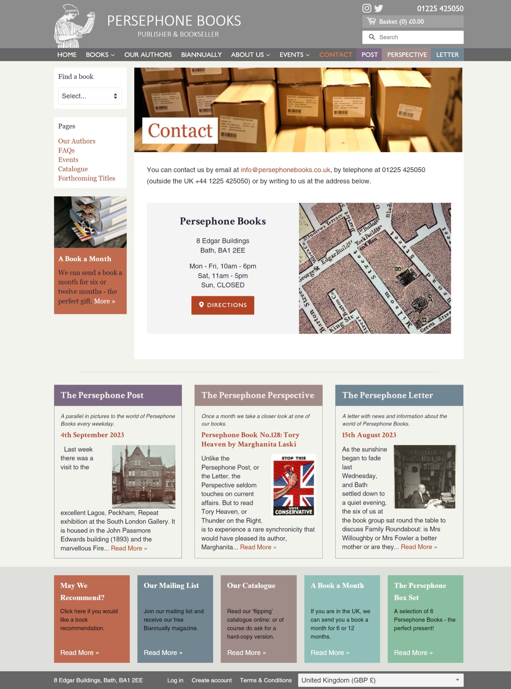
The Contact Us page of this UK-based publishing house gives out all the information in the easiest way possible. They provide social media links and multiple contact methods. You'll also find the store's address along with an image of the map and a CTA (that has a visual cue in the form of an icon) that will open Google Maps. They don't shy away from including blogs and other announcements below.
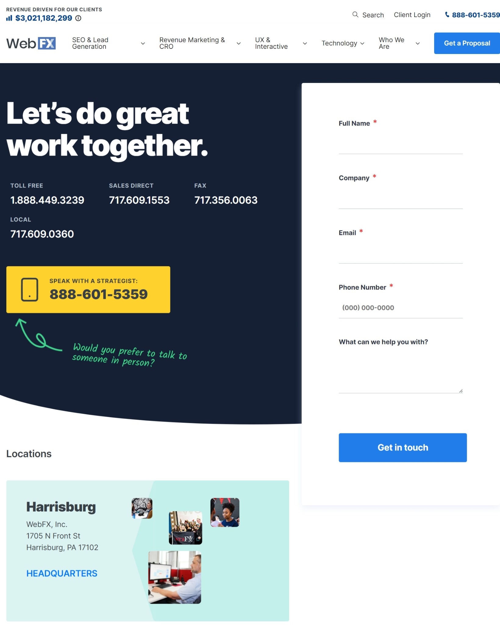
A digital marketing solution expert, WebFX incorporates an encouraging headline, the mandatory contact details, and a CTA on their Contact Us page. They use a squiggly arrow below the CTA along with a casually-worded sentence in green and mostly sans serif fonts indicating a free-and-easy style. Beside this is a contact form that has the usual fields that B2B companies employ to get information.
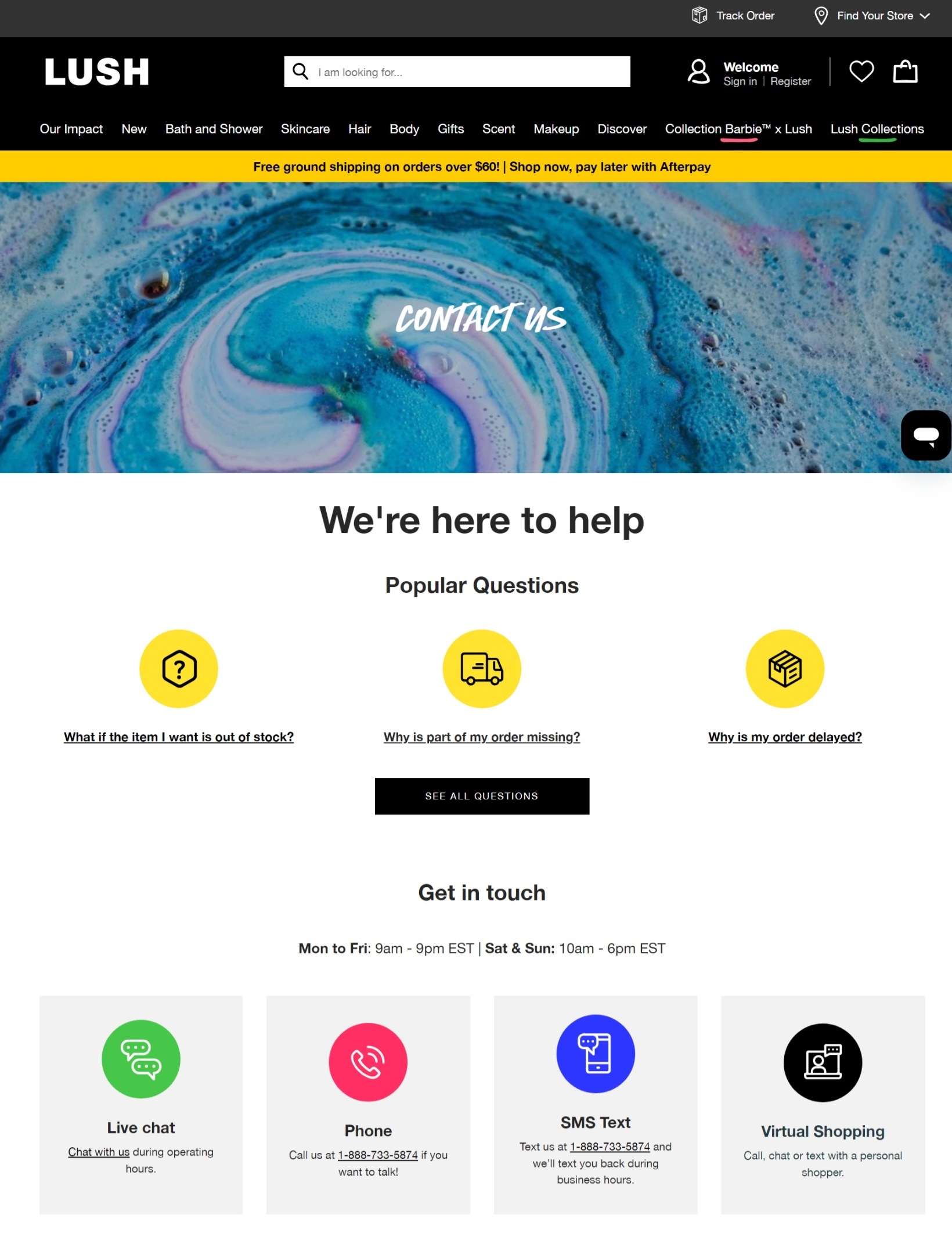
This minimalistic design has just two sections. One highlights the FAQs, and the other gives the contact details, along with their business hours.
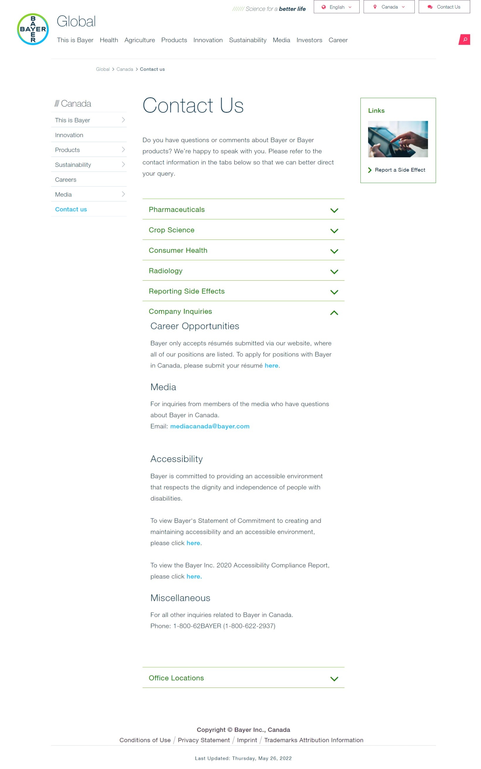
This pharmaceutical, consumer health, and crop science brand incorporates a vertically-stacked accordion that expands to provide contact information for different kinds of website visitors.
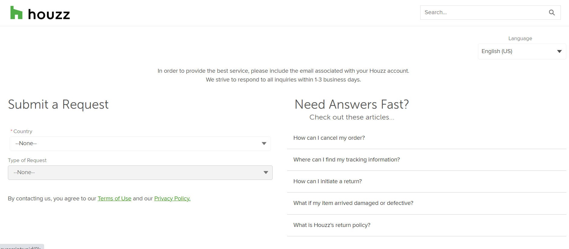
This platform that connects homeowners to real estate experts like vendors and designers has a Contact Us page with an elaborate contact form. Once the user chooses an option from the dropdown, relevant fields pop up below. It's easy to understand and simple to use.
In summary
In conclusion, your Contact Us page is more than just a functional element of your website—it's a vital gateway to connecting with your audience and fostering meaningful interactions. By following the best practices outlined in this blog, you can create a captivating and user-friendly Contact Us page that enhances user engagement, builds trust, and encourages visitors to take action.
Regularly monitor and optimize your Contact Us page based on user feedback and performance data to ensure it continues to meet the evolving needs of your audience. Ultimately, a well-designed Contact Us page can be a powerful asset in your online presence, helping you connect with visitors, provide excellent customer support, and achieve your website's objectives.
