Marketplace listing content guide
- Contents [Hide]
- Naming your application
- Creating a tagline
- Adding an overview and key features section
- Adding visual assets
- Application logo
- Banner tile or display tile
- Demo video
- Graphics or screenshots
- Optimizing your listing
- Search optimization
- Adding categories
- Adding tags
- Ratings and reviews
- Resources
- Vendor branding
Naming your application
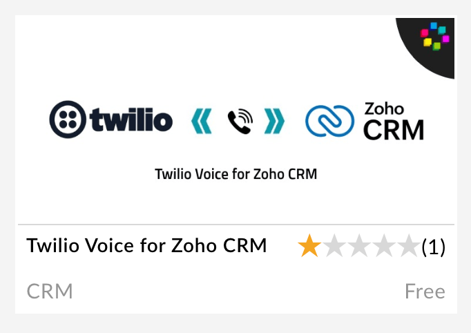
Your application name is the first thing prospects see and it's indexed in our search function, so ensure that you provide the correct name before you submit. The application name cuts off at approximately 25-30 characters in the search result page so aim to include the most relevant information within this limit.

In the above example, the application name cuts off at 25 characters and does not convey much information about the integration to the users.
Recommended naming approach for extensions
"[Your Product] for [specific Zoho Product for which the integration was built]"
Creating a tagline
Your tagline is a brief, one-sentence summary of your application. An application's tagline shows up on the listing page, and on hovering your cursor over a search result. The tagline is also indexed in search, so make sure you mention the keywords relevant to your listing in the tagline. Keep it within 125 characters so it does not cut off in the search results display page.

We can see the tagline here (outlined in red) below the application name.
Adding an overview and key features section
Writing an overview
When your potential users browse Marketplace, they are usually looking to solve a business need and won't be willing to spend much time reading a listing. So your first paragraph must tell prospects how your solution can positively impact their business, instead of describing what you are selling. You must convey your value proposition in the first few lines. Describe why someone should use your solution. Explain how you can help solve their pain points or offer them more convenience. One trick is to begin your statement by identifying the pain points your application solves, followed by the benefits. Begin by answering the following:
- What is the application?
- Who will gain from it the most? Indicate to whom your solution is targeted, so prospects know right away if it is designed for them. Is your solution best suited for salespeople, marketing teams, or specific industries or regions? Be clear and descriptive.
- What need or pain point does it address?
- What are the expected benefits?
Examples:
- What need or pain point does it address?
Example: Cut revenue losses due to better inventory management.
- What are the expected benefits?
Example: Enhance process efficiency and lower costs.
TIP: Make your value proposition come alive with tangible data. A quantified value proposition will help us market your application better.
Improve productivity by saving users 1-3 hours per week, or 260-360 hours annually. Over three years the time saved is worth at least $3000.
Reduce the time it takes to prepare reports and enter data by approximately 40 percent—the equivalent of up to four days a month
A 10-20% increase in sales productivity is typical and in most companies. That translates to a five-times increase in ROI in 180 days.
Writing a key features section
List out 4 bullet points in this section. That being said, simply listing your solution’s features and functionality in a bulleted list is not very compelling. Focus on communicating what the feature does and why prospects need it.
Adding another paragraph
It may not be necessary to have a longer app description than the initial paragraph that communicates the value proposition of your application. That being said, sometimes an application merits a little more selling—especially if you are targeting a crowded market. Show empathy for your users, and speak directly to the problems you will be solving for their business, team, or workplace (for instance, "This application is perfect for mobile sales teams"). Consider writing from the perspective of a user. Describe the experience of using your application in a relatable, commonplace scenario at work. Try to emphasize user benefits over features. Identify some of your prospects’ most prominent challenges, and explain how your application solves them. Cut out any filler information that is tangential to the app's main selling points. Avoid company history and secondary features.
Important note for API-based integrations: You must provide a link to a landing page that covers the integration in detail. This will be linked on your Marketplace listing. The landing page should reside within your website and have an option to let a user sign up. This page should not be a means for user data collection.
Adding visual assets
Here are the file format requirements for the visual elements of your listing page, accompanied by some useful tips.
Application logo
This is the logo that will appear on a white circular background on your listing page. It should feature the third-party app's logo.
Dimension180 x 180 (maximum file size: 1 MB)
Format.gif, .jpeg, .jpg, .png

While it's not mandatory to include the integrated Zoho product logo, if included, use the respective product lockup logo. Make sure you include an icon or symbol that denotes an integration.
Note: Your use of any of Zoho’s marks including Zoho's trademarks, logos, or trade names (collectively, "Zoho Marks") must comply with the branding guidelines published by Zoho. Your use of any third party's marks, including trademarks, logos, or trade names (collectively, "Third Party Marks") must comply with the applicable branding guidelines of such third party. Your use of Zoho Marks or Third Party Marks should not imply an endorsement or responsibility that does not exist.
Banner tile or display tile
This is the tile that is displayed to users when your listing appears in the search results display page and the Marketplace homepage.
Dimension740 X 340 (maximum file size 2 MB)
Format.gif, .jpeg, .jpg, .png

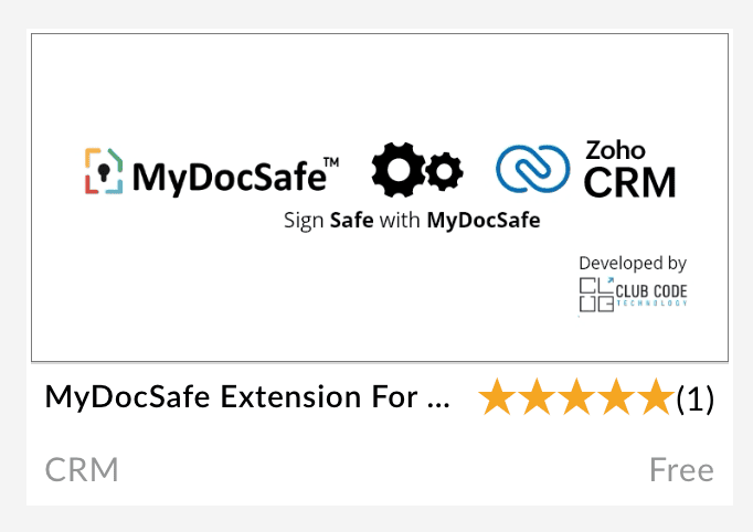
If a tagline is included, it must be a one-liner (font size must be small). If the integration is built by an SI and a vendor logo is necessary, it should be relatively smaller in size when compared to the icon or symbol that's used to denote an integration.
While it's not mandatory to include the integrated Zoho product logo, if it is included, use the respective product lockup logo. Make sure you include an icon or symbol that denotes an integration.


Note: Your use of any of Zoho’s marks including Zoho's trademarks, logos, or trade names (collectively, "Zoho Marks") must comply with the branding guidelines published by Zoho. Your use of any third party's marks, including trademarks, logos, or trade names (collectively, "Third Party Marks") must comply with the applicable branding guidelines of said third party. Your use of Zoho Marks or Third Party Marks should not imply an endorsement or responsibility that does not exist.
Demo video
File sizeNo limit (share link in body of listing)
- A demo video, though not mandatory, is a quick and effective way to showcase your solution and improve user interaction with your listing. It is a good idea to include a call to action at the end of the video to inspire viewers to take the next step toward purchasing or installing your solution. For example, offer a free trial on Marketplace, or offer a resource to learn more about the integration.
- Share your videos on your website, embed links in your email campaigns, and post your videos on social media.
- Communicate your app’s main value propositions in the first 10-15 seconds of your video to ensure that your most impactful messages are delivered to most of your visitors, regardless of engagement level.
Graphics or screenshots
File size1 MB
Make your first screenshot as attractive and informative as possible to entice prospects to learn more about your application. Add screenshots showing in-app action, not just splash screens or app menus. Overlay text and magnify images to showcase key features or UX design elements. This will help explain anything that isn’t clear from the image alone. Users love device-hopping, so try showing your UI on different devices, wherever applicable.
Points to remember
- Make sure to populate data in the fields wherever applicable.
- Ensure that sensitive information including personally identifiable information (PII) is masked.
Optimizing your listing
Search optimization
- Your tagline will be indexed in search. So ensure you mention keywords relevant to your listing in your tagline.
- Add relevant keywords in your content. However, avoid overloading your copy with technical industry jargon.
- Avoid using uncommon abbreviations, especially in your application name, tags, and tagline because those parts of your listing are indexed in search.
- Stick to more commonly used terms in your application name description for better searchability. For instance, "integration" and "connector" are often used interchangeably, but "integration" is far more commonplace. This means that when a customer searches for "CRM integration", they may end up missing an app named "CRM connector" which might otherwise be perfect for their needs.

Descriptions like this one that are full of buzzwords can alienate potential users.
Adding categories
Select your primary application categories carefully. It is a good idea to select secondary categories also. For example, if you have a telephony application, you can choose telephony, customer service, marketing, and sales as categories. Keep in mind that selecting lesser relevant categories affects your listing appearing in a search.
Adding tags
Consider each tag as a label that makes it very easy for users to find all applications related to a particular topic they're interested in. All the tags that you use in your application listing page will be listed after the Key Features section.
- Improve your application's searchability by adding tags. Tagging helps when your application has multiple key functions that can't all fit into your title and tagline.
Example: If your application has e-signature, bookkeeping, and marketing capabilities, you can add all of these terms as tags to make sure your application shows up every time someone is searching for these terms or clicking on these tags.
- Keep each tag to two words or less, unless strictly necessary
Ratings and reviews
Good ratings and reviews are a sign of quality and the best drivers of adoption, as prospects tend to consider reviews before deciding to use your application. Having multiple strong customer reviews helps boost your adoption rate.
- Invite your users to try your solution and leave a review.
- Make sure to check your reviews frequently!
Resources
Add integration-relevant content such as user help guides and FAQs under the "Resources" section of your listing. These documents should have detailed information on how the application should be set up, business use cases that the application addresses, and how the application can be leveraged to address them.
Vendor branding
- Do not be tempted to cut corners when filling out your profile page, as a vendor profile also influences the decision to use an application.
- Do not forget to include your company details and logo in your vendor profile.
- Please ensure that you include links to your Privacy Policy and Terms of Service.