If you’re an admin, you already know this feeling.
It’s Monday morning. Someone from the finance team asks why emails to a client domain bounced last week. HR wants to know if the mailboxes of several former employees are still active. The security team flags a sudden spike in outbound emails and wants answers at the earliest. And you’re stuck somewhere in between, trying to make sure that the storage doesn’t quietly creep up.
None of these questions are about email. They’re about what’s happening behind the scenes.
Most admins don’t struggle because they lack control. They struggle because visibility is fragmented. Sometimes you might find out what happened, but not how often. You might notice a pattern, but not have proof or numbers to back it up. You might see a change in usage, but can’t tell for sure if the growth is normal or needs any immediate action.
That’s where admin work quietly becomes investigative. So many questions come to mind.
- Is this increase in email traffic seasonal or sudden?
- Are the inactive users just on leave or have they actually stopped using email?
- Is a mailbox filling up because of genuine reasons, or because nothing is being cleaned up?
- When something goes wrong, was it an isolated incident or part of a larger trend?
Without a reliable way to go through, compare, and verify, admins are left reacting instead of anticipating. Decisions become guesswork and conversations turn vague. Simple questions take longer to answer than they should.
What admins really need is context over time. They need a way to see how things usually behave, how they’re changing, and when something naturally stands out.
This is why reports exist on the admin side. They’re not just charts for the sake of having them. They come as a practical tool to replace assumptions with clarity.
In the next section, we’ll get into what reports mean in the context of Zoho Mail, and how they’re designed to give admins that missing piece of the puzzle.
Reports in Zoho Mail: From activity to insight
In Zoho Mail, reports are essentially a structured record of how email is being used across your organization. They don’t focus on individual messages. Instead, they present activity in a consolidated way—whether you’re looking at recent updates or analyzing patterns across days, weeks, months, or longer time ranges.
Every organization generates a steady stream of email activity, like users logging in and out, emails moving in and out, groups being used, and domains receiving traffic. Reports pull all of this ongoing activity together and present it in a way that lets admins understand usage without having to piece things together manually.
Some data reflects quickly as activity happens, while reports also allow you to step back and examine trends over selected periods. This flexibility is what makes them useful—you can review what’s happening now, or zoom out to understand how behavior evolves over time.
From an admin’s point of view, this changes how information is consumed. Instead of reacting to isolated requests (checking one user, one mailbox, one day), you’re able to look at trends across the organization and understand what’s normal, what isn’t, what’s changing, and what deserves attention.
Zoho Mail groups its reports around how admins naturally think about email. Some reports focus on users—active, inactive, or the ones consuming more storage than expected. Others focus on mailboxes, email traffic, groups, or organization-level activity. Each report answers a slightly different operational question, but they all serve the same purpose: visibility.
For example, if storage becomes a concern, reports help you see if it’s a handful of mailboxes that are growing unusually fast or a general increase across teams. If leadership asks about email adoption, reports give you a factual view of login activity and usage rather than assumptions. If compliance or security teams raise a flag, reports help establish whether the behavior is new or long-standing.
Another key aspect is that reports in Zoho Mail are read-only by nature. Viewing them doesn’t change anything in the system. They don’t enforce rules or block actions, making them safe to explore and share internally, especially when decisions need to be backed by data before any configuration changes are made.
To put it simply, if settings define how email should behave, reports show how it actually behaves.
Over time, admins often stop thinking of reports as a separate task and start treating them as a reference point. They look at reports before taking any action to confirm whether the action is justified.
So “reports” in Zoho Mail aren’t about spreadsheets or charts for the sake of analysis. They’re about a built-in way for admins to understand how email is actually being used, across people, mailboxes, and the organization as a whole.
The admin reports dashboard: Your control room
When you open the Reports section in the Admin Console, you’re not dropped into tables or long lists. You land on a dashboard, which is built for orientation and not for deep investigation.
In Zoho Mail, the admin reports dashboard acts as that first layer of visibility. It’s designed to surface key indicators without forcing you to navigate through multiple report categories right away. So before you start filtering, exporting, or drilling into specific reports, the dashboard gives you a quick visual sense of where things stand, whether they look alright or if something deserves attention.
The dashboard isn’t one static page either. It’s organized into different views—each with its own focus—so you’re not looking at everything all at once.
The Graphical View: Reading patterns visually
The Graphical View is exactly what it sounds like—a visual representation of activity across your organization. Instead of scanning through figures, you see trends mapped over time. Email traffic, usage distribution, activity changes—they’re all presented in a way that makes movement obvious.
What this does well is highlight shifts. A gradual increase doesn’t feel dramatic when read as numbers, but it becomes clear when plotted visually. A sudden spike stands out immediately. Even periods of stability are visible, which can be just as reassuring as spotting anomalies.
This view works well when you want to understand direction—whether activity is rising, dipping, or staying consistent.
The Summary View: A consolidated snapshot
If the Graphical View focuses on trends, the Summary View focuses on consolidation.
Here, different metrics come together in one place to provide a broad snapshot of organizational email activity. It’s less about curves and more about current status across multiple areas. Instead of moving between separate reports, you can see key indicators aligned in a single screen.
For admins who just need to check whether everything looks balanced before moving on to other tasks, this view becomes a quick checkpoint. It’s often the first stop when there isn’t a specific issue at hand.
The Security View: A focused lens
Email is often the first line of communication in any organization, which also makes it a potential point of vulnerability. The security dashboard narrows the focus to activity that may require closer scrutiny.
Instead of general usage, this view highlights patterns relevant to security monitoring. It helps admins keep an eye on aspects that could indicate unusual behavior without having to comb through detailed reports manually.
This separation is helpful. Security-related insights don’t get buried under broader activity metrics. They’re given their own space, allowing admins to review them independently without distraction.
Custom dashboard: Built around your priorities
No two admins monitor the same way. Some might check storage frequently, while others might be more concerned with activity distribution or email traffic trends. This dashboard customization allows you to shape the view according to what you need to monitor most often.
Instead of adjusting your workflow to match a predefined layout, you can bring relevant widgets forward and organize the dashboard around your priorities.
Over time, this becomes less about “checking reports” and more about having your most important indicators available the moment you open the Reports section.
Types of reports in Zoho Mail: The core categories
Inside the Admin Console of Zoho Mail, reports aren’t random metrics stitched together. They’re organized into clearly defined report families, each focusing on a specific layer of email administration.
While each family contains multiple individual reports and filters, understanding what each of them is built to monitor makes navigation much easier.
Here’s how they break down.
User account reports
User account reports revolve around the lifecycle and status of user accounts within the organization.
This includes visibility into account states like active, blocked, or otherwise restricted, license allocation and consumption, and overall user-level activity patterns. These reports are particularly useful when managing onboarding and offboarding users, reviewing access controls, or evaluating whether license usage aligns with actual organizational needs.
Instead of checking individual accounts one by one, this category gives you structured oversight of how user identities function inside the system.
Mailbox reports
These reports focus on how mailboxes behave across your organization.
Storage is a central part of this category, but it’s not limited to just showing how much space is used. These reports let you see how mailbox sizes are distributed, how they grow over time, and which accounts are approaching their allocated limits. Instead of checking mailboxes one by one, you get a consolidated view of usage patterns.
Mailbox reports are especially useful when you’re reviewing storage policies, planning capacity, or monitoring how mailbox usage evolves. By looking at patterns over selected time periods, you can understand whether growth is steady, uneven, or increasing faster than expected.
Email statistics reports
These reports shift attention from individual accounts to message movement.
This category covers data around incoming and outgoing email traffic, internal mail flow, and volume trends across time periods. It provides visibility into how communication behaves across the organization.
For admins managing multiple domains, these reports can also reflect domain-based activity, helping distinguish traffic distribution across business units or brands.
Rather than looking at specific delivery events, these reports show the bigger picture of email flow and usage scale.
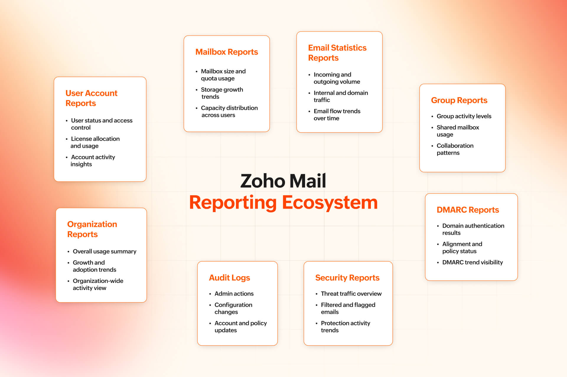
Group reports
Group reports focus on shared mailboxes and distribution groups.
They provide insight into how actively groups are being used, how much communication flows through them, and how group-level engagement compares across the organization.
For teams that rely heavily on shared inboxes, such as support or operations, these reports help assess whether groups are functioning as intended or require restructuring.
DMARC reports
DMARC reports are centered on domain authentication and alignment.
They provide visibility into how your domains are performing under DMARC policies and how authentication results are being handled. These reports are particularly relevant for organizations monitoring domain reputation and email authenticity.
Rather than diving into raw authentication logs, DMARC reports summarize alignment patterns and policy outcomes in a structured way.
Audit logs
Audit logs focus on administrative and system-level actions.
Instead of tracking email traffic, this category records changes and activities performed within the Admin Console. It helps administrators review configuration changes, account updates, or policy adjustments.
When accountability or change tracking becomes important, audit logs provide a chronological record of administrative actions.
Organization reports
These reports aggregate data at a broader level.
Rather than isolating specific users or domains, this category provides a consolidated view of activity across the organization. It’s useful when reviewing growth trends, overall adoption, or presenting high-level insights to leadership.
Such reports step back from granular detail and show how the email environment behaves at scale.
Security reports
These reports bring together insights related to protective mechanisms within the system.
This includes reports tied to threat-related activity, filtering outcomes, and protection-based monitoring. They allow administrators to observe patterns that may require closer review, without manually analyzing every flagged message.
Instead of focusing on day-to-day traffic, this category narrows in on security posture and risk visibility.
A structured and layered reporting system
What becomes clear across all of these categories is that reporting in Zoho Mail is layered.
Some reports focus on people.
Some focus on storage.
Some track communication flow.
Others monitor authentication, security, or administrative changes.
Because dashboards allow you to create widgets from these reports, you’re not locked into one way of viewing them. You can surface what matters most to your role—whether that’s license tracking, DMARC alignment, traffic analysis, or audit review.
Sharing, exporting, and scheduling reports
Reports aren’t always meant to stay inside the Admin Console. The data often needs to be shared, reviewed externally, or referenced later.
Zoho Mail allows reports to be exported in standard formats, making it easier to circulate them beyond the dashboard view. Whether the goal is to archive a snapshot, attach data to internal documentation, or review it offline, exporting ensures that the information isn’t limited to on-screen access.
Reports can also be shared directly, depending on how teams collaborate. This is useful when insights need to reach leadership, compliance teams, or other stakeholders without granting full administrative access.
Scheduling adds another layer of flexibility. Instead of manually generating the same report repeatedly, reports can be configured to run at defined intervals. This allows periodic insights—such as traffic trends, license usage, or security summaries—to be delivered automatically.
Together, these capabilities extend reporting beyond monitoring. They make it possible to document trends, maintain oversight, and ensure that the right information reaches the right people at the right time.
Bringing it all together
Admin reports in Zoho Mail aren’t a single feature tucked away in the Admin Console. They form a structured system that gives visibility into every layer of email administration—from user accounts and mailbox usage to mail flow, authentication, security monitoring, and organizational trends.
- The dashboards provide orientation.
- The report categories bring depth.
- Sharing and scheduling make insights reusable.
Taken together, they create context, rather than just practical raw data.
Instead of reacting to isolated questions, you have a consistent way to verify patterns. Instead of guessing whether growth is normal, you can see it. And instead of manually tracking changes, you can rely on structured records—whether that’s mailbox trends, license allocation, DMARC alignment, threat traffic, or administrative actions captured in audit logs.
You don’t need every report every day. But knowing they’re there and understanding how they’re organized changes how email administration feels. It becomes less about firefighting and more about informed oversight.
In the next part of this series, we’ll move deeper into individual report families and explore how specific reports can be used in real operational scenarios.
Comments