What Is Data Visualization? Definition, Examples, And Benefits
Data visualization is the representation of data, using visual elements like charts and graphs. Data visualization helps you to spot trends, patterns, and outliers, for quick insights and to make better decisions. It is increasingly important in today's world to understand the overwhelming volume of data being generated by businesses every single day.
Sign up for free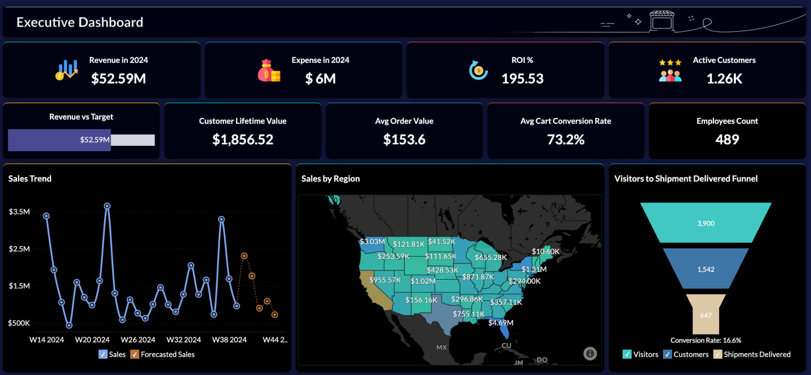
What is data visualization
Data visualization provides a clear, concise and an easy understandable way to present complex data in a compelling and accessible manner. Data visualization can be of help for business users to identify relationships, patterns, and outliers that will empower timely decision-making.
Why is data visualization important
Good data visualization removes noise from data, highlights useful information, and tells a story. Edward R. Tufte, a pioneer in data visualization says, "Graphical excellence is that which gives to the viewer the greatest number of ideas in the shortest time, with the least ink in the smallest space." It is imperative for today's data visualizations to allow users to interact and explore with data dynamically, enabling them to drill down into specific insights or contexts. Also well-designed visualizations enhance information recall and enable interdisciplinary collaboration.
What are the broad goals of data visualization in business
In a business environment, the speed at which decisions are made is key. It shouldn't take too long to find answers for known questions and indicators. Yet, while dealing with unknown scenarios, there should be sufficient scope to explore the available data in less time-consuming ways.
Hence, for any data visualization software, the two major goals are:
Explanation: Visuals that provide users with relevant information for standard, day-to-day needs (e.g., volume of sales in a day across regions)
Exploration: Offering a multi-dimensional view of a data-set for users to explore, ask questions as they reflect, and uncover insights along the way (e.g., performance of a business measured by different parameters over a given time period)
Components of data visualization
Human minds process visuals at an incredibly high speed, and the same also applies to data visualizations. The reason is that it takes less than half a second for the eye and the brain to grasp what is called the pre-attentive visual properties of an image—the color, form, spatial positioning and movement that makes up a data visualization.
A wide range of visualizations can be created with these building components. They include:
- Time-series visualizations, such as line charts and area charts which depict how a variable, or multiple variables, change over time.
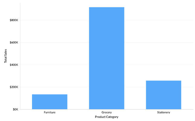
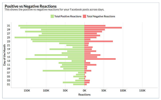
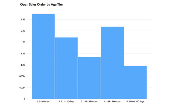
- Ranking & comparison of different types of bar-charts, like horizontal/vertical, grouped, and stacked.
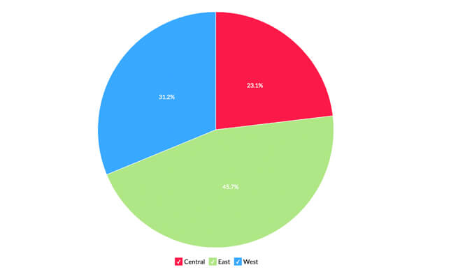
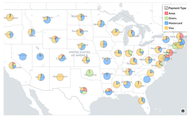
- Part-to-whole views of data on a percentage basis using pie charts.
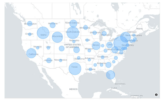
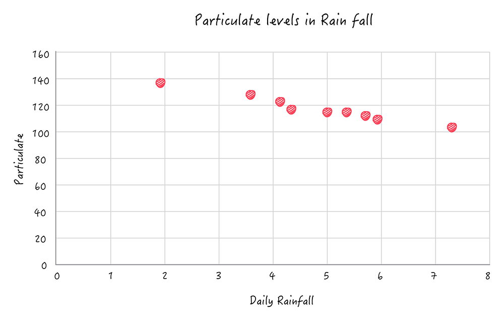
- Correlation between two or three variables can be effectively understood using scatter plots and bubble charts.
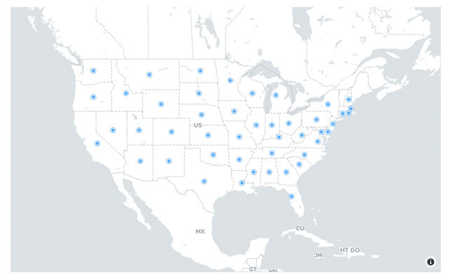
- Geo mapping visualizations like choropleth—a shaded or pattern-filled map—are useful when it's necessary to compare or segment a data set by geographic region.
Types of Data Visualization
Charts
Be it discrete or continuous, charts can visualize any type of data for effective analysis and interpretation. There are a wide range of chart types like Area, Line, Bar, Stacked, Pie, Scatter, Combination, Funnel, Web etc. Each chart facilitates a wide range of user interaction options for further deeper and contextual analysis.
Some notable and widely used chart types include:
Line Chart
This can be used to visualize trends across any time-period. There are two variants of line chart: Smooth Line and Step chart.
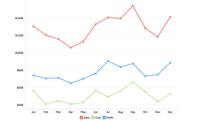
Area Chart
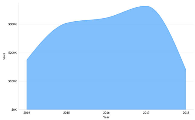
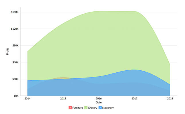
Area charts shade the area beneath the lines and therefore help you more readily compare data magnitudes.
Pie Chart
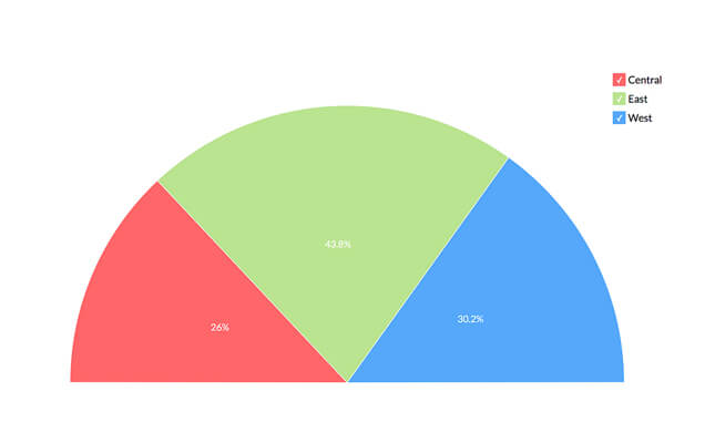
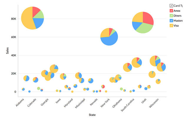
This chart is more apt to depict percentage or proportional data. It can be useful to analyse and find out the contribution of parts to a whole set.
Ring Chart
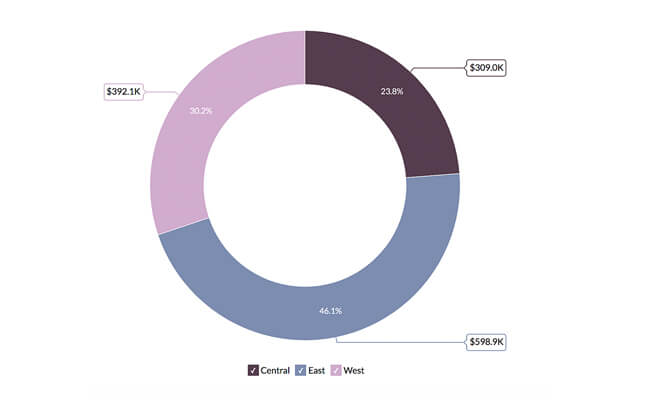
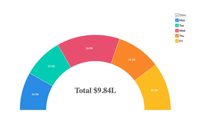
Otherwise known as doughnut chart, this is also useful in presenting data as sum of its parts, in percentage values.
Scatter Chart
Typical use of the scatter chart is to plot sporadic data with uneven intervals. It is used for the comparison between two numerical axes unlike the line chart, where one axis is never numerical.
Bubble Chart
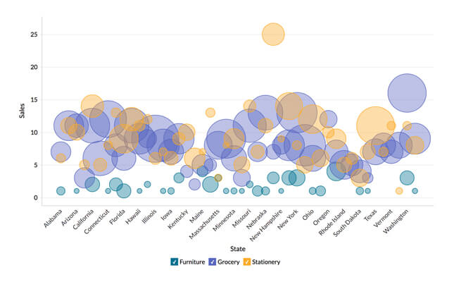
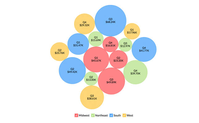
They are useful to visualize data by highlighting the magnitude of data value with proportionate sizing. Also, bubble chart can be interchangeably used with scatter plots too.
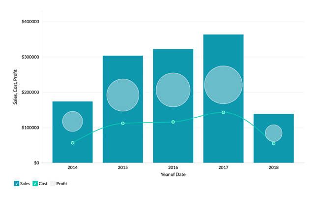
Combination Chart
When you have mixed types of data series and you need to represent both simultaneously, pick any suitable combination chart. The possible chart types for combination include bar, line, area, bubble and scattered chart.
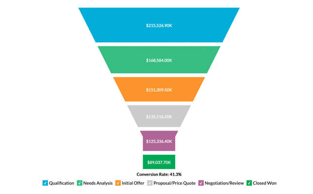
Funnel Chart
This chart is used to represent the progressive flow or reduction of a business metric across phases.
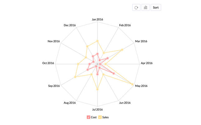
Web Chart
Pick this chart to study the comparison of different data series. This helps to compare the values in a data series represented with data markers, relative to a centre point.
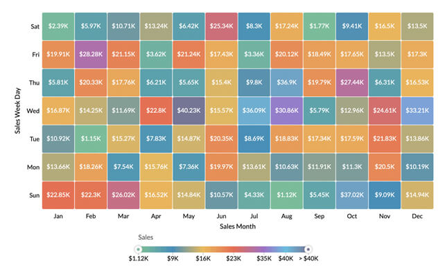
Heat Map
This two-dimensional grid chart is useful to display values with colors of varying intensities - that helps in easy visualization, categorisation and filtering of data.
Geo Map
These charts are useful for visualizing geo spatial data through interactive visualizations within and across cities,states, countries and continents of the whole global landscape.
Pivot Tables
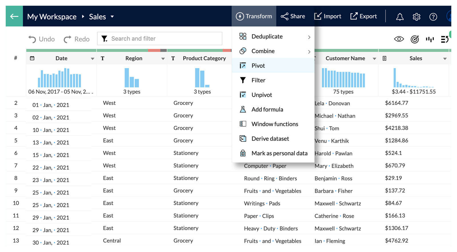
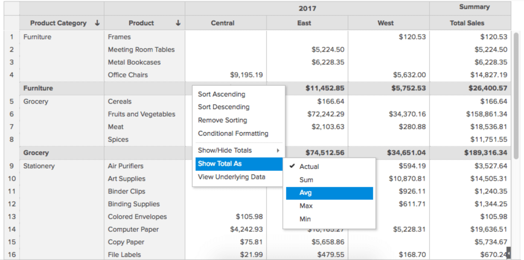
Pivot Tables allow you to dynamically rearrange, group, summarize and tabulate large sets of data for easier analysis and consumption. A wide range of options are available to filter, sort and customize the table's appearance and presentation of the data.
Dashboards
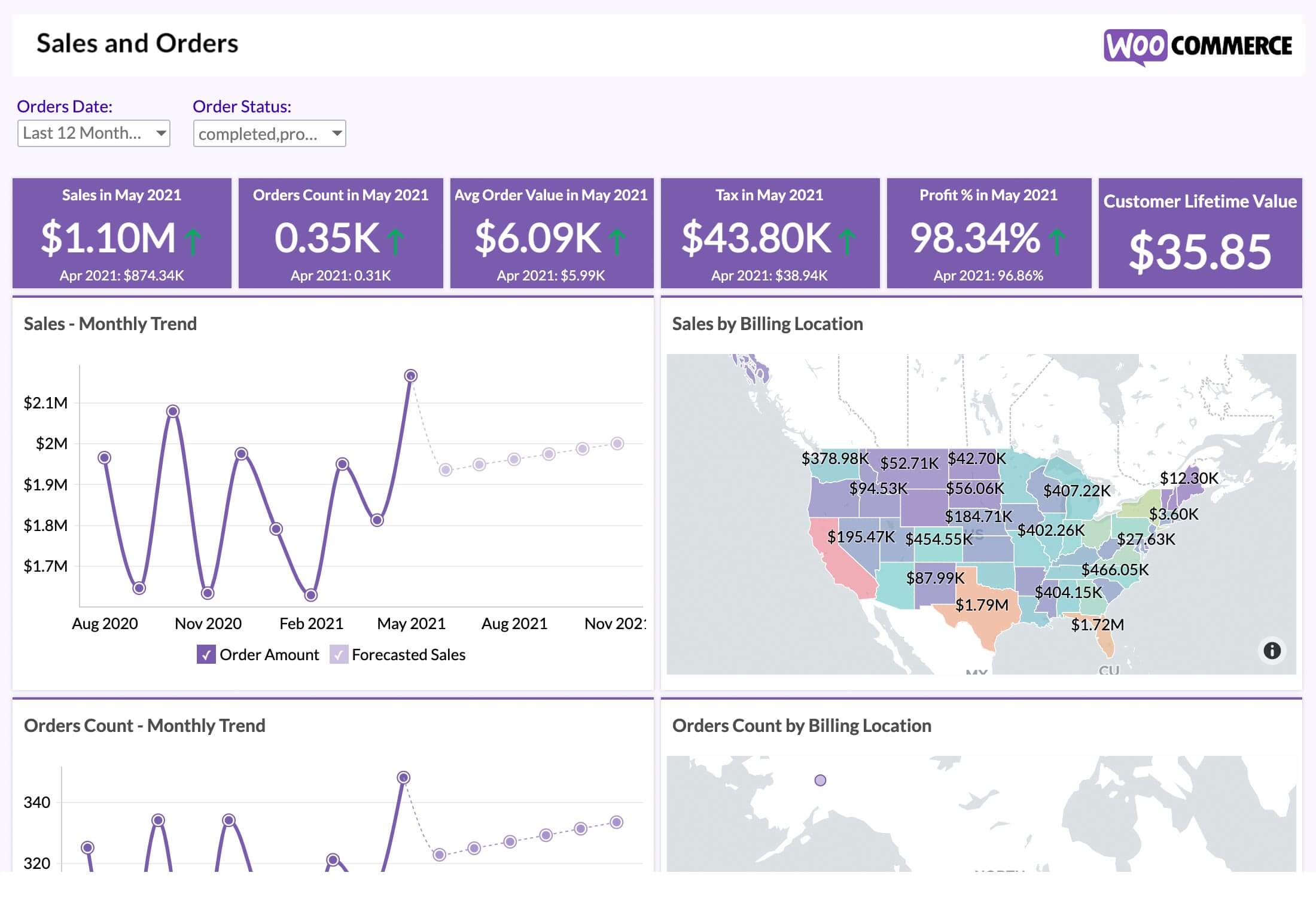
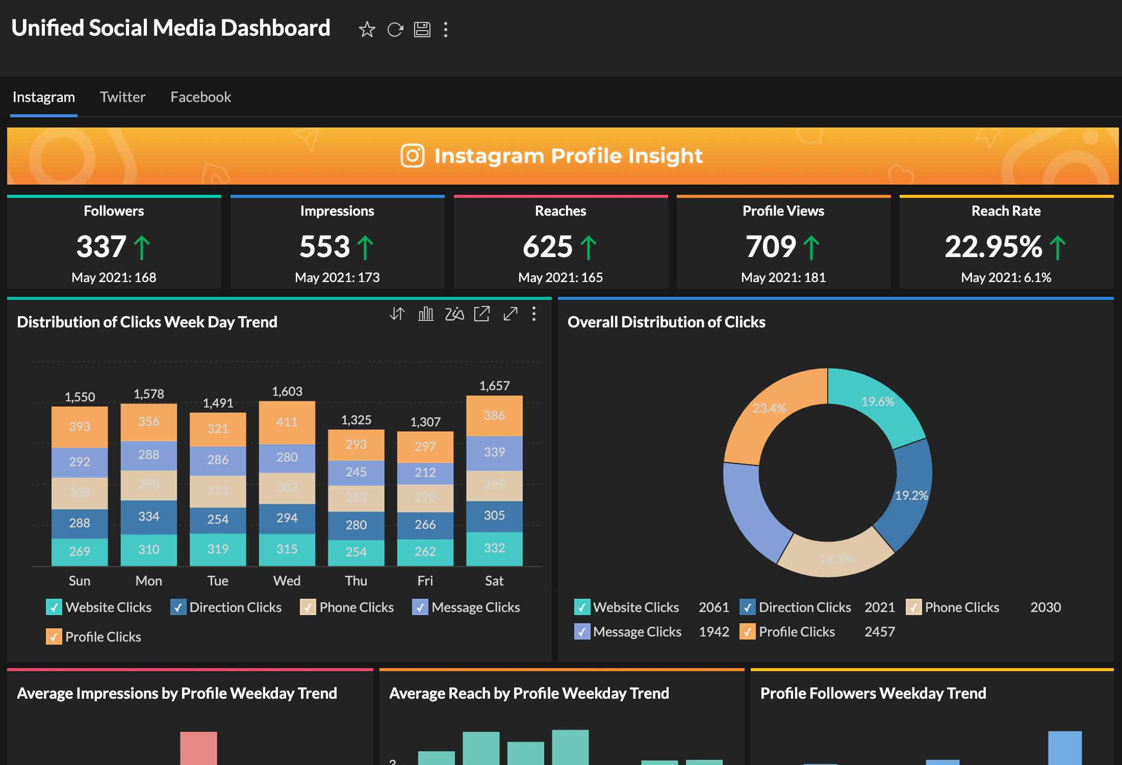
Dashboards allow you to combine multiple reports and KPI widgets in a single page for a quick overview. The reports and widgets can be organized conveniently using flexible layouts. In addition to that, the dynamic filtering capability enables the viewing of any required and specific information.
Interactive data visualizations
A data visualization by default is expected to be interactive and engaging, thereby offering users a more immersive and personalized experience. Some of the key characteristics of interactive data visualizations are
Drag-and-Drop
Dynamically choose chart elements and drop them over the visualization layout. Rearrange visual elements and perform customizations to suit user preferences.
Dynamic Filtering
Applying filters to focus on subsets of data specifically, based on different criteria, provides more contextual analysis and insights.
Hover and Tooltip Features
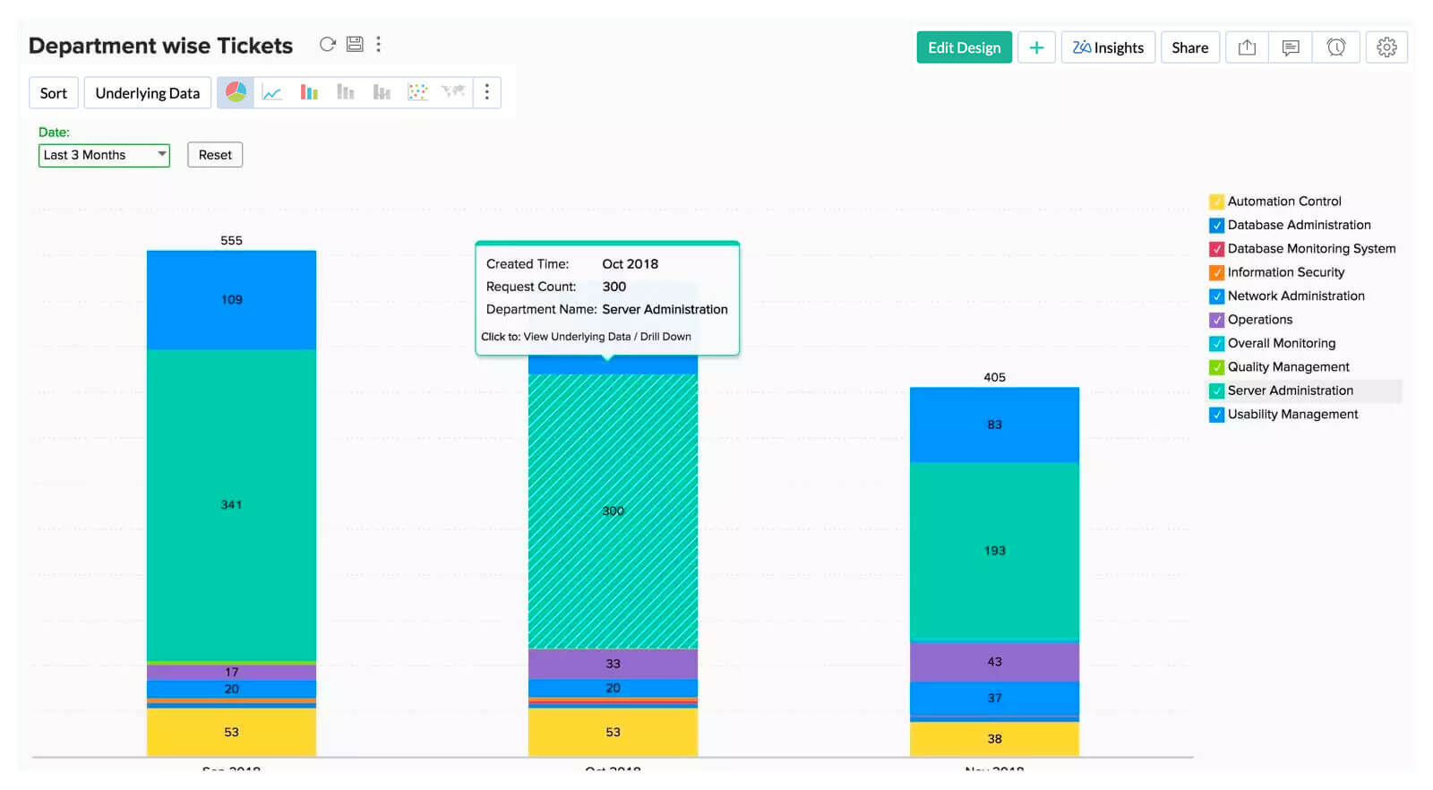
Moving the cursor over data points to show additional information through tooltips, provides contextual details without much clutter.
Auto-generated Insights
AI-powered automated insights can be generated over data visualizations, to provide detailed information and explanations for easier understanding.
What are the best practices of data visualization
Data visualization and big data
Data visualizations become more essential for extracting and presenting meaningful insights, as the volume, velocity and veracity of data continues to grow. Here are some key requirements for data visualization tools to handle big data
Handling data at scale 1
Data visualization platforms must be able to seamlessly render and process large volumes of data.
Interactive visualizations 2
To explore and analyze big data at greater length, it is important for data visualizations to offer interactivity w.r.t drilling down into details, dynamic adjustment of relevant parameters to gain deeper and contextual understanding.
Real-time Insights 3
Use-cases of big data often involves streaming and processing data in real time. In such situations, real data visualization tools must be capable of handling data updates up-to-the-minute and enable their users to gather up-to-date insights.
AI Augmentation 4
Data visualization tools should be able to leverage advanced Machine Learning(ML) models that offer advanced statistical analysis for big data analytics.

Common data visualization use cases
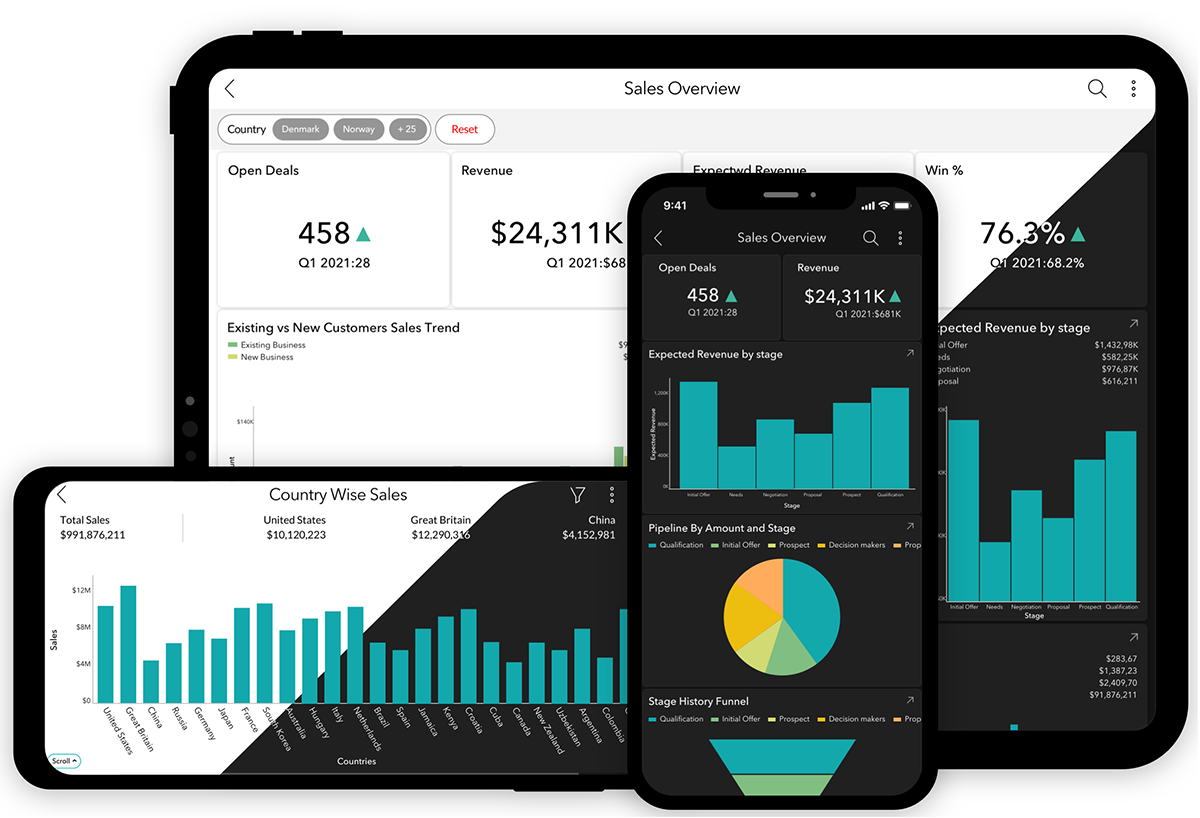
Faster decision-making in business can be better facilitated by precisely offering the context needed for stakeholders. Dashboards achieve this by collating data visualizations that measure and track essential KPIs. The effectiveness of a dashboard though, lies in offering the latest available data.
Choosing appropriate data visualizations for business can be made based on 1) the type of users, 2) the level of detail they're looking for, and 3) their frequency of usage. Data visualizations have their specific utilities in different disciplines and industries. Here are just a few examples:
- Sales
- Marketing
- Finance
Sales
Visualizations help in evaluating the effectiveness of different channels in achieving the larger sales objectives by communicating data aggregated from multiple tools and sources. Learn more about sales data visualization.

Marketing
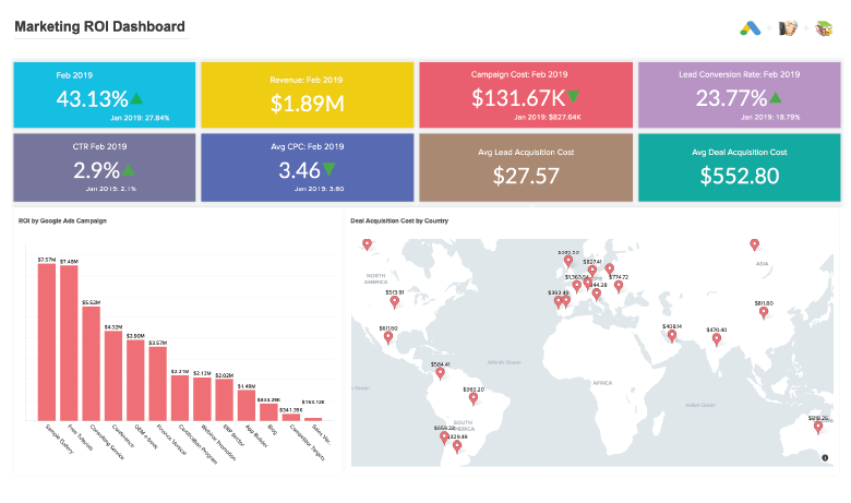
Track the impact of your marketing initiatives in terms of engagement and conversion-rates using insightful visualizations. They can also be easily shared across the stakeholders involved for their up-to-date awareness. Learn more about marketing data visualization.
Finance
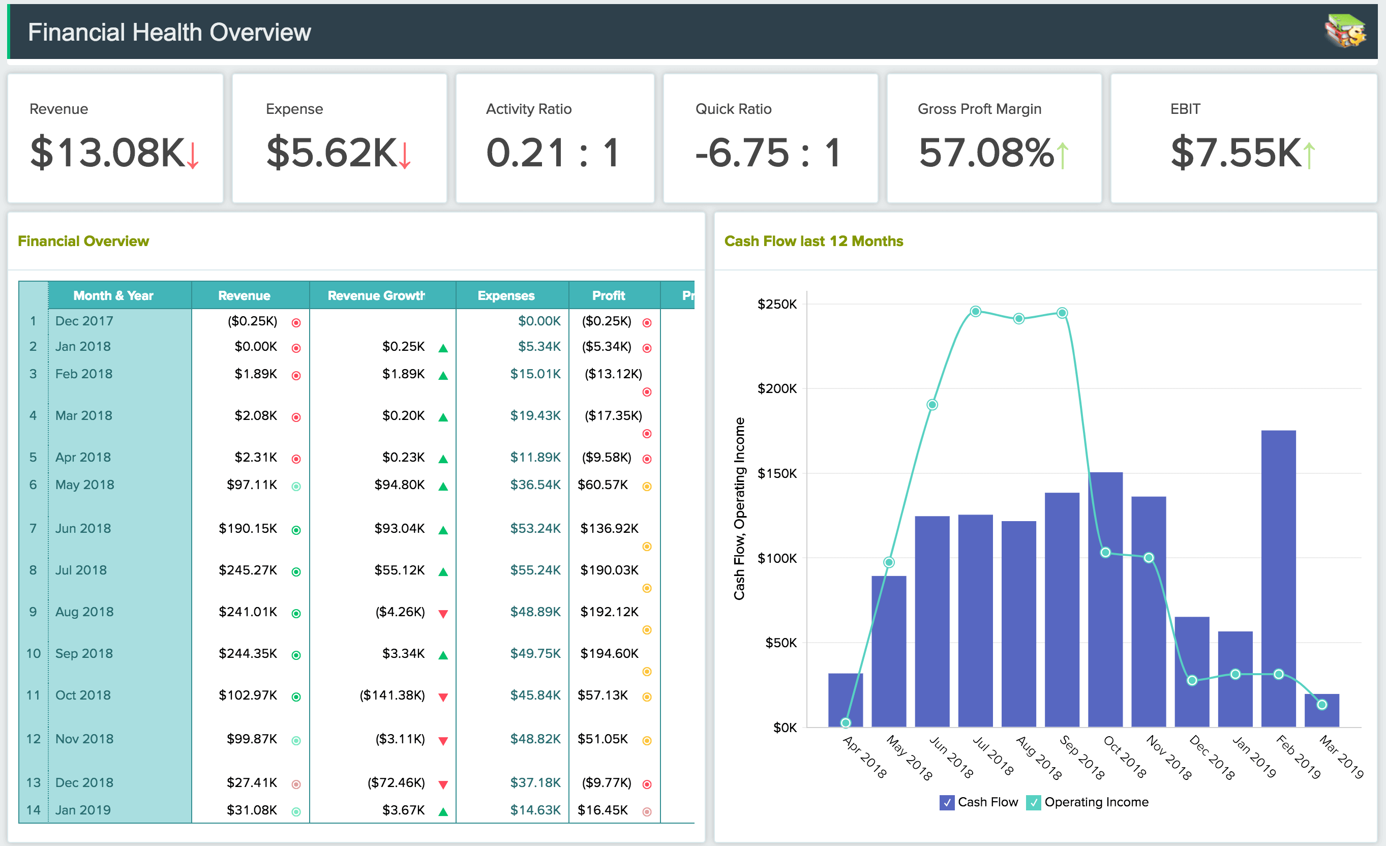
The enumeration and presentation of in-depth financial data enables better tracking and forecasting of organizational performance, and readiness to withstand uncertainties. It also saves a substantial amount of data preparation time that could be better utilized for other high-value activities. Learn more about financial data visualization.
Data visualization tools
In this era of big data, businesses need versatile data visualization tools that would solve all their visualization needs. Best data visualization software that offers this excellence will become a vital component of any business and its processes. All effective data visualization tools share some common attributes. Some of the notable aspects are:

Data Connection and Integration
Data visualization tools should have the ability to connect and integrate data from a wide variety of sources such as files and feeds, databases, business apps etc. for a comprehensive and detailed analysis.
Broad range of visualization options
An effective data visualization tool supports a variety of visualization types, including charts, graphs, maps, and dashboards. This versatility enables users to choose the most suitable option that's relevant for their data.

Interactivity
Data visualization tools must support options for interactivity that enables users to engage with visualizations, drill-down and explore data for deeper analysis.

Customization Options
A robust data visualization tool offers customization options for visual elements to ensure that the overall look and feel aligns with specific branding preferences

Collaboration Features
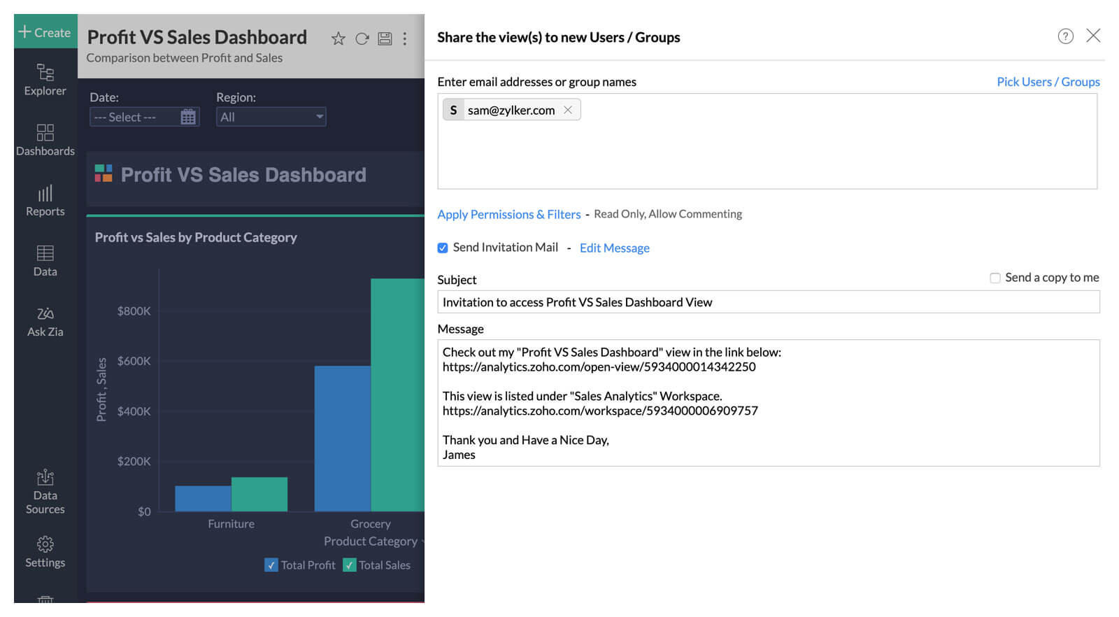
Collaborative data visualization tools enable sharing of visualizations and dashboards with peers and other relevant stakeholders. They also provide options for collaboration such as contextual comment threads, real-time messaging within the scope of data visualizations
A powerful data visualization software like Zoho Analytics offers all the essential ingredients to generate powerful data visualizations that can be consumed by users of all kinds.
Ready to start with Zoho Analytics?
A cloud BI pioneer for over a decade, Zoho Analytics is now used by more than 10 million business users, and 100,000 businesses in 120+ countries around the world.
Want to join us? Get started now!
Sign up for free