- HOME
- BI & Analytics
- 14 Must-have features of data visualization software (and how to evaluate them)
14 Must-have features of data visualization software (and how to evaluate them)
- Last Updated : July 30, 2026
- 274 Views
- 12 Min Read
You have the data, which is living in your CRM, your database, a few spreadsheets, maybe a tool or two that doesn't connect to anything else. Getting a clear picture out of all that is harder than it should be.
That's the problem data visualization software is built to solve. It takes raw numbers and turns them into charts, dashboards, and reports that people can actually read and use.
The challenge is that tools vary a lot under the surface. In the 2024 BARC BI Survey, data quality and data integration ranked as the top two pain points among BI users (ahead of performance, cost, or usability). That's a signal: the features that matter aren't always the ones that get the most attention in demos.
The 14 features covered here were selected because omitting any one of them during evaluation consistently creates problems once teams are six or twelve months into deployment: integration gaps, governance issues, or capability ceilings that require a full platform change to resolve. Knowing which specific attributes to examine, and which vendor claims to pressure-test, makes the difference between a long-term fit and a costly pivot.
What data visualization software does
Data visualization software converts structured data into visual representations (charts, graphs, maps, tables, and dashboards) so that patterns, trends, and outliers become legible.
The gap between older tools and newer ones is significant. Older tools required data export before anything could be built. Newer platforms connect directly to live data sources, refresh on their own, and expose a query interface so that analysts and non-analysts alike can generate charts from natural language questions.
There's also meaningful overlap now between visualization tools and what practitioners classify as BI (business intelligence) platforms. Pure visualization tools focus on chart generation. BI platforms extend further into data preparation, role-based access control, and analytics workflows. Many modern platforms combine both capabilities, which makes the platform's feature set a more reliable evaluation criterion than its product category label.
The 14 core features of data visualization software
1. A wide chart library
The gaps in a chart library's coverage create more workflow disruption than most teams anticipate.
Every platform includes bar charts, line charts, and pie charts. The problems emerge when the operations team needs a Gantt chart for project timelines, sales data needs to be plotted on a geographic map, or finance requires a pivot view for multi-dimensional slicing. When those chart types are absent, teams build workarounds in separate tools, fragmenting the workflow and adding maintenance overhead.
Gantt charts, heatmaps, pivot tables, KPI widgets, funnel charts, and geographic maps are the types most frequently missing from lightweight visualization tools, and they're the ones most frequently requested once a platform is in production.
2. A drag-and-drop report builder
A drag-and-drop builder lets users construct reports by placing data columns onto a canvas and selecting a chart type.
The practical test is whether an analyst's non-technical counterpart (a sales manager, a marketing director, a regional operations lead) can build a basic report independently. If they can't, every ad hoc request routes back to the analytics team, creating a bottleneck that slows down decision-making at exactly the wrong moments.
When we look at how teams use Zoho Analytics in the first week, the ones that extract value fastest are those where business users can create their own reports without submitting a request to the analytics team. The drag-and-drop builder is the mechanism that makes self-service reporting functional rather than nominal.
The most reliable test during a trial period is to give a non-technical team member a specific reporting task and observe without assistance. The outcome tells you more about day-to-day usability than any vendor-run demonstration.
3. Interactive dashboards
An interactive dashboard lets users apply filters, drill into chart elements for additional detail, and adjust the view dynamically based on the question being investigated.
When a dashboard aggregates multiple reports into a single view, those reports should respond to shared filters. Changing a date range filter on one chart should update every other visualization on the page simultaneously.
During evaluation, test this behavior explicitly: apply a filter and observe whether every dependent chart updates. If the filtering is not synchronized, users will need to replicate the same parameter change across multiple charts each time the view needs adjustment, which compounds into a significant inefficiency in daily analytical work.
4. Data connectivity
The visual layer of a platform is only as reliable as the data feeding into it. Connectivity limitations and error-prone sync processes undermine everything built on top of them.
Capable data visualization software connects directly to relational databases, cloud data warehouses, and business applications (CRM, ERP, marketing platforms), and accepts file uploads for supplemental data. Syncs should also run automatically on a defined schedule.
The distinction between a native connector and an export-and-upload workflow matters operationally. A native QuickBooks connector maintains its own sync schedule and authentication. Exporting a CSV from QuickBooks manually and uploading it weekly is a different process entirely, one that introduces latency, introduces human error, and doesn't scale.
Evaluate connectivity by working through every data source your team currently uses. Check whether each has a native connector, what the sync frequency is, and how sync failures are surfaced and resolved.
5. Data preparation
Data is rarely analysis-ready when it comes out of a source. Duplicate records, inconsistent field formatting, columns that need to be split or joined, and calculated fields that don't exist in the source system all require transformation before visualization is meaningful.
When the visualization platform lacks transformation capabilities, data preparation moves to a separate data preparation tool (a standalone ETL platform, a scripting workflow, or a data engineer's manual intervention), adding complexity and delay to every new reporting project.
A capable data preparation layer within the platform lets users join tables from different sources, normalize records, and apply transformations with a visual interface that shows the data state at each step of the pipeline. This eliminates a class of dependencies that otherwise slow down the analytics function considerably.
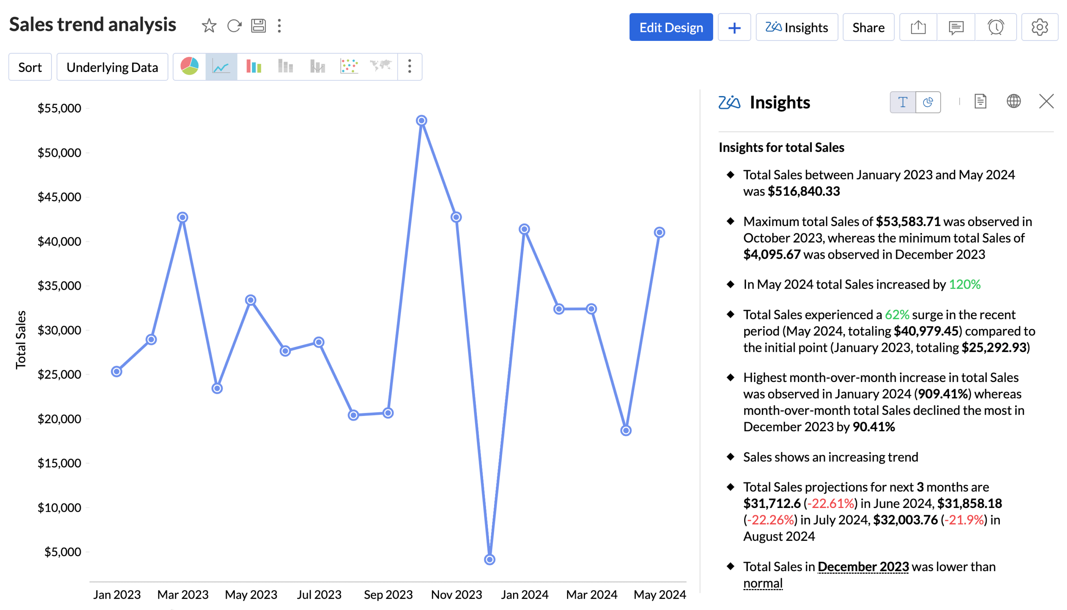
6. AI-powered insights
Analysts running scheduled reports can examine what they're looking for, but they can't systematically detect everything that changed across the full dataset before the next review cycle.
An AI layer embedded in the visualization platform scans the data continuously and surfaces anomalies and patterns without requiring a specific query. A revenue decline in one geographic segment. An elevated refund rate on a specific product line. A conversion rate deviation that falls outside historical variance. These signals exist in the data regardless of whether anyone happens to pull the relevant report at the right time.
Look for AI data visualization tools that offer automatic insight generation, anomaly detection, and an explanation of why something was flagged. A notification that a number is statistically unusual without any contextual explanation transfers the diagnostic work back to the analyst.
7. Natural language query
SQL proficiency should not be a prerequisite for extracting answers from operational data. Natural language query (NLQ) interfaces let users type questions in plain English and receive chart output in return.
A query like "What were the top five products by revenue last quarter in the Northeast region?" should return a visualization directly, without the user needing to construct a SELECT statement, specify JOIN conditions, or understand the underlying data schema.
Performance on NLQ varies considerably across platforms. During evaluation, test it with the kinds of questions your team asks most frequently, including follow-up queries that reference the previous result, and assess whether the output matches the intent.
8. Maps and geo-visualization
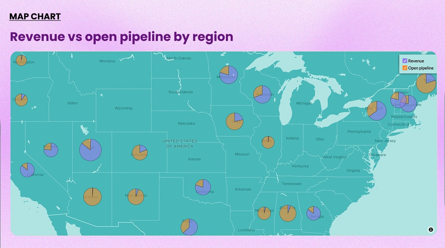
Any dataset with a geographic dimension (store locations, sales territories, delivery networks, customer distribution by region) yields faster insights through spatial visualization than through tabular presentation.
A table of revenue figures broken out by region requires deliberate reading to identify patterns. A choropleth map renders the same distribution spatially, allowing a regional lead to identify underperforming territories in a few seconds rather than scanning rows. The reduction in time-to-insight compounds meaningfully when geographic analysis is a regular part of the team's workflow.
9. Forecasting and predictive analytics
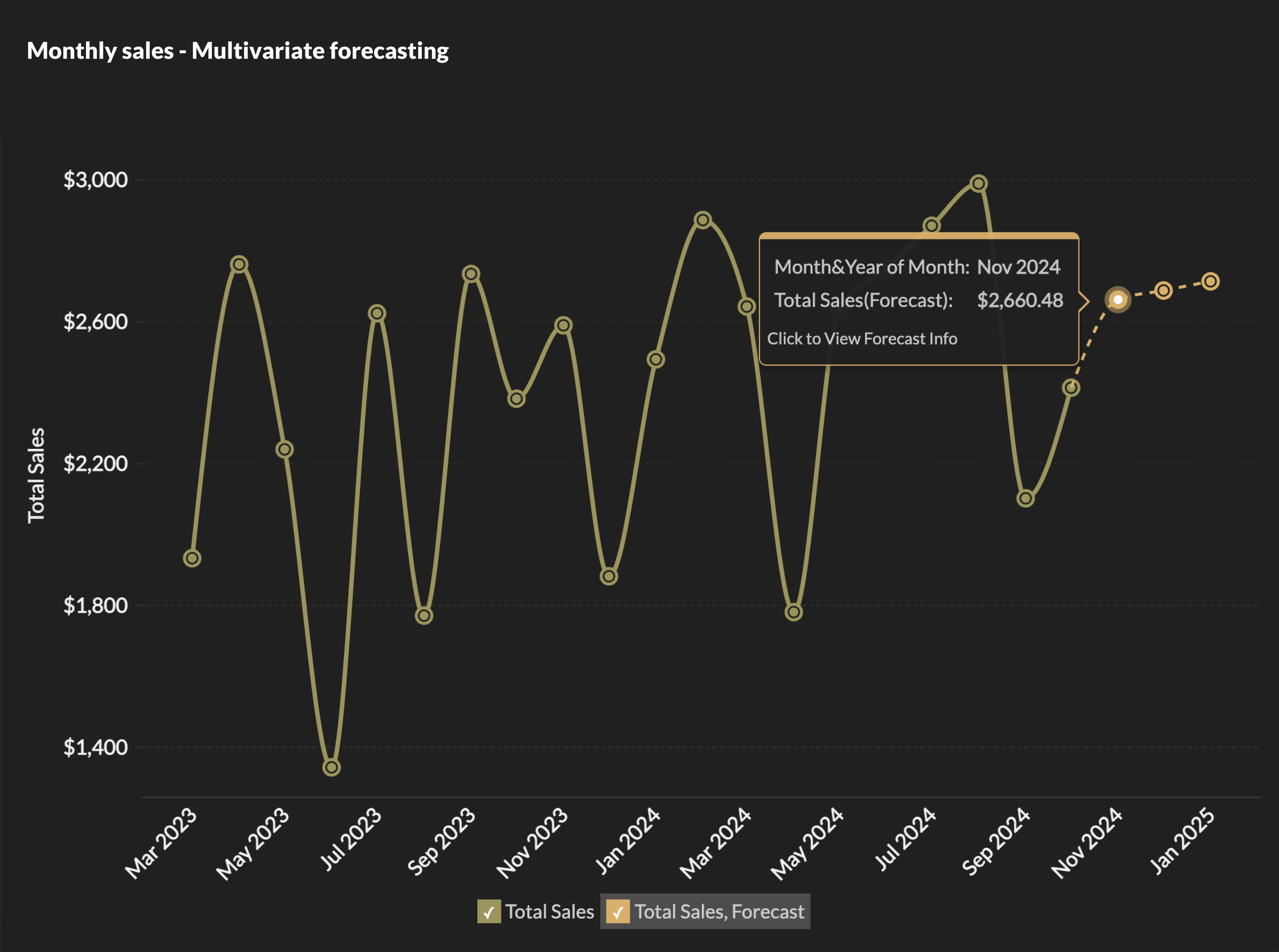
Historical reporting describes what has occurred. Forecasting extends the analysis forward, generating projected values based on detected patterns in historical data using machine learning models, without requiring the analyst to configure the underlying statistical framework manually.
Well-implemented predictive analytics generate forecasted values alongside historical trends, include confidence intervals to communicate projection uncertainty, and support what-if simulation so analysts can model how changes in input variables affect the forecast. These capabilities allow business planners to run scenario analysis within the same platform they use for historical reporting, rather than exporting data to a separate modeling tool.
10. A metrics layer
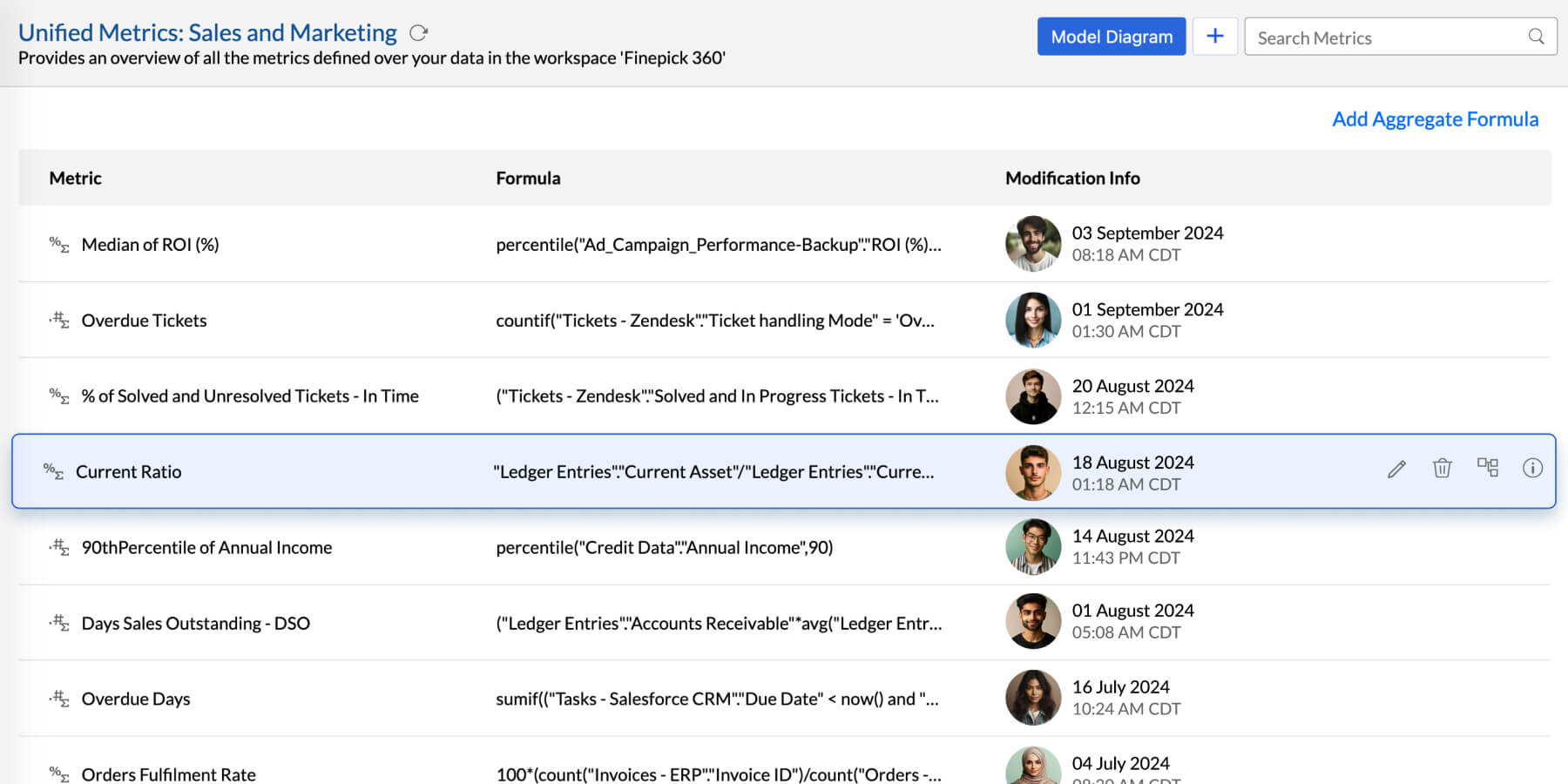
When KPI definitions live inside individual reports, different teams calculate the same metric differently. "Revenue" includes or excludes refunds depending on which dashboard someone opens. A new analyst rebuilds a churn rate calculation that already exists in a dozen other reports with subtle variations. The metrics layer prevents this by establishing a single governed definition for each KPI, one that every report and dashboard references rather than recalculates independently. Editing the definition in one location applies the change everywhere it's used.
A centralized metrics layer is what allows a 10-person analytics function and a 200-person one to operate from the same definitional foundation without metric drift accumulating over time.
Evaluate this feature by checking whether metric definitions can be centrally managed with access controls that restrict editing rights, and whether those definitions apply consistently across all view types in the platform.
11. Sharing and collaboration
Sharing functionality needs to extend beyond file export. Team members should be able to access dashboards with appropriate permission levels: view-only for consumers and edit access for contributors. Scheduled email delivery should be available so stakeholders receive relevant reports without needing to log in and navigate to them. Threaded commenting directly on a dashboard, visible to the relevant collaborators, keeps the analytical conversation attached to the data rather than distributed across email threads.
Among the best data visualization tools, how a platform handles these collaboration mechanics is frequently the determining factor in whether it achieves sustained adoption or remains a tool used only by the analytics team.
12. Data storytelling
A dashboard presents metrics. A data story provides the interpretive framework that allows those metrics to drive decisions.
With data storytelling, analysts can arrange charts and dashboard panels into a structured narrative with written commentary, sequenced flow, and explicit framing for each key finding, rather than presenting a collection of visualizations and leaving interpretation to the audience. For quarterly business reviews, board presentations, or cross-functional findings that need to reach audiences without deep data context, this capability substantially reduces the gap between analytical output and business action.
Instead of sharing a dashboard link and relying on readers to form the correct interpretation independently, the analyst controls the sequence and provides the necessary interpretive context alongside the data.
13. Embedded analytics
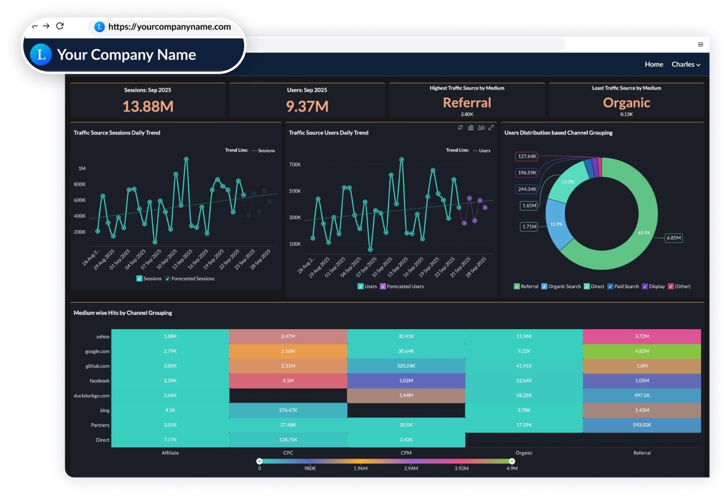
Some deployments require analytics to be surfaced within a separate product or internal portal rather than as a standalone BI platform.
Software vendors building client-facing products, and organizations running internal portals where users need their data without navigating to an external tool, use embedded analytics to deliver visualizations within the host application. Each user sees data filtered to their account or access level. The underlying BI platform is not visible.
Evaluate embedded analytics implementations for white-labeling capabilities, iframe and API embedding options, row-level security that enforces per-user data isolation, and an SDK that supports custom integration work. The row-level security implementation deserves particular scrutiny: confirm how it is configured and how it enforces data boundaries across embedded views.
14. Security and access controls
Every capability described in the preceding sections introduces data exposure risk if access controls are not rigorously implemented.
The foundational requirements include role-based access control (restricting what users can view and modify based on their role), row-level security (ensuring a regional manager's view is scoped to their region's data), single sign-on integration for enterprise environments, audit logging that tracks data access and configuration changes, and compliance certifications relevant to the organization's regulatory context (SOC 2, GDPR, HIPAA, and similar frameworks for teams in regulated industries).
Platform documentation often presents these features with similar descriptions. During evaluation, request a technical walkthrough of how row-level security is configured and enforced, where data is physically stored, and what encryption standards are applied at rest and in transit.
Three data visualization features buyers tend to overlook
These capabilities rarely appear on standard evaluation checklists and are typically encountered in support escalations several months after a team has gone into production.
1. Drill through and drill actions
Drill-down is a standard feature in most platforms: clicking a bar in a chart surfaces the next level of detail in the same view.
Drill-through is a distinct capability. Clicking a data point navigates to a separate pre-configured report that is already filtered to the context of what was clicked. An analyst configures that connection once, and it becomes available to every user navigating the dashboard without additional setup.
Drill actions extend this further: clicking a data point triggers an action in an external system such as opening a CRM record, creating a new deal, updating a field in another application, or calling an external API. For a sales representative reviewing a pipeline report, that means clicking a deal and opening the full CRM record in context, without switching applications manually.
2. Custom visualization builder
The standard chart library covers the large majority of analytical use cases, but industry-specific requirements frequently fall outside what any default library provides.
Custom visualization support allows teams to build chart types not available in the standard library using JavaScript and libraries such as Plotly or D3, packaged as plugins that function natively within the dashboard builder alongside standard chart types.
Teams in manufacturing, healthcare, logistics, and finance regularly encounter visualization requirements the standard library doesn't address: a custom budget variance chart, a network graph for dependency mapping, or a clinical data layout that adheres to domain-specific display conventions. Without a plugin architecture, the typical resolution involves a separate domain-specific tool, which reintroduces the data silo problem the BI platform was intended to solve.
Evaluate this capability by confirming support for external JS libraries, configurable field mappings within plugins, and admin-controlled plugin management that prevents unauthorized extensions from being introduced into production dashboards.
3. Report and dashboard templates
When a team invests significant effort in designing a high-quality dashboard (appropriate chart selection, filter logic, layout, metric configuration), that work should be exportable and reusable across other teams, clients, or regional deployments.
Template export saves the full configuration of a view (charts, pivot tables, summary views, dashboard layout) as a portable file that can be imported into a different workspace and connected to a different underlying data source. The structure is preserved; only the data connection is remapped.
For a consulting firm, this means building one client reporting dashboard and deploying it across dozens of accounts with minimal rework. For an organization with regional business units, it means one regional KPI dashboard can be deployed consistently across all regions rather than rebuilt independently each time.
Evaluate this capability by testing whether template export covers all view types the platform supports, whether import includes field remapping functionality, and whether templates can be transferred across separate accounts, not just workspaces within the same account.
How to evaluate a tool before you buy
Here are five things worth testing while choosing a data visualization tool.
- Can a non-technical user operate it independently? Assign a business stakeholder without a data background to build a basic report during the trial. Observe where they reach a decision point that requires outside help.
- Does it connect to every source your team currently uses? Map each data source to the available connector list, confirm whether the connector is native or intermediary, and test what happens when a sync fails.
- Does performance hold at your expected data scale? Request benchmark numbers from the vendor for data volumes larger than your current dataset. Vendor-provided demo environments use clean, small datasets that don't reflect production conditions.
- Does the governance model hold as the team grows? Test the metrics layer and row-level security with multiple user roles. These are the features most frequently cited in escalations as team size increases and more users are writing reports against the same data.
- What does total cost of ownership look like over two years? Factor in license cost, implementation effort, data source connection time, and ongoing maintenance. A lower license cost that requires substantially more setup and maintenance overhead may represent higher total spend over the platform's useful life.
How Zoho Analytics holds up against this list
Here's a quick look at how Zoho Analytics maps to all 14 features before we go into more detail.
| Feature | Zoho Analytics |
| Wide chart library | 50+ types: Gantt, geo maps, pivot, KPI widgets, racing bar, heatmaps |
| Drag-and-drop builder | Full no-code builder |
| Interactive dashboards | Cross-filter, drill-down, tabbed layouts, tooltip customization |
| Data connectivity | 500+ sources, 100+ native business app connectors |
| Data preparation | Visual ETL pipeline builder, 250+ AI transform functions |
| AI-powered insights | Zia: automated insights, anomaly detection, NLQ in multiple languages |
| Natural language query | Ask Zia: ask questions in plain English, get charts back |
| Maps and geo-visualization | Choropleth, heat maps, custom territories |
| Forecasting | Multiple forecasting models, confidence intervals, and more |
| Metrics layer | Centralized KPI definitions, access control per metric |
| Sharing and collaboration | Role-based access, scheduled email reports, commenting |
| Data storytelling | Native data stories feature |
| Embedded analytics | White-labeled dashboards, row-level security, SDK |
| Security and compliance | SOC 2, GDPR, SSO, data masking, audit logs |
| Drill through and drill actions | Supported on charts, pivot views, summary views |
| Custom visualization builder | Plugin-based, JS library support, admin-controlled |
| Report and dashboard templates | Export/import across workspaces and accounts |
Zoho Analytics has been included in the Gartner Magic Quadrant for Analytics and Business Intelligence Platforms for five consecutive years, including 2026. In the BARC BI Survey, 91% of users said they would recommend Zoho Analytics. The platform serves 22,000+ customers and over 3 million users.
One thing worth remembering
Platform demos are designed to show capabilities under optimal conditions: controlled data, pre-built queries, no edge cases. The real picture only emerges when your team runs the trial against your own data sources, at your actual volumes, asking the questions that drive your operational decisions week to week.
Zoho Analytics is built for exactly that test. With 500+ data connectors, a no-code report builder, and AI-powered analytics that works across your full dataset, it's designed to hold up when the conditions aren't ideal. Start a free trial with no credit card required and run it against your real data.
 Pradeep V
Pradeep is a product marketer at Zoho Analytics with a deep passion for data and analytics. With over eight years of experience, he has authored insightful content across diverse domains, including BI, data analytics, and more. His hands-on expertise in building dashboards for marketing, sales, and major sporting events like IPL and FIFA adds a data-driven perspective to his writing. He has also contributed guest blogs on LinkedIn, sharing his knowledge with a broader audience. Outside of work, he enjoys reading and exploring new ideas in the marketing world.