Creating data visualizations using Zoho Analytics: The ultimate guide
- Last Updated : June 3, 2026
- 1.5K Views
- 5 Min Read
Without effective visualization, data can be overwhelming and difficult to interpret. Traditional legacy data visualization tools often involve complex steps to generate reports and charts, and AI tools can create reports quickly but typically lack real-time data connectivity. As a business, finding the right balance between these options is essential.
This is where Zoho Analytics comes in—a powerful data visualization software that simplifies the process of transforming raw data into meaningful insights. With easy-to-use features and real-time data sync options, it offers a seamless way to analyze and interpret data efficiently.
In this guide, we’ll take a sample marketing dataset, clean and prepare it, and transform it into a fully functional dashboard using Zoho Analytics. By the end, you’ll have a marketing dashboard that provides actionable insights.
Why data visualization matters
Data visualization helps businesses:
- Identify patterns and trends quickly.
- Make informed decisions based on insights.
- Communicate findings clearly.
Instead of scrolling through spreadsheets, a well-designed dashboard with KPI reports and charts allows you to spot insights at a glance. For example, a heat map can instantly highlight regions with the highest sales and save hours of manual analysis.
Getting started with Zoho Analytics
To begin using Zoho Analytics, you can sign up for a 15-day free trial and explore all the data visualization features without any limitations.
What you can do with Zoho Analytics
- Connect data from 500+ sources: Connect databases, data lakes, cloud business apps, files, feeds, URLs, and spreadsheets.
- Automate data syncing: Schedule automatic sync at custom intervals for all data sources.
- Prepare and transform data: Use 250+ data transformation options to clean and prepare data for analysis.
- Create insightful visualizations: Choose from 50+ interactive data visualization types to generate reports and charts.
- Collaborate efficiently: Share reports with team members using fine-grained access controls.
- Stay updated with smart alerts: Get notified when critical changes or anomalies are detected.
Leverage AI with Zia:
- Ask Zia: Use natural language queries to generate visualizations instantly.
- Zia Insights: Receive easy-to-read narratives explaining your data trends.
- Zia Suggestions: Get recommendations for the best visualization types for your reports.
Step 1: Understanding the sample dataset
We have a sample marketing dataset containing website performance data. Try our sample marketing dataset; it contains website performance data to help you learn how to use Zoho Analytics.
The raw dataset includes key metrics such as clicks, signups, and customers by channel and source.
Step 2: Importing and preparing data for analysis
Zoho Analytics allows you to import data from multiple sources, including:
- Excel, CSV, and Google Sheets
- Cloud storage (Google Drive, OneDrive, and Dropbox)
- Business apps (Zoho CRM, Salesforce, Google Ads, etc.)
- Databases (MySQL, PostgreSQL, SQL Server, etc.)
To import your data:
- Sign in to your Zoho Analytics account.
- Click Create New Table, then Import Data.
- Choose your data source and follow the prompts. (In this case, upload the dataset as a CSV or Excel file or connect to Google Sheets.)
- Map columns and data types correctly.
- Set up an import schedule if you're working with live data.
Cleaning and structuring data
Before analysis, ensure your data is clean and structured:
- Remove duplicate rows (if any exist).
- Fix missing values (replace them with averages or estimates).
- Format data types (dates, numbers, and text).
💡 Tip: Use Zoho DataPrep (available in Premium and Enterprise plans) for AI-powered cleaning and transformation.
Step 3: Creating key visualizations
How to build a bar chart for a channel performance comparison:
- Navigate to your dataset.
- Click +, then Chart View.
- Drag and drop columns into the X and Y axes.
- Click Click Here to Generate Graph. Zoho Analytics will automatically create a bar chart based on the data.
- Customize the report with labels, colors, and sorting as needed.
Create as many reports as you need for meaningful insights.
✨AI feature highlight: Need help choosing the right data visualization type? Zia Suggestions automatically recommends the best visualizations based on your analysis.
Step 4: Building interactive dashboards
A dashboard combines multiple visualizations to provide a comprehensive view of your data.
How to build a dashboard:
- Click Create New, then Dashboard.
- Drag and drop the reports created earlier.
- Click Elements and drag the KPI widget to create widgets.
- Use filters for interactivity (e.g., filter by date).
- Customize the layout and color theme.
💡 Tip: Use KPI widgets to track key metrics like signup rate, customer conversion rate, and more.
Step 5: Advanced analytics and AI-powered insights
Meet Zia: your AI-powered data assistant.
Zia helps you:
- Ask questions in natural language (e.g., "What is my top-performing customer acquisition channel?").
- Detect anomalies in signup trends.
- Forecast future performance based on historical data.
Forecasting trends
- Open a line chart with time-series data. (For this example, use the customer trend report.)
- Click Analysis, then Forecast, then Add Forecast.
- Choose the column for forecasting, select the forecast length (e.g., three months), and pick a model.
✨ AI feature highlight: If you select Auto as the forecasting model, Zoho Analytics will automatically apply the most suitable model based on your analysis.
Step 6: Sharing and collaborating on insights
Share reports and dashboards:
- Team collaboration: Share dashboards with team members with different permission levels.
- Scheduled email reports: Set up daily, weekly, or monthly reports via email.
- Embed reports: Add dashboards to websites or client portals.
- Comment and discuss: Tag team members directly in dashboards for feedback.
To share a dashboard:
- Click Share, then Share this View.
- Set permissions for read options and sharing and collaboration options.
- Click Share.
Case study: WhatConverts
Challenge
WhatConverts needed a powerful tool for better data visualization and readable reports. As an advertising company, they managed data from multiple sources, making it essential to consolidate and analyze information efficiently.
Solution
WhatConverts chose Zoho Analytics as their go-to data visualization tool.
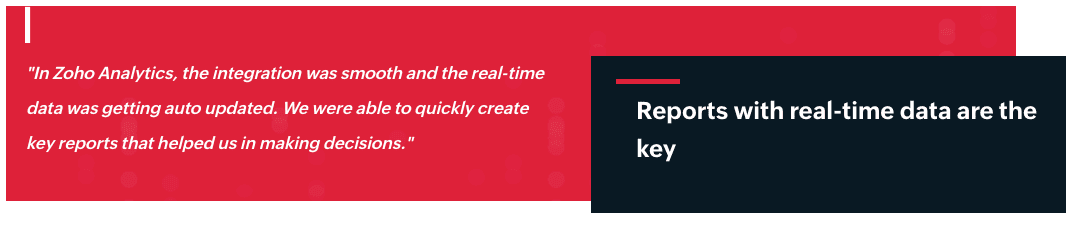
Using Zoho Analytics’ data connectivity options and built-in connectors, they seamlessly integrated data from Xero and Zoho CRM. Additionally, data from CallHippo and the WhatConverts database was brought into Zoho Analytics via Zoho CRM.
With Zoho Analytics, they created all their necessary charts, and real-time data updates made their reports even more insightful.
How WhatConverts uses Zoho Analytics
- Sales analytics: WhatConverts analyzed, identified, modeled, understood, and predicted sales trends and outcomes.
- Lead analytics: They reported and evaluated marketing strategies to understand leads better.
Result:
WhatConverts improved client relationships and saw a nearly 10% increase in revenue.
Next steps
We've explained how to transform raw data into meaningful insights using Zoho Analytics. Now, it's your turn. Sign up with Zoho Analytics to create impactful visualizations and get actionable insights for your business.
You can also:
- Explore Zoho Analytics' advanced analytics features.
- Join the Zoho Analytics community for expert tips.
- Book a free personalized demo to see how Zoho Analytics can help your business.
 Pradeep V
Pradeep is a product marketer at Zoho Analytics with a deep passion for data and analytics. With over eight years of experience, he has authored insightful content across diverse domains, including BI, data analytics, and more. His hands-on expertise in building dashboards for marketing, sales, and major sporting events like IPL and FIFA adds a data-driven perspective to his writing. He has also contributed guest blogs on LinkedIn, sharing his knowledge with a broader audience. Outside of work, he enjoys reading and exploring new ideas in the marketing world.