Creating Chart
Zoho Analytics provides an easy to use drag and drop interface to create charts fast & easy. You can create various types of charts, including Bar, Line,Pie, Bubble, Packed Bubble, Stacked, Scatter, Area, Combination, Funnel, Web, etc., by dragging and dropping the required columns into the respective shelves in the design area.
- Who can create reports in Zoho Analytics?
- Creating a Chart
- Zia Suggestions
- Applying Functions on Columns
- Choosing Chart Type
Watch the below video to get an overview on creating Charts.
You can change the chart type any time without having to recreate it. You can also apply the appropriate aggregate functions on the columns to calculate and summarize data the way you want it.
Who can create reports in Zoho Analytics?
By default, users with administrator privileges (account admin, organization admin and Workspace admin) can create reports. Users with custom roles or standard user privileges can also create reports, provided they have been granted the necessary permissions. Refer to the Zoho Analytics User Roles article to learn more.
Creating a chart
You can invoke the chart designer in one of the following ways:
From the Side navigation panel
Access the workspace and click Create in the top left corner and choose Chart View from the drop-down menu.
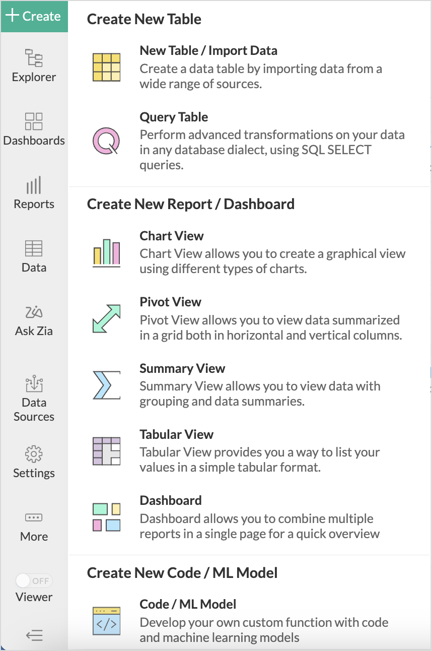
(or)Click Reports from the side navigation panel and click Create New Reports and choose Chart View from the list.
- Choose the base table above which the reports should be created.
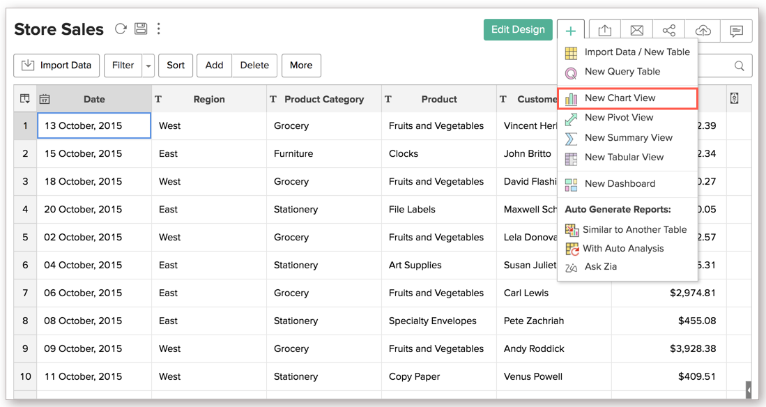
- From the Table interface
- Open the table over which the report should be created.
- Click the more icon and choose New Chart view from the list.
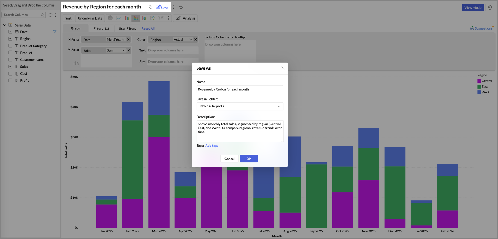
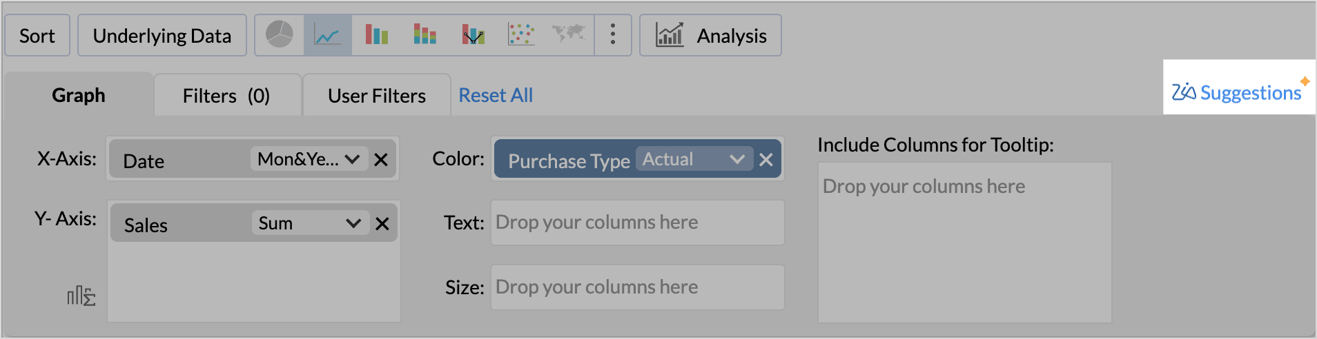
- On the left is the Column List pane, and on the right is the Chart Designer area.

- Drag-and- drop the required columns into the respective shelves
- X-Axis: Column dropped in this shelf appears horizontally across the X-axis.
- Y-Axis: Column dropped in this shelf appears vertically across the Y-axis. You can drop multiple columns in this shelf to create charts with multiple Y-axes.
- Color: When a column is dropped in this shelf, the chart will be further categorized showing each data point in different colors (different data series) in the chart.
- Text: Includes the corresponding value of the dropped column as a data label in the chart, according to the function applied on the column.
- Include columns for Tooltip: Includes the corresponding value of the dropped columns in the chart tool-tip, according to the function applied on the column.
- At the top, click Save. The Save As dialog box will appear.
- Enter a suitable Name for the report.
- Select the Folder where the report should be stored from the Save in Folder drop-down.
- Add a description (optional) of the report in the Description field.
- Optionally, add relevant Tags to make the report easier to search and organize.
- Click OK to save the report.


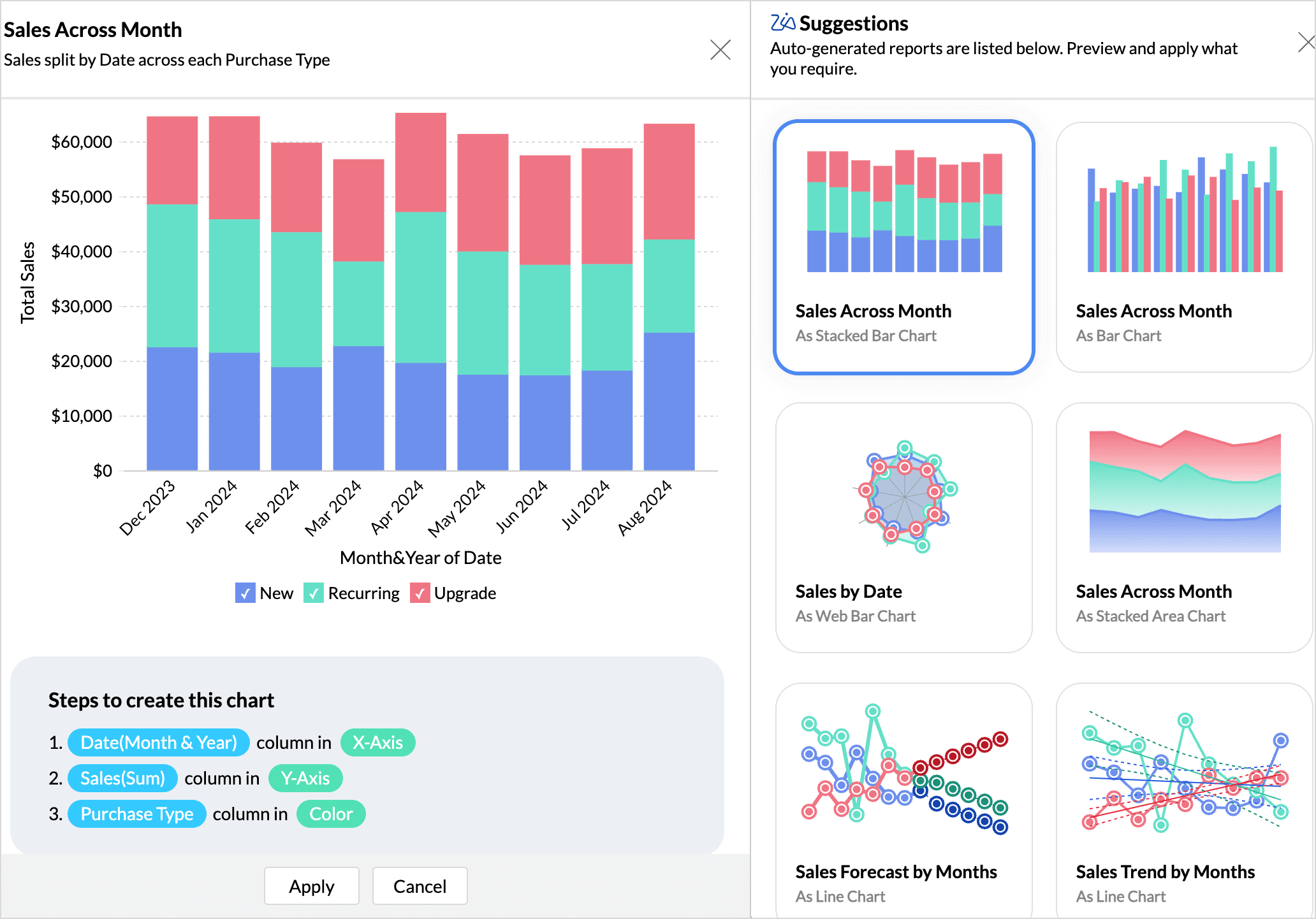
Zia Suggestions
Choosing the appropriate chart type can be challenging. With Zia's suggestions, you can find the right visualizations that are best suited for the data.
These suggestions will be available once the columns are dropped on the designer shelf.
- Click Zia Suggestions at the top left corner above the chart designer.
- Zia Suggestions will list all the suitable chart types based on the fields (dimensions and measures) dropped in the designer shelf.
- You can preview the charts and choose the most preferred one. Refer to choose the right visualization article to learn more. The Preview page will also list the steps to create the chosen chart type.
- Click Apply to use the report for analysis.


Undo and Redo
The Undo option helps reverse a single or multiple action in the order of execution. The Redo option helps repeat a recent action that was undone. These options can be found on the upper-left corner of the chart editor.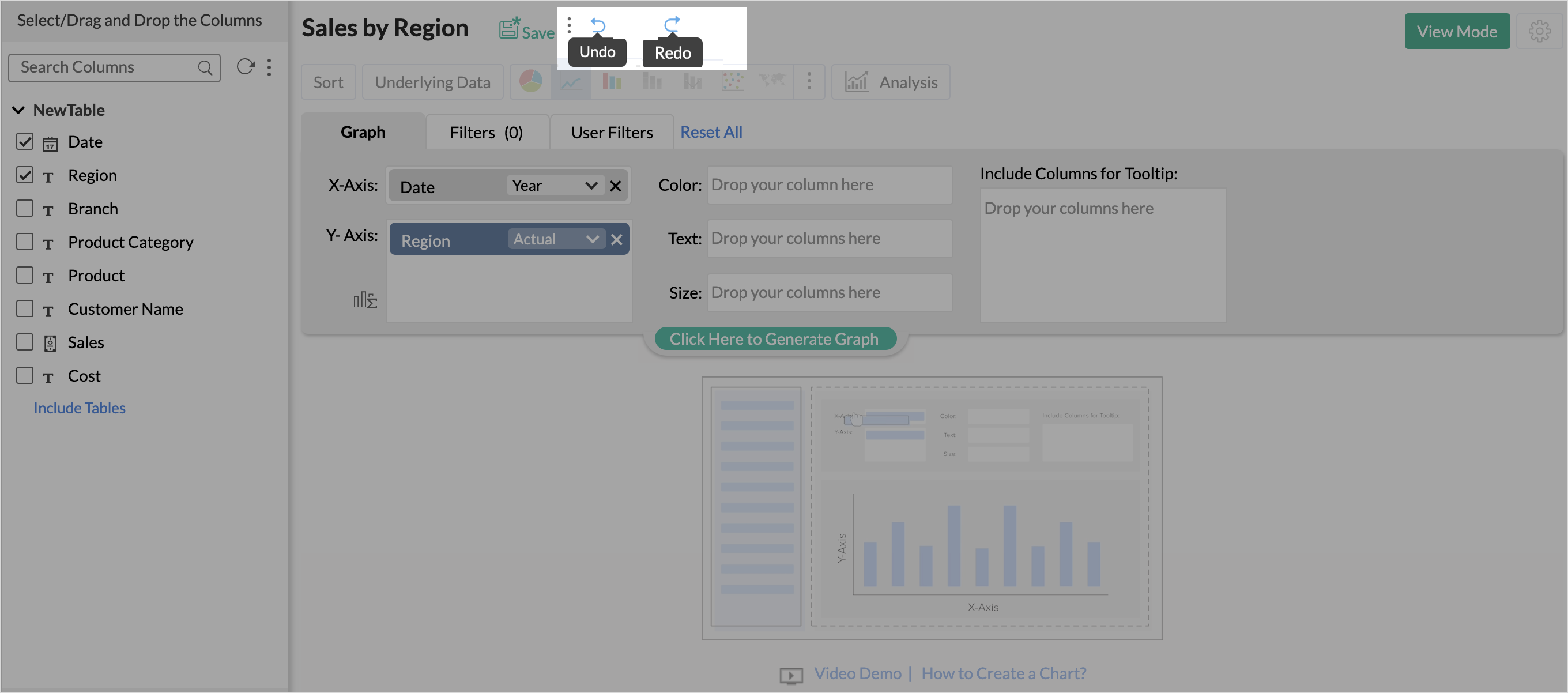
Applying Functions on Columns
Zoho Analytics allows you to apply aggregate/categorical functions like Sum, Count, Average, Min, Max, etc., on the data columns to a group and summarize data in charts. When you apply a function on a column, a single value will be returned which is derived based on the values in the column. The default function for a Numeric (including Currency) data type is Sum and for a Date data type is Year. If the data type of the column is a string (Categorical/Dimension column) and not numeric, then the default function applied is Actual Values.
To change the default function applied, after dropping the column, select the required function (aggregate/categorical) from the drop-down list present in the column. The drop-down list displays all the applicable functions based on the data type of the column, as shown in the screenshots below.
String Data Type

Numeric Data Type

Date Data Type

For instance, if you want to plot Average Sales for each Month across each Region, select Averagefunction from the drop-down list for Sales(Y Axis) column, Month & Yearfunction for Date(X Axis) column and select Actual Values function for Region(Color column) and then click on the button 'Click here to Generate Graph'.

The following tables list all the functions along with the description of their functionality.
Numeric and Currency Data Types:
| Function | Description |
| Sum | Returns the sum of all the values in the column. The summation will be done at each category/group level shown in the report. |
| Maximum [Max] | Returns the maximum value in the column. |
| Minimum [Min] | Returns the minimum value in the column. |
| Average [Avg] | Returns the average of all the values in the column. |
| Standard deviation | Returns standard deviation derived based on all values in the column. |
| Median | Returns the middle value of the column. |
| Mode | Returns the value that occurs most often in the column. |
| Percentile | Returns the percentile of the column. by default, the 50th percentile will be returned. You can change this as needed. e.g., the 90th percentile of a column is a number which has 90% of the column values below it. |
| Variance | Returns the variance of the column. |
| Count | Returns the count of the number of values in the column. |
| Distinct Count | Returns the count of the number of distinct values in the column. |
| Measure | Treats the values in the column as a measurable numeric value. Returns each distinct value present as a numeric value to be plotted in the report. |
| Dimension | Treats the values in the column as a textual (categorical/dimensional) value. Returns each distinct value present as a text value to be plotted in the report. |
| Range | Groups the entire range of numeric values present in the column into multiple ranges.. e.g., if your data range is between 0 to 1000 then it will be grouped as 0 to 100, 101 to 250 ... 901-1000. You can also specify the custom range size to group the data using the Add New Range link. i.e.,if you set the range size as 50, then it will be grouped as 0 to 50, 51 to 100 .... |
Date Data Type - Actual Value Functions:
| Function | Description |
| Year | Returns all distinct year values present in the column. E.g.,2003, 2010 |
| Quarter & Year | Returns all distinct quarter & year values present in the column. E.g., Q1 2010 |
| Month & Year | Returns all distinct month & year values present in the column. E.g., March 2010 |
| Week & Year | Returns all distinct week of the year values present in the column. E.g., W1 2010 |
| Full Date | Returns all distinct dates present in the column. E.g., 1/1/2011 |
| Date & Time | Returns all distinct date and time pairs present in the column. E.g. 01/12/2010 00:10:07 hrs |
Date Data Type - Seasonal Value Functions:
| Function | Description |
| Quarter | Helps identifying seasonal trends based on quarters present across all years in the column. E.g., Q1, Q2. |
| Month | Helps identifying seasonal trends based on months across all years. E.g., January, February. |
| Week | Helps identifying seasonal trends based on weeks across all years. E.g., Week 1, Week 2. |
| Week Day | Helps to identify seasonal trends based on weekday across all years. E.g., Sunday, Monday. |
| Day of Month | Helps identifying seasonal trends based on day of month across all dates. E.g., 1 to 31. |
| Hour of Day | Helps identifying trends across hours in a day. E.g., 0 to 23hrs. |
Date Data Type - Aggregate Function:
| Function | Description |
| Count | Returns the number of date values in the column. |
| Distinct Count | Returns the number of distinct date values in the column. |
String(Categorical/Dimension) Data Type:
| Function | Description |
| Actual Values | All the distinct values in the column will be listed. |
| Count | Number of values in the column will be listed. |
| Distinct Count | Number of distinct values in the column will be listed. |
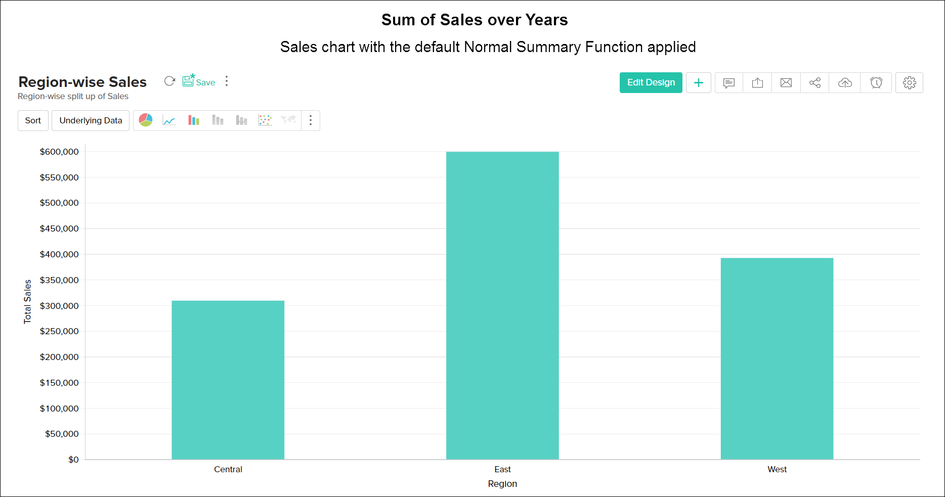
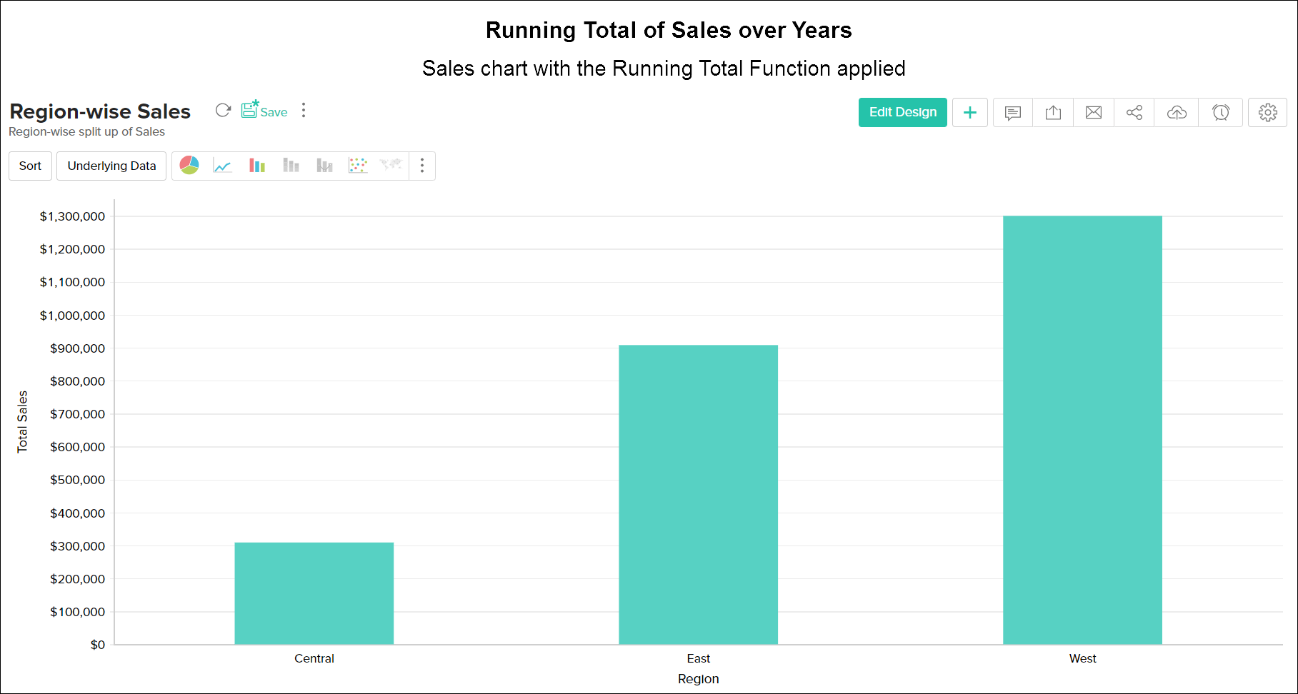
Advanced Summarizing Options
When creating a chart, Zoho Analytics provides advanced summary functions, apart from the basic functions such as Sum, Max, Min or Average. This allows you to summarize data values in that column based on the values in other columns. Using this you will be able to do some powerful calculations on a chart like running total of sales over years or calculate the difference in sales from the previous year etc.,

Dependent Fields
While creating a report, advanced functions like Running Total and the difference from function are applied over a base column like date and categories. Zoho Analytics allows you to move or reorder the dependent columns to other fields like Color, Text, Size, and Tooltip in the chart editor. However, the removal of a dependent column is not allowed. An alert message will be displayed while trying to remove a dependent column.

The below table tabulates the advanced functions available in Zoho Analytics
| Function | Description |
| Normal | Displays the calculated value of the aggregate function applied over the column. By default this option will be selected. |
| % of Total | Displays the percentage of the grand total of all the data in the chart series. |
| Running Total | Displays data in successive data points of the chart as a running total, based on the selected Base Field. |
| Difference From | Displays the data in each data point as the difference from the value in the previous data point, based on the selected Base Field. |
| % of Previous Value | Displays the data in each data point as a percentage of the value in the previous data point, based on the selected Base Field. |
| % of Difference From | Displays the data in each data point as a percentage of differences from the value in the previous data point, based on the selected Base Field. |
| 100% Group | Displays the percentage of the data point value in total of the group, based on the selected Base Field. This will be useful while creating 100% Stacked Bar and 100% Stacked Area Chart. When you create a chart for sales across years categorized by region, then using this function you could get the percentage of sales in each region as seen the example at the left. |
| Moving Average | Displays the calculated moving value of each data point based on the inputs you provide. The summary function selected will be taken as the base for calculation. You can perform sum, average, minimum and maximum calculation using this. This will be useful to visualize the trend of the your data. The example at the left illustrate the impression of your website vs. moving average of the impressions for the last 30 days. |
The following screenshot illustrates a sample chart with different advanced summary functions applied.
Choosing Chart Type
After creating a chart, you can easily change it to another chart type by simply clicking on a button with out changing the plotted data. For example, you have created a Bar chart, but then decide that you want the data to be displayed as a Pie chart. You can do this by changing the chart type using the toolbar or you can use Other Charts button on the toolbar.
The toolbar provides you with the options to choose between Pie, Bar, Stacked Bar, Line, Scatter and Table chart types at the top level. If you do not find the chart type that you are looking for, then click on Other Charts button in the toolbar and select the chart type that you want to apply from the Chart Options dialog box that appears. You can view a brief description of each chart type the bottom of the dialog box by clicking on the specific chart type. Notice that chart types that are not applicable/unsupported for the combination of columns that you are using to create the chart will appear disabled.
After selecting the required chart type in the dialog box, click OK.

The below table describes the various Chart types supported by Zoho Analytics. For a detail understanding of the chart types and the combination of columns used to create them, refer to this help documentation.
| Chart Type | Description |
| Pie | Pie chart is a circular chart divided in to slices. It plots the contribution of each value to the overall total expressed in percentage. |
| Ring | Ring chart plots the data in a ring. It displays the contribution of each value to the overall total expressed in percentage. |
| Funnel | Funnel chart plots series of data in a funnel shape. Useful to plot values in a process/stage oriented data set. |
| Bar | Bar (Column) chart plots the data as sets of vertical bars. Displays values as individual bars whose height is determined by the value plotted and grouped by each category |
| Stacked | Stacked bar chart plots the contribution of each value to the total across categories. |
| Scattered | Scattered chart plots values as a set of points. |
| Line | Line chart displays data as a series of points connected by a line. |
| Line with Points | It is a Line chart with markers displayed at each data point. |
| Step | Step chart is similar to the line chart where data points are connected by steps (up or down) instead of straight lines. |
| Smooth Line | Smooth Line chart connects the data points with a smooth curve. |
| Smooth Line with Points | This is a Smooth Line Chart with markers displaying the data point. |
| Combo Bar | Combination chart compares value across categories. Combo Bar is a combination of bar and line chart. |
| Combo Stacked | Combo Stacked is a combination of stacked bar and line chart. |
| Smooth Line Bar Combo | Smooth line chart can also be applied in Combination charts using the Use Smooth Line check box. Combo Bar and Smooth Line is a combination of bar and smooth line chart. |
| Smooth Line Stacked Combo | Combo Stacked and Smooth Line is a combination of stacked bar and smooth line chart. |
| Area | Area charts is similar to a line chart, but with all the area below the line filled with a color. |
| Area with Points | It is an Area chart with markers displayed at each data value point plotted. |
| Smooth Line Area | It is an Area chart with a smoorth line. |
| Smooth Line Area with Points | It is an smooth line Area chart with markers displayed at each data value point plotted. |
| Stacked Area | Stacked Area chart is an Area chart, where the contribution of each data series is stacked over the previous one |
| Stacked Area with Points | It is a Stacked Area chart with markers displayed at each data point. |
| Smooth Line Stacked Area | It is a Stacked Area chart with Smooth Line. |
| Smooth Line Stacked Area | It is a Smooth Line Stacked Area chart with markers displayed at each data point. |
| Bubble | Highlights the data based on the magnitude in the form of bubbles. |
| Packed Bubble | Packed Bubble chart type is used to display data in a cluster of circles or bubbles disregarding the axes |
| Filled Web | Filled Web is a two-dimensional chart of three or more quantitative variables represented on axes starting from the same point. |
| Web | Web Chart displayed without filling color shade. |
| Map - Scatter | Plots the locations in the map using a scatter chart. |
| Map - Pie | Plots the values in the map using a pie chart. |
| Map - Bubble | Plots the values in the map using a bubble chart. |
| Map - Bubble Pie | Plots the values in the map using both a pie and a bubble chart. |
| Map - Filled | Fills the map area with colors depending on the data |
Until recently Zoho Analytics had both 2D as well as 3D charts. But, having analyzed the usefulness of 3D charts deeper especially from the user experience point of view, we have decided to completely stop the support for 3D charts. Click here to learn more.