What is a workload allocation report?
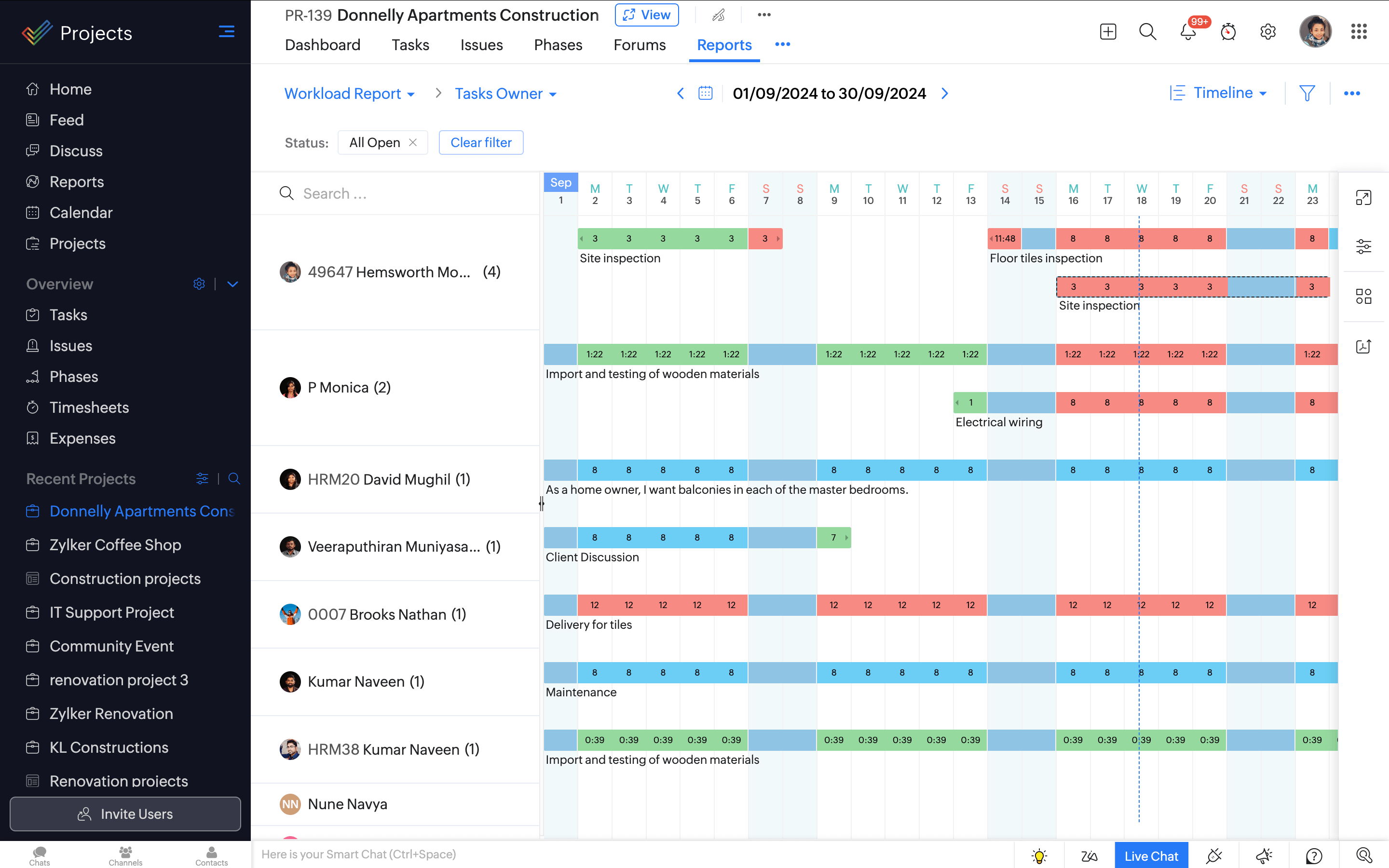
The workload allocation report is not your typical graph, it gives you a view of how balanced your team's work hours and free hours are. Here's what you will spot in this chart:
-
Color Code
Work is within the available business hours. Depending on whether the bar for a selected date range is full or not, the person may have time to spare.
The person's work hours go beyond the available business hours.
-
Task bars
For each task, a horizontal task bar stretches across the duration of the task. You can slide the bars across dates to reschedule work or drag and drop them to reassign work to another user right from the chart.
-
Views
Bar view- For each employee, horizontal bars represent how optimally occupied their schedule is with respect to the available business hours.
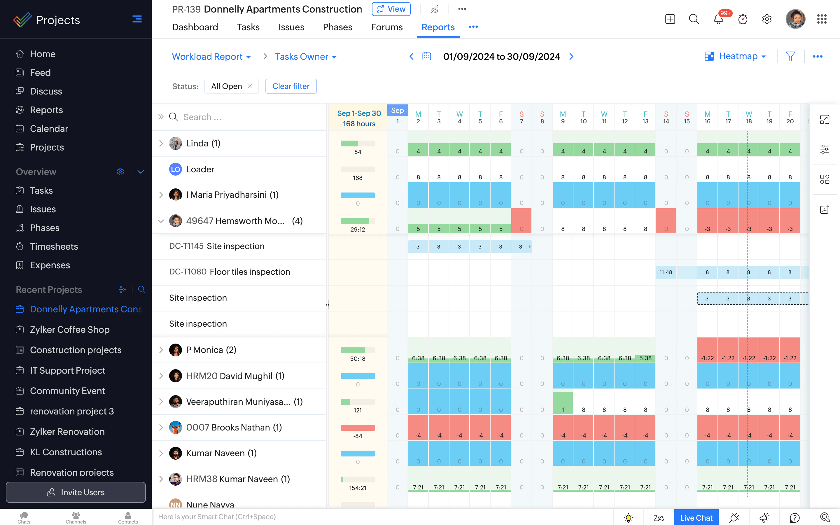
Heatmap view- Heatmaps help visualize disconnected schedules better by showing how occupied a person is with respect to available business hours.
Know availability in one quick glance
With the workload report, get to know how each of your team member's time is being utilized without having to calculate the hours manually. The style of the chart makes sure you gauge information quickly and act on it right away.

Best fit allocation
Achieve maximum results from your team by allocating work based on resources and availability. When you have a task to add, this chart helps you decide who is free enough to take it up.

View schedule for the selected period
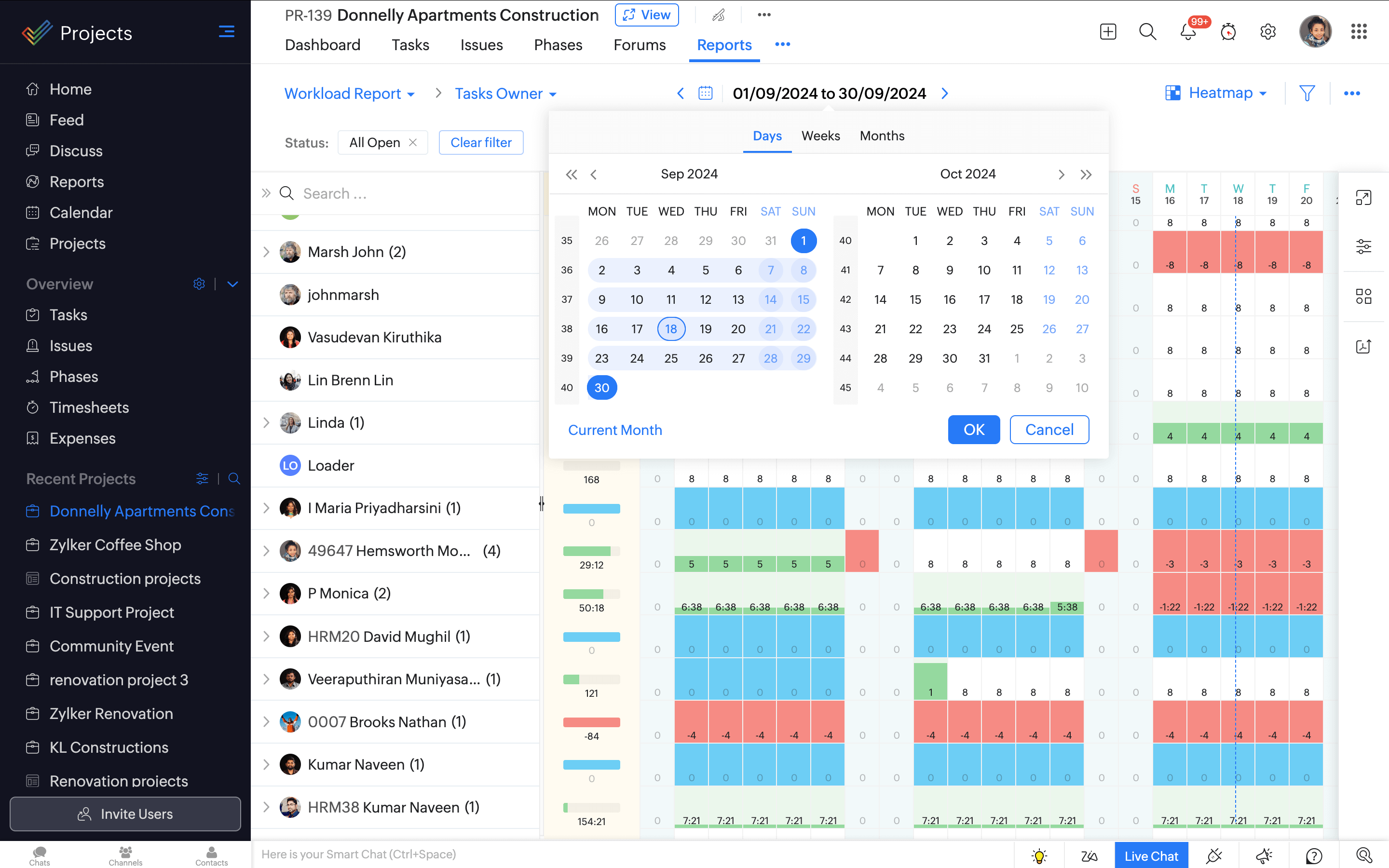
If you need to know your team's schedule over a specific time period, we've got you covered. View the task allocation schedule daily, weekly or monthly, or select a custom date range with the help of the calendar.

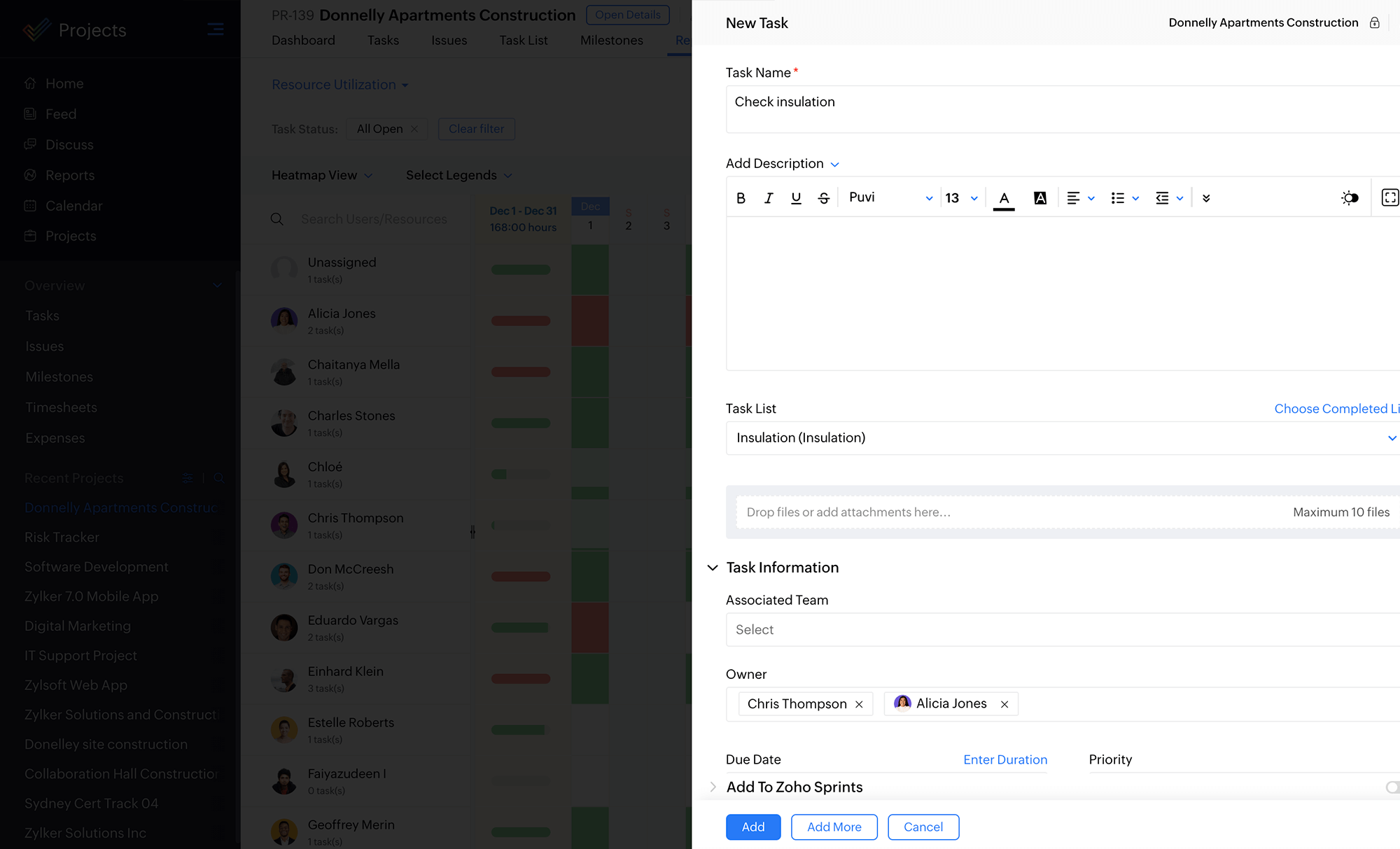
Add and manage tasks
Don't stop with a glance, act on your observations too! Add new tasks in one click, drag and drop tasks bars to reassign them to a different member or slide the task bar to rechedule or adjust the work hours.

