Design engaging forms with style and ease
At Zoho Forms, we believe form designing should be a breeze, regardless of whether you have coding skills. Our powerful form design tools offer a wide range of customization options empowering you to create visually appealing forms that reflect your brand's personality. Let's take a look at some of the exciting features Zoho Forms has to offer.
Themes
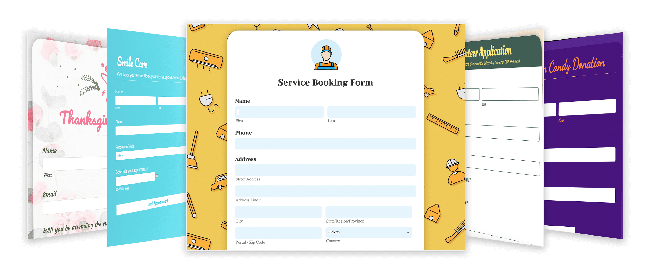
At Zoho Forms, we have a form design for your every mood and need. Choose from a variety of pre-designed themes suited to different goals and industries. You can access themes you/your organization have created and saved under My Themes/Org Themes.
Alternatively, select from a library of background images, or upload your own, to create a unique look and feel for your forms. Get started with online form design templates and make your own form today.
Colorscape
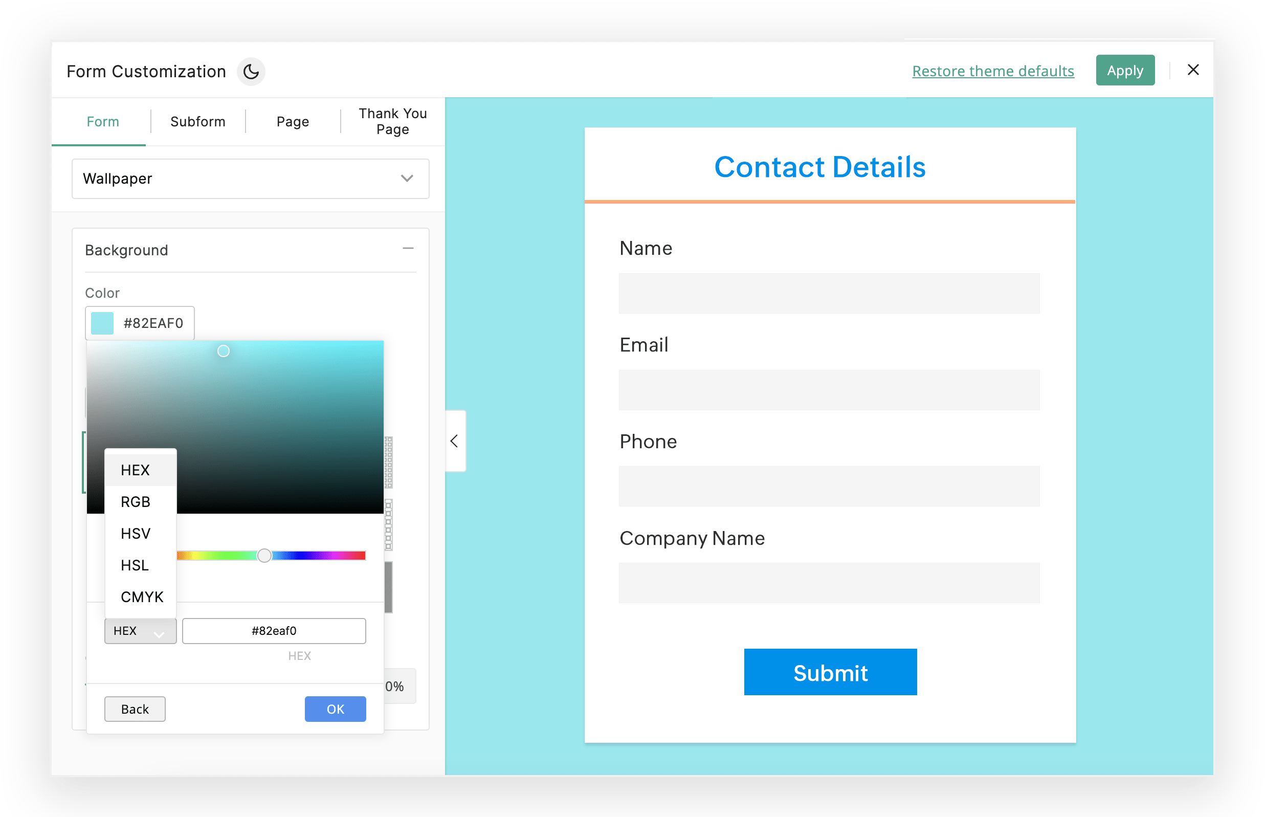
Colors play a crucial role in branding, and our form design makes it easy to find the perfect color palette. Choose from a wide range of colors, or input your custom HEX or RGB values, to create a cohesive and consistent look across your forms.
Logo
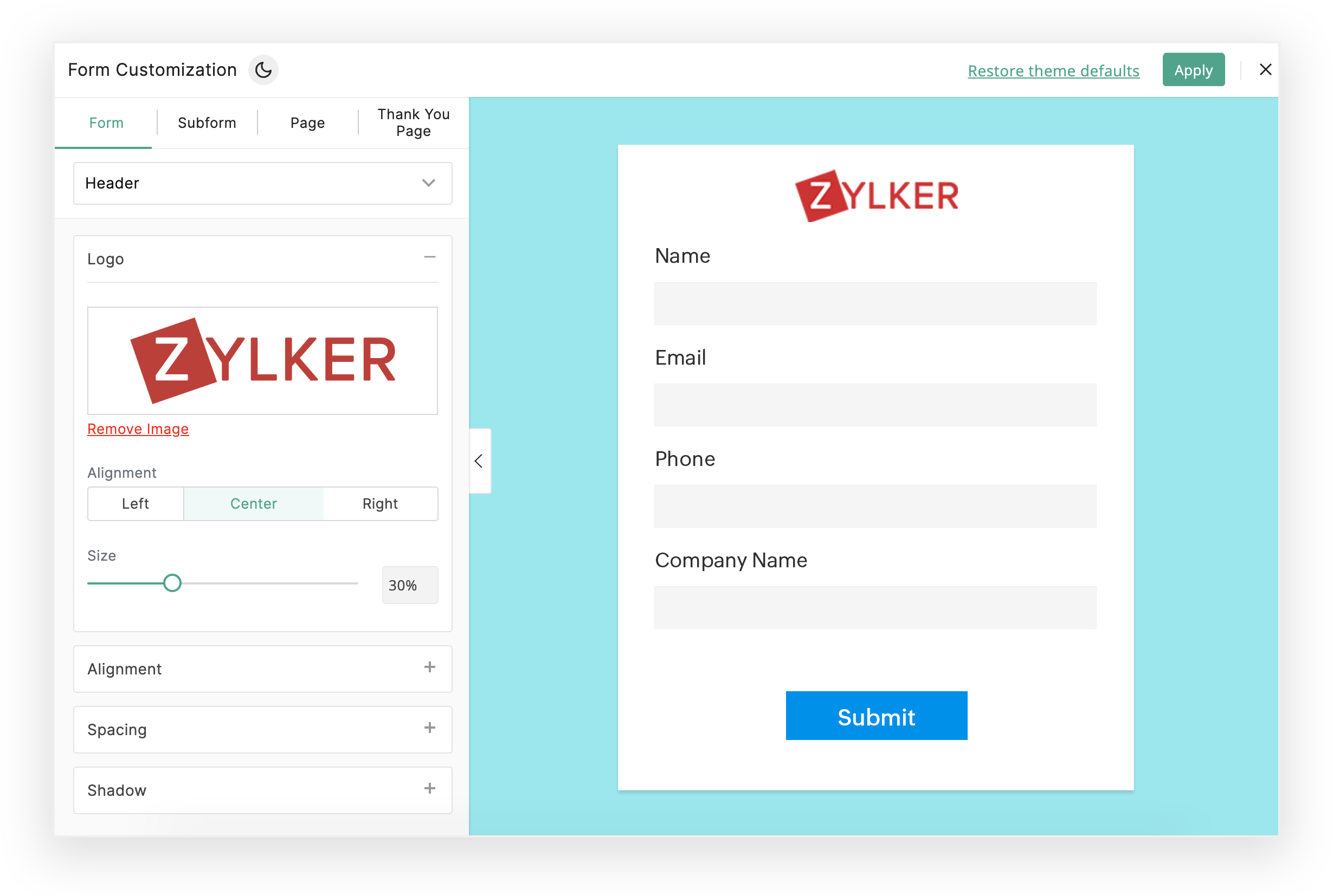
By incorporating a logo into your form design, you can promote brand recognition and establish a consistent brand presence across different touchpoints. With Zoho Forms, users can easily add their company logo to their forms for a familiar and professional appearance. This feature enhances the visual appeal of your forms, while strengthening the connection between your company and the forms it sends to its customers.
Form fields
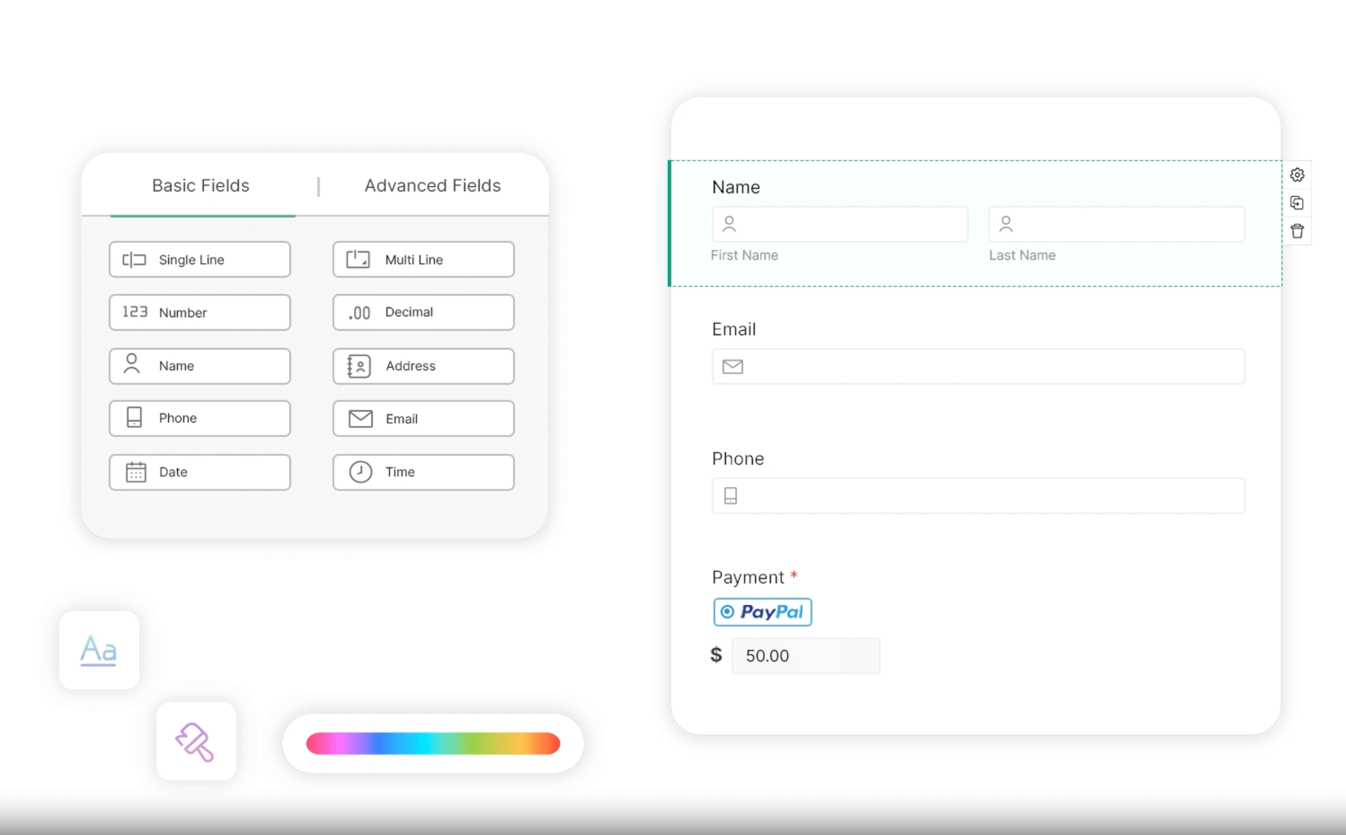
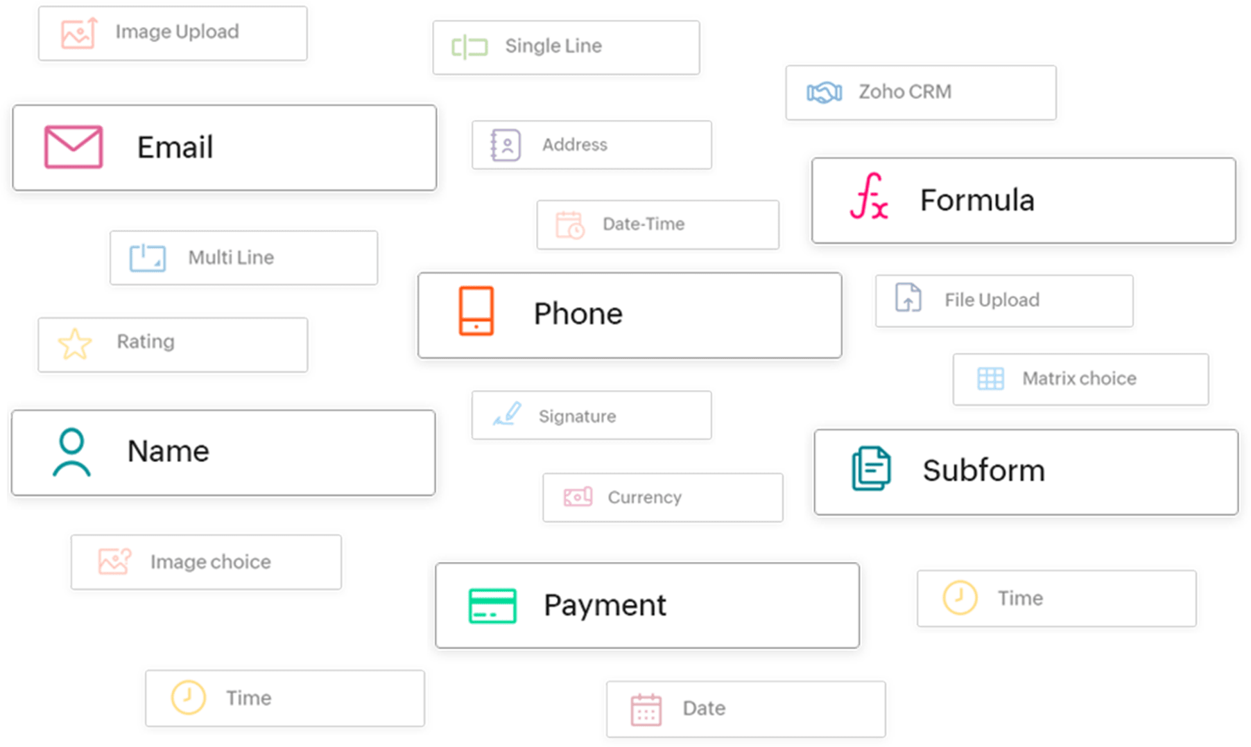
Zoho Forms' designer offers a vast array of drag and-drop form fields. From basic fields, like Name, Phone Number, and Email Address, to advanced options, like Formula, Subform, and Payment fields, our form fields are designed to cater to your unique needs.
Form languages
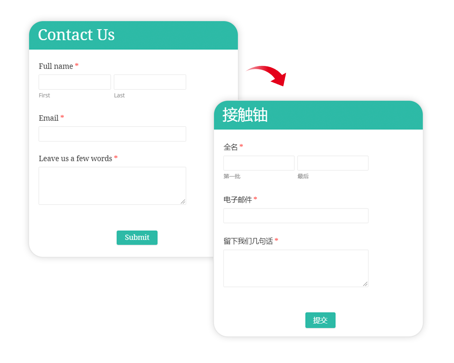
With our web forms designer, you can design forms in more than 70 languages. Select a language to translate your form fields, buttons, messages, and labels. Zoho Forms makes it easy to suit the language preferences of your users, helping you improve their experience and increase engagement.
Fonts
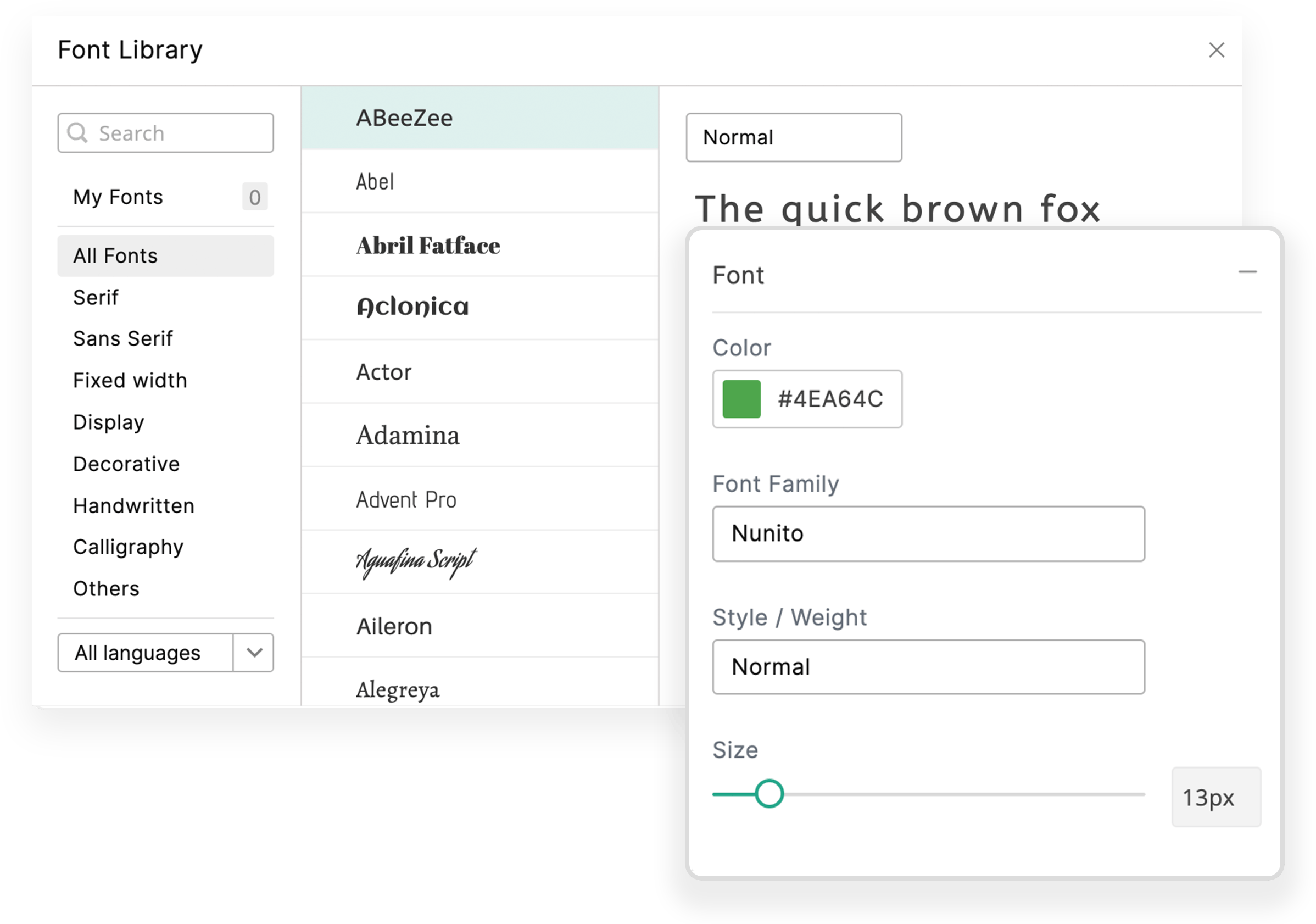
Typography matters! Zoho Forms offers a wide selection of fonts to choose from, so you can create forms that are visually appealing and easy to read. Customize the font style, size, and color to match your brand's guidelines.
Responsive designs
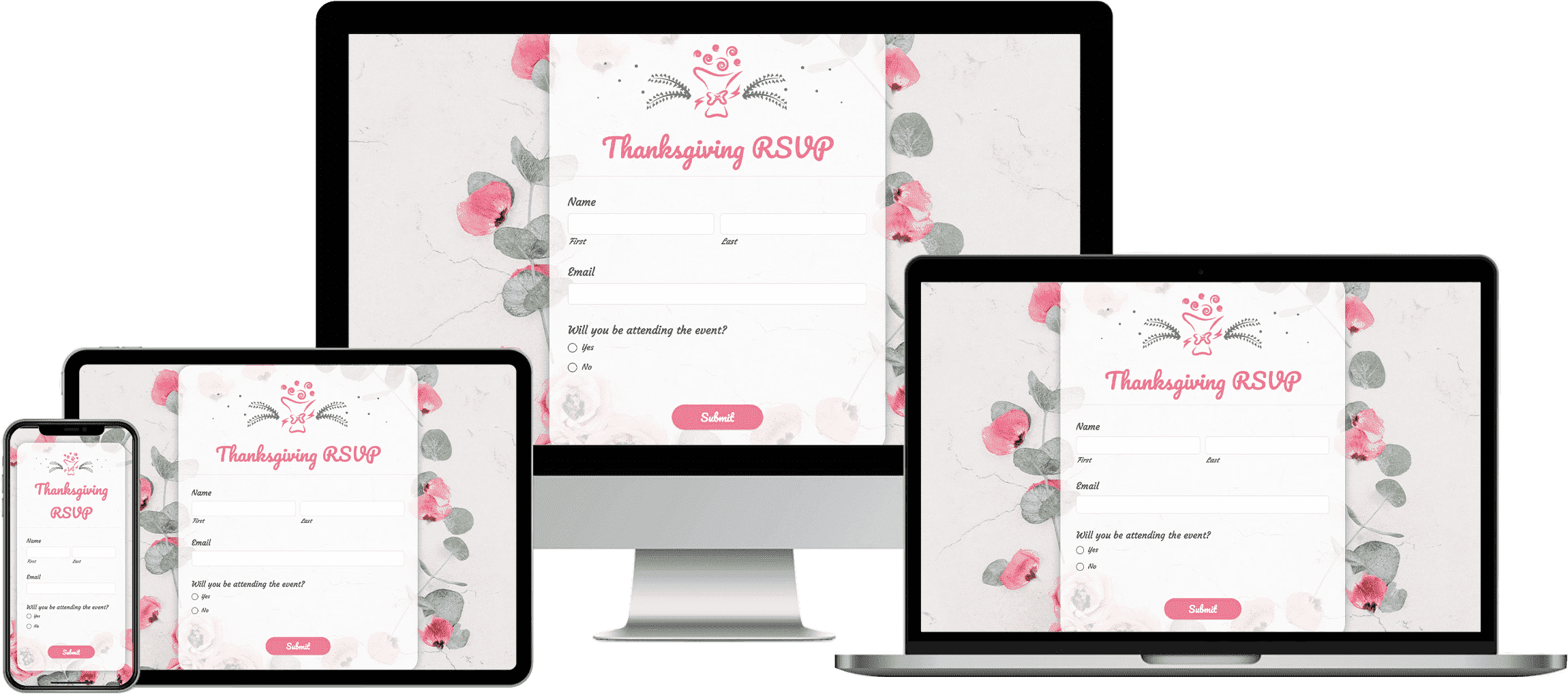
Your custom-designed form can be accessed on any device, anywhere on our online form maker for free. All our form designs are responsive and provide great interactive experiences across a wide range of devices, across desktop to mobile devices.
Form design best practices (Tips to boost conversions and UX)
Clear form titles: Clearly label your forms with descriptive titles that convey the purpose of the form. For example, instead of a generic "Contact form," use "Contact us for support".
Use consistent layout: Maintain consistency in the layout of your form fields. Place labels above, to the left of input fields for easy readability and completion flow.
Minimize required fields: Reduce friction by only asking for essential information. Minimizing required fields streamlines the form completion process and reduces user abandonment.
Smart placeholder text: Utilize placeholder text effectively to provide hints or examples without cluttering the form. Placeholder text should disappear once users start typing.
Form pre-fill: Pre-fill form fields with default values where appropriate to expedite the completion process.
Accessible design: Design forms with accessibility in mind by using clear labels, providing alternative text for visual elements, and ensuring compatibility with screen readers and keyboard navigation.
User testing: Regularly conduct usability testing with real users to identify pain points and areas for improvement. Incorporate feedback to continuously refine the form design and enhance user satisfaction.

