



Editor Interface

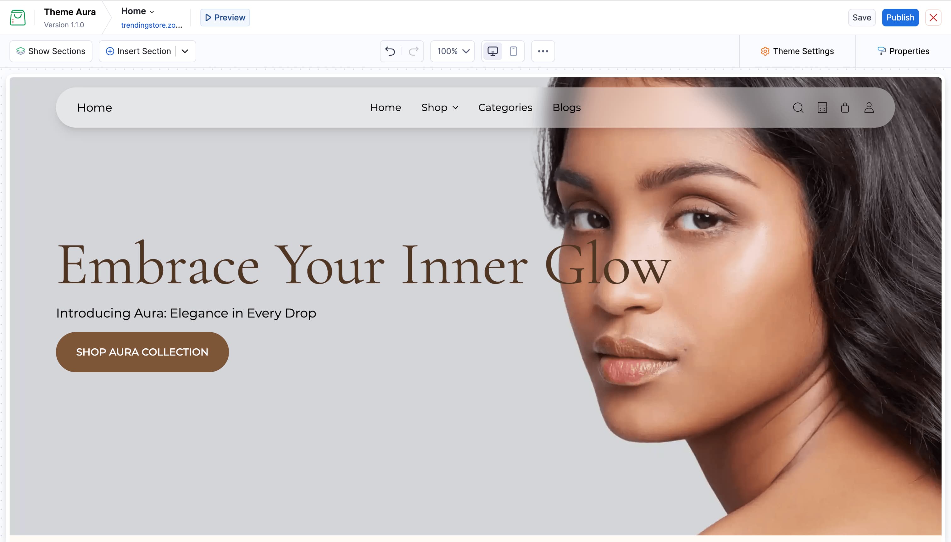
When you open the Commerce Theme Editor, the screen is divided into four main areas. This page walks through each one so you know exactly where to look.
Top Bar
The top bar runs across the top of the theme editor.
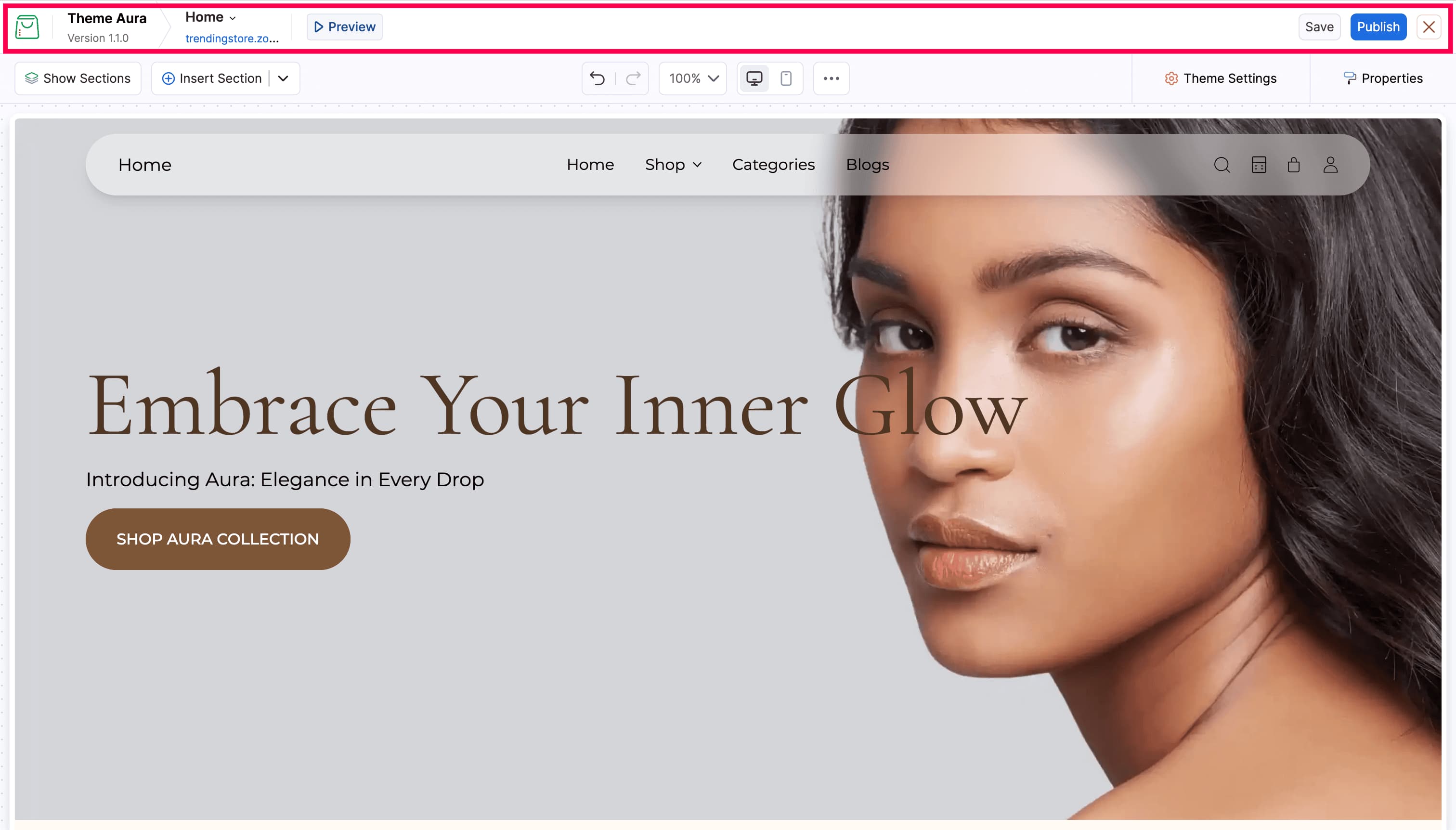
| Options | Description |
|---|---|
| Theme name & version | Displays which theme is currently being edited |
| Page selector | Dropdown to switch between pages (Home, Product, Collection, etc.) |
| Storefront URL | Clickable link that opens your live store in a new tab |
| Preview | Enters full-screen preview mode (Refer Preview & Publish) |
| Save | Saves changes without publishing to the live store |
| Publish | Saves and immediately applies changes to the live store |
| Exit (×) | Leaves the theme editor and returns to the Online Store module. |
Toolbar
The toolbar runs horizontally below the top bar.
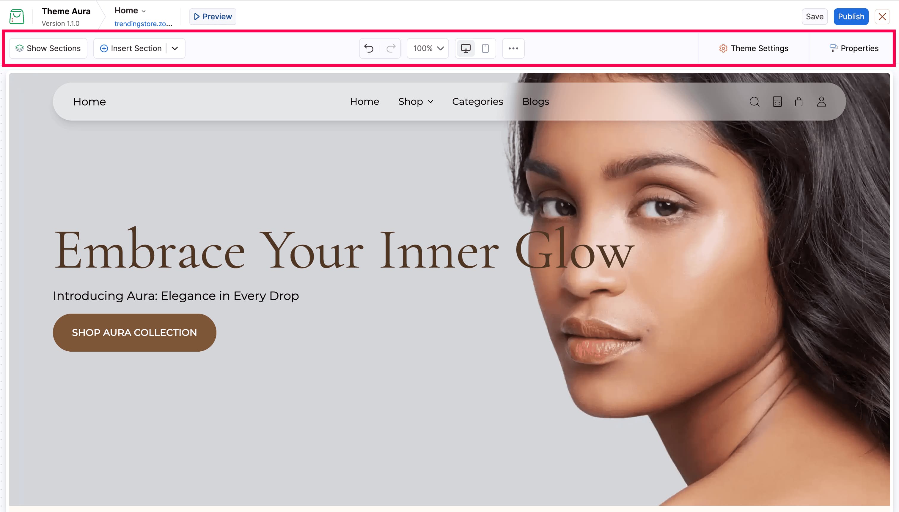
| Options | Description |
|---|---|
| Show Sections | Opens the layer panel listing all sections and blocks on the page |
| Insert Section | Opens the section picker to add a new section |
| Undo / Redo | Step back or forward through changes (keyboard: Cmd/Ctrl+Z / Cmd/Ctrl+Shift+Z). Note: adding, editing, or deleting a custom section are immediate publish actions — they are not tracked by undo/redo and cannot be saved as draft |
| Zoom | Dropdown to zoom the canvas in or out (25% – 250%) |
| Desktop icon | Switches canvas to full-width desktop view |
| Mobile icon | Switches canvas to a 430 px mobile view |
| More Options | Opens additional option, Revert to Last Saved to discard unsaved changes and restore the last saved state |
| Theme Settings | Opens global theme style options on the right |
| Properties | Opens settings panel for the selected element |
Canvas
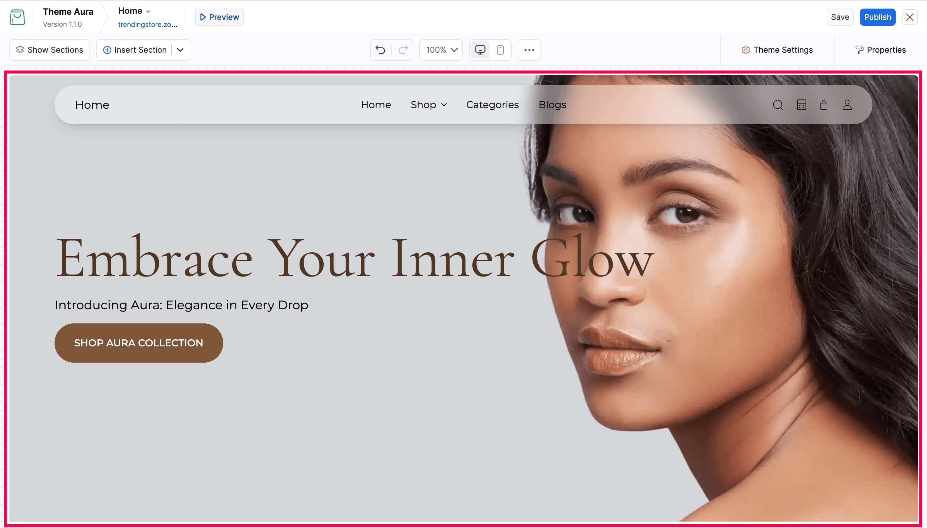
The canvas displays your online store in a live preview. Everything you see is exactly how it will look in the browser.
Interacting with elements
- Hover over any section or block to see a dashed blue highlight and a name label in the top-left corner.
- Click any element to select it. A solid blue outline appears and the Properties panel opens on the right.
- When an element is selected, a small action toolbar appears above it with quick actions such as copy, hide, reorder, and delete.
| Icon | Action |
|---|---|
| Copy | Duplicates the selected section or block |
| Eye | Toggles visibility (hides or shows the element) |
| Arrow up / down | Moves the element up or down in order |
| Delete (red) | Removes the element permanently |

Sections List Panel
The Sections List is a layer panel that shows every section and block on the current page in order.
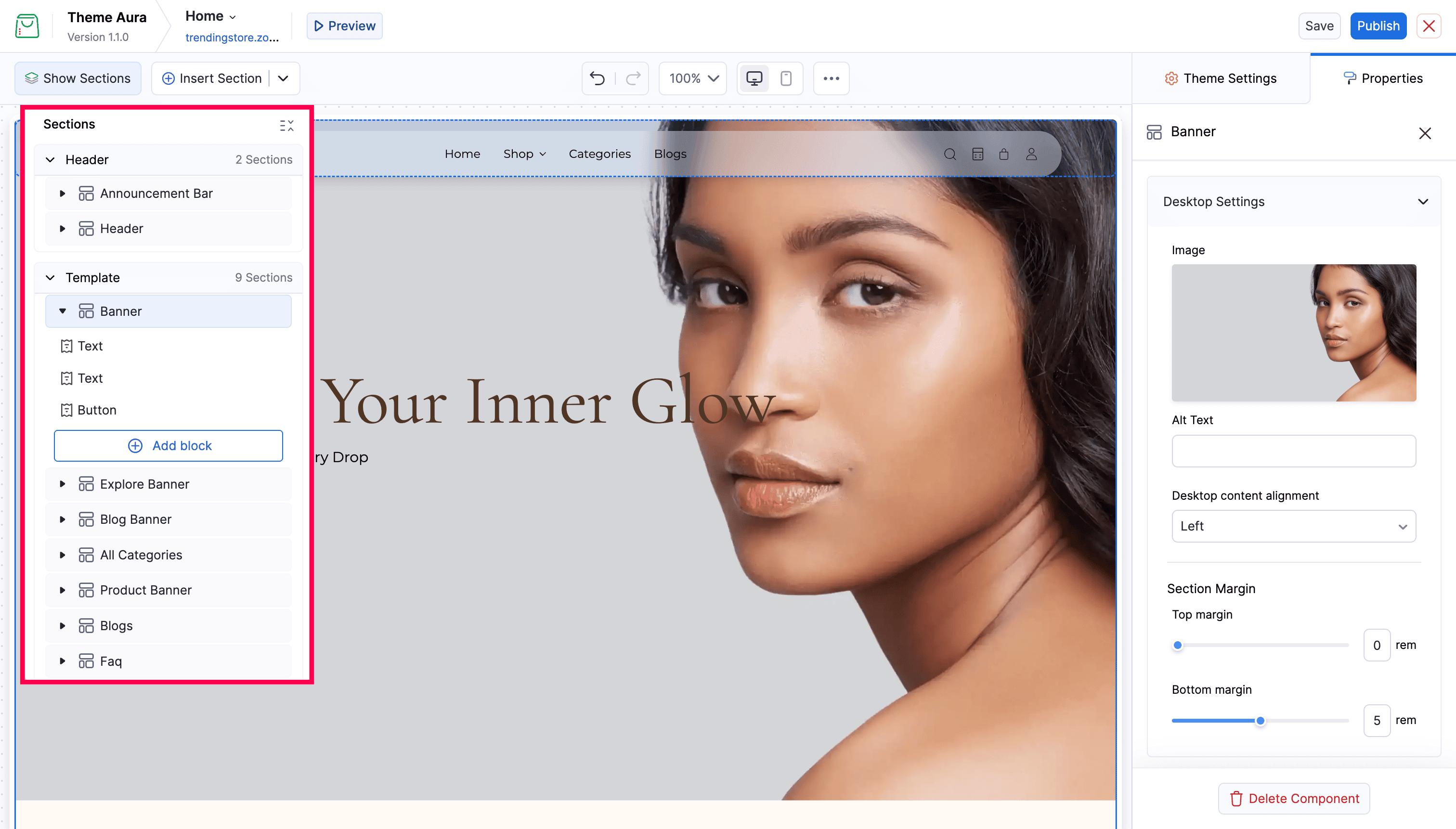
- Sections are grouped into Header, Template (main page content), and Footer.
- Click any item to jump to it on the canvas and open its settings.
- Expand a section row (click the arrow) to see its blocks listed underneath.
- Click the More Options icon on any row to access Edit Name, Copy, Toggle visibility, and Delete.
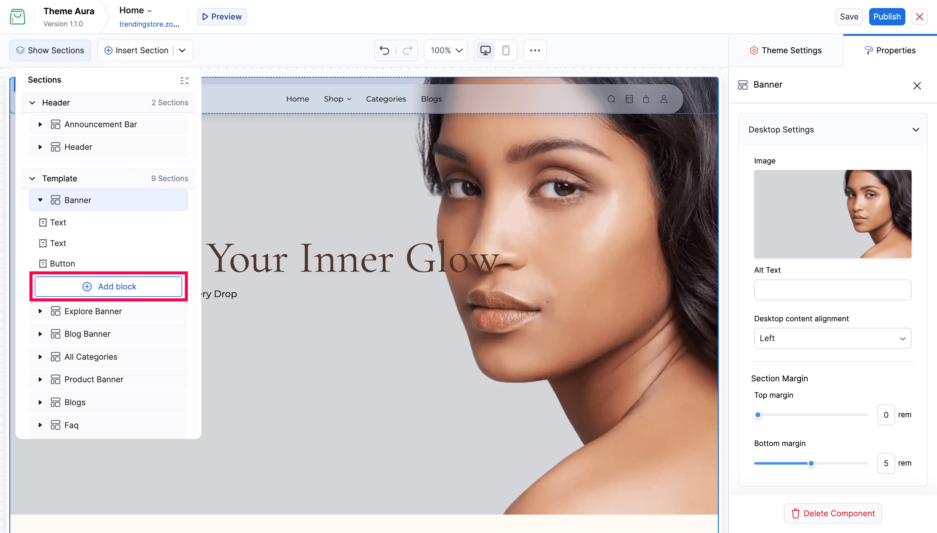
- Click Add block at the bottom of an expanded section to add a new block to it.
Properties Panel
The Properties panel opens on the right when you select a section or block. It shows all editable settings for that element.
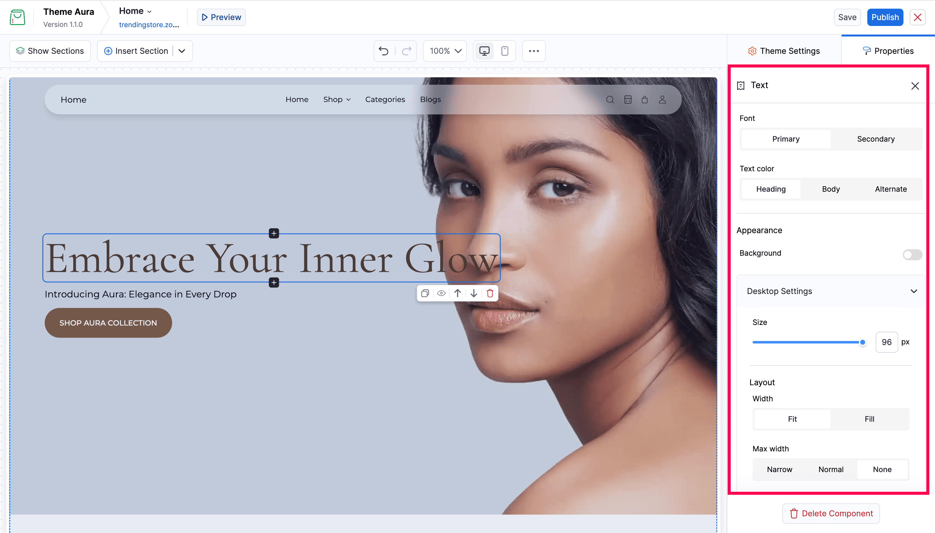
- The panel header shows the element name (e.g. “Explore Banner”).
- Settings are grouped by category. Scroll down to see all options.
- Changes update the canvas preview immediately.
- Delete Component at the bottom of the panel removes the selected element.
Theme Settings Panel
Click Theme Settings in the toolbar to open the global style panel. It replaces the Properties panel on the right.
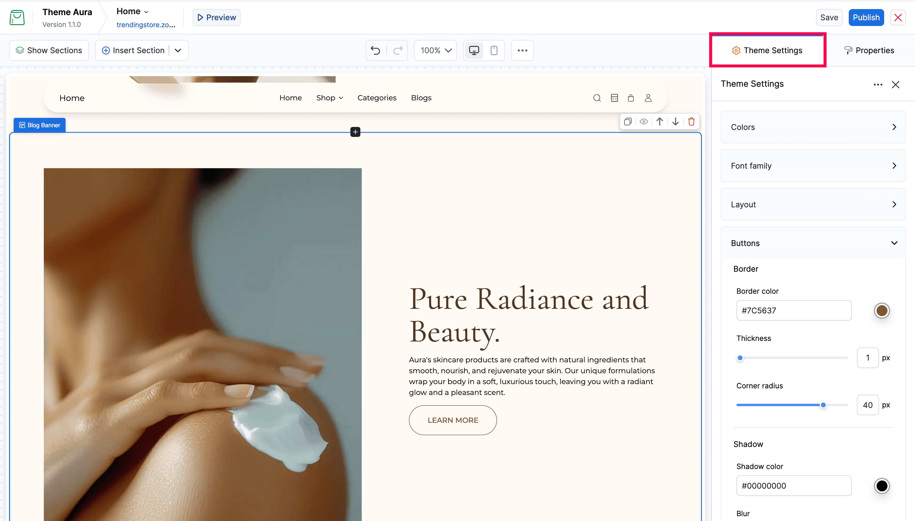
- Contains top-level groups: Colors, Font family, Layout, Buttons, Message bar, Blog Cards, Product cards, and more.
- Expand any group to see and edit its values.
- Changes apply across the entire online store instantly in the canvas preview.