- HOME
- Website Building
- Web Forms
- Contact Us Forms and Pages
Contact Us Forms and Pages
- 10 Mins Read
- Posted on April 17, 2018
- Last Updated on October 8, 2024
- By Lauren
Here’s a fact worth chewing on for a moment: Contact forms have a conversion rate of around 1%—the lowest conversion rate of any type of web form. In other words, 99 out of every 100 people who land on a contact form don’t complete it.
It’s worth asking why that is.
After all, a contact form is one of the most important elements you can offer on your business website. It keeps visitors from experiencing the frustration of not being able to expediently reach out when they have a problem or a question. What’s more, your contact form is often the origin of your relationships not only with your prospects—a group your email signup is typically limited to—but with every visitor type your website has.
Think, for a moment, about the range of visitors who arrive on your site and what their intentions are. A media outlet that wants to run a story in the local paper for your business’s one-year anniversary? A future rockstar employee who has a question about applying for that open position? A partnership offer? A customer service inquiry from a frustrated new customer… who may become one of your most loyal customers after a good user experience on your contact form (and follow-up)?
That’s a lot of possibility riding on a single form… and it’s why it’s so important to design a contact form that converts better than that 1%.
Of course, you don’t have to have a dedicated contact page on your site. Some businesses use footer forms. (Your company’s contact information should already be readily available in your footer anyway.) But we’d recommend one, since most users will expect them and since they’re valuable for local SEO.
Zurb uses a site-wide footer form that’s also available on their dedicated contact page:
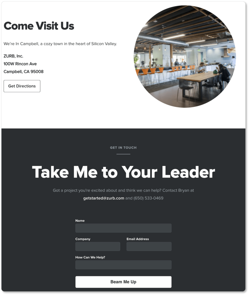
A design like this essentially turns each of your website’s pages into a “Contact Us page.” It acknowledges that visitors are bound to have questions on any page of your site… and it makes it expedient for them to contact you from whatever page they happen to be on.
Of course, it’s not enough that your site visitors see they can easily contact you; good UX on both the contact page and the form itself is essential. (Remember, we’ve got some depressing data we’re working against.) So below are our best practices for increasing conversions on your contact forms.
Disclaimer: While your contact form may have a wide range of uses—as we mentioned above—we’ll be focusing on it more as a lead generation tool, and less as a feature of your company’s support pages here.
Reflect your company personality
The headline on Zurb’s contact form is “Take Me to Your Leader,” a phrase that suggests Zurb’s design team does “otherworldly” work, and that their team runs—at least in part—on humor. Marble Media’s Contact page invites prospects to “Spill the Beans,” a phrase that evokes the divulging of a secret, and suggests Marble is a company to be trusted:
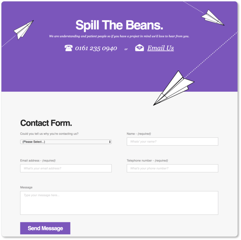
The copy in your contact form should give users a sense of your company’s personality. Users filling in the form are looking to discover more not only about your offerings, but also about your business and your brand. So let your headline and your Contact Us copy reflect your brand persona. (It may very well also set the tone for how users write to you.)
Naturally, this means your Contact form has to sound human—as though it’s speaking to the very visitors on the threshold of filling it out. The more your visitor feels as though they’re being spoken to, the more likely they are to “speak back”… and thus begins your relationship.
But beyond simply sounding human, your form should also reflect the light-hearted nature, the humor, the enthusiasm, the diligence, the fastidiousness, or the [insert your own adjective here] of your team. Pay attention to the way your customer service reps talk on the phone with your customers. Consider the language you use when you approach a prospective client who’s just walked through your door.
Remember, your Contact Us form is an invitation. And visitors will only respond to that invitation if it reads like precisely that. Here’s one of our favorites, from Best Made, whose Contact page is consolidated with their FAQ page. (Note: It’s never a bad idea to embed your contact form on your FAQ page or in your support pages):
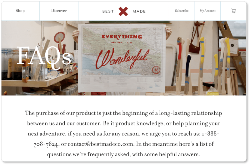
What Best Made does so well here is state a company value in their Contact copy: The company doesn’t believe that its relationship with a customer ends after the purchase of their product. What’s more, they’re emphatic in their invitation to reach out (“we urge you to reach us.”) There’s a sense of genuine eagerness that comes through in Best Made’s copy.
Explain why users should contact you
You’ll have noticed that Best Made offers a couple of reasons why prospects might contact them: “Be it product knowledge, or help planning your next adventure.” What we love about describing these possible queries is that most visitors to Best Made’s page aren’t likely to think that the outdoor lifestyle brand would be willing to solve that second pain point mentioned (help planning an adventure).
That phrase suggests that Best Made is as interested in the ways its products can help improve customers’ lifestyles as it is in how pleased its customers are with its products. If your business is similarly invested in your customers’ overall well-being (and you should be!), let them know you’re willing to answer questions or offer advice on matters that your visitors may not have considered.
What are some visitor problems or pain points you can solve? What are the kinds of questions you can help with? What is the range of reasons for which a user would contact you? Here’s another great example from TUNE’s Contact Us page:
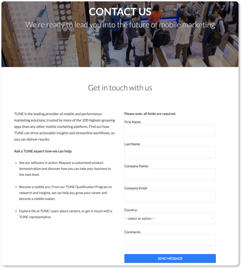
TUNE offers visitors examples of three reasons they might contact the company: to request a product demo, to learn more about their Qualification Program, and to learn about careers at TUNE. A visitor clicking into the contact page to ask the company a question might be learning for the first time here that TUNE even has a Qualification Program—let alone that they may be hiring. Suddenly, now, that visitor has two reasons to contact the company.
Your copy may be as simple as “Get in touch to set up a free consultation,” “to arrange a visit,” or “to discover how our service can grow your business.” If you offer your visitors a shortlist of reasons to contact you, you’re bound to hit on something they hadn’t considered and spark their curiosity… and that curiosity may lead to a contact.
Include various methods of contact
We know… this section is about contact forms. But it’s worth remembering that users will have different preferred methods of contact. Some will want to speak with a real human, no matter how long they have to wait on the phone to do so. Others will prefer to click into your company’s Facebook page and ask their questions there. So consider including these things near your contact form:
- phone number
- email address
- physical address
- embedded map of your location
- hours of operation
- social handles
- a live chat feature
The size of your business, your visitor demographics, and the number of inquiries you receive over the course of a day will collectively determine which of these things you include. Grover Web Design’s contact form is positioned alongside their phone number, email, and social handles:
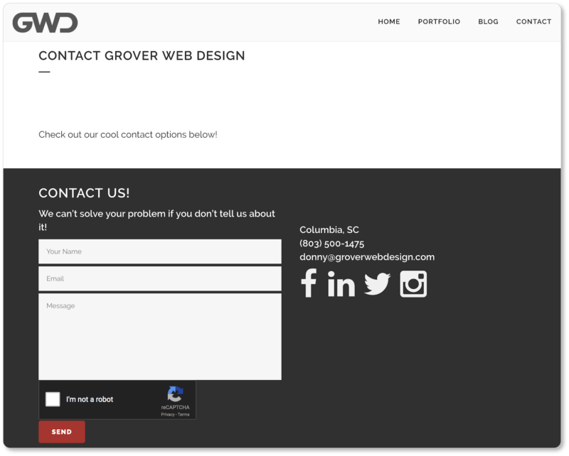
The point is not to lose out on conversions—or on maintaining happy customers—by offering your visitors a lack of options. More options might also mean spreading the labor out among your team. This, in turn, means faster response time for your customers.
Humanize your team
This is a valuable move, regardless of the size of your team. Of course, you’ll already be “humanizing” with your copy. But you might also increase your lead generation efforts by including a photograph of your team near your contact form.
The point is to show that on the other side of the form are real humans who are ready to be of service to your site visitors. There’s a welcoming element to this addition, which is valuable for generating leads. It’s also great for user confidence… and the more confident your visitors are, the more likely they are to contact you. Here’s what’s above the fold of Nutcher Milk’s contact page:

Avoid unnecessary fields
We covered this in our section on account creation forms, so we won’t linger on it here. The same logic applies: shorter forms = more conversions.
Remember, your prospect’s initial contact is only the beginning of your relationship. Prioritize the lead over a complete set of information at this point: What is the nature of your user’s inquiry, and what is the best way to get in touch with them to answer their question or resolve their problem? This is probably all the information you need for now.
If you run a business that requires you to get more information about prospective clients before reaching out to chat (so as not to waste your time on a call with a prospect who can’t afford your services, for example), you might try something along the lines of the creative studio Grain & Mortar’s contact pages:

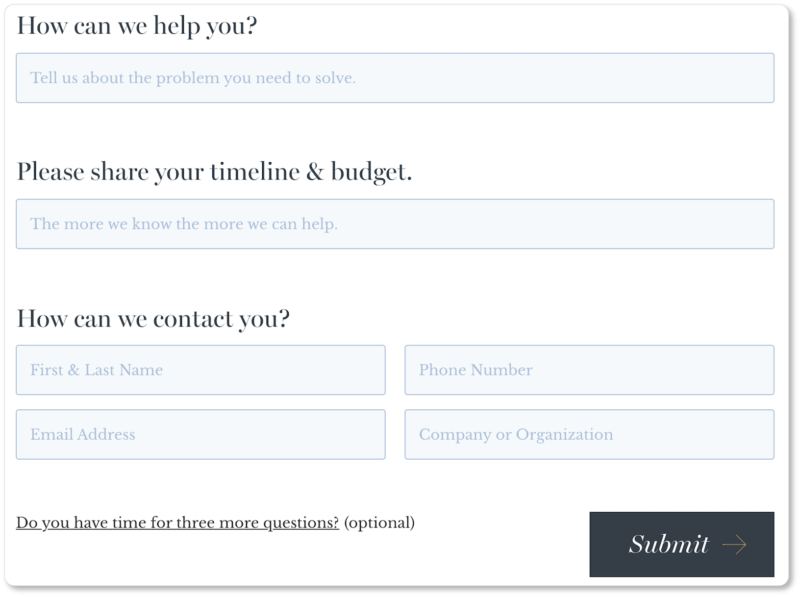
Knowing their prospects’ timeline and budget from the get-go helps Grain & Mortar weed out the prospects who simply can’t afford their services—or who need something too soon for the company to turn it around.
Be up-front about response times
This is an easy way to avoid needless frustration on your inquirers’ parts. Let them know whether or not anyone will be in the office to pick up the phone when they call, or to respond when they send a live chat, or how long it will take you to get back to their contact form inquiry.
Carved tells its contact form users that “We do our best to respond in 1 business day”:
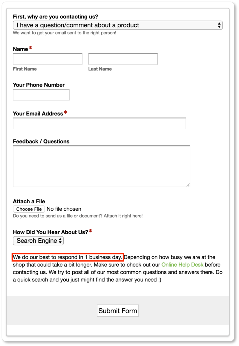
We recommend displaying the local time at your office so that prospects who have inquiries outside of your time zone don’t have to do the math before they call you.
The point is that, no matter what mode of contact your prospects choose, they should be given clear expectations about how long they’ll be waiting to hear back from you. Having this information boosts prospect confidence that a response is eventually on its way. It also lets the prospect decide how to proceed. If the wait time is tolerable, they can move on to other tasks, knowing the response is forthcoming. If they’re told the response may take a day, and they need the answer sooner than this, they may try going back into your support or FAQs to find the answer on their own.
Link to social media
This strategy gives visitors and inquirers a secondary (or tertiary) way to engage with your business. Linking out to your Twitter, Facebook, Instagram, and LinkedIn accounts also gives users the opportunity to engage with a larger community around your business, product, or service, and ask their questions there.
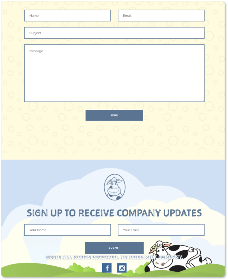
Nutcher Milk company includes social buttons for both Facebook and Instagram below their contact form. The company’s followers use these platforms as a way to get answers (both from Nutcher Milk and from Nutcher Milk’s customers)—possibly more quickly than they’d get them from Nutcher’s contact form:

Redirect from your contact form to a thank-you page
Your thank you page might simply confirm receipt of your visitor’s query. It might remind them about when they should expect to hear back from you (and in what medium). It might include some cute copy. It might redirect visitors who’ve just submitted their inquiry to other helpful resources on your site (your most popular blog posts, for example). It might offer them a discount code on their next purchase with your company. And so on.
Your CMS should have a contact form plugin that allows you to display a confirmation message or redirect inquirers to a new page. Make use of these plugins: Your visitor will be comforted by the message of receipt; and the redirect will keep users on your site, and continuing to explore your offerings.
Make it as beautiful as it is functional
By this point, you know what we mean by “functional.” Along with everything we’ve recommended above, your contact page should be easy to find. The form should either be embedded in your homepage, or clearly linked to from your homepage navigation.
Functional UX also means clarity and concision, with minimal to no friction. Your copy should be short and to-the-point, and the call to action and instructions should be clear. Test your contact page on occasion to make sure it’s fully functional. Fill out any forms and test links for email, chat, and dedicated support pages. Make sure automated responses, confirmations, and redirects are working.
But after all that focus on UX from a functional standpoint, don’t forget that aesthetics is a crucial part of good UX. Of course, we’re more visually drawn to some of the examples we’ve given you here than others; and you’ve probably had your own favorites. A/B testing will give you the best idea of what images or design will prompt your visitors to fill out that form.
Built By Buffalo offers a lead-generating contact form that uses buttons and drop-down menus to ensure users don’t have to do much typing. What’s more, it’s an aesthetic delight:
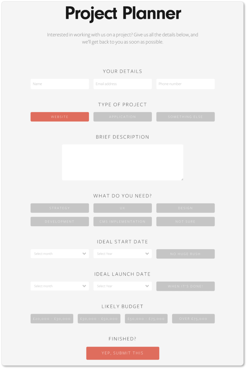
We recommend you click into the contact pages of the businesses you admire and respect to get a sense of their overall contact page design. Pay special attention to the contact form: How much information is it asking for? How is it asking for this information? Why do you think it’s asking for this particular set of information? How is the copy above the form—or at the top of the page—working? How about the form’s CTA? And so on.
Use your findings to help craft your contact page. And as always, test and repeat. We want to get you well above that 1% conversion rate.
If you run a business that offers a service, then many of your contacts are probably about setting up appointments. Naturally, this means you’ll need to offer your prospects an exceptional online scheduling experience. In the next section, we describe how to do just that. We also take you through the booking processes on a few business websites, so you can see a variety of scheduling pages (and designs) in action.