- HOME
- Website Building
- FAQ Pages
- Creating Compelling FAQ Content
Creating Compelling FAQ Content
- 11 Mins Read
- Posted on April 19, 2018
- Last Updated on October 8, 2024
- By Lauren
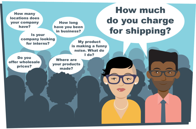
“Frequently asked questions” isn’t code for something more complex. It doesn’t refer to the questions you wished your prospects were asking (those would be WAQs), or to the questions you invent so you can strategically create demand for your product, or even to the questions you believe are the most important questions your prospects should be asking.
Take the phrase literally. FAQs are questions your business actually receives from your customers and prospects—frequently.

Your FAQ page, after all, is a kind of promise. When someone navigates to your page with a seemingly common or obvious question, they expect to find the answer to their query there. If they can’t, they’re likely to get irritated.
So how do you create compelling FAQ content? The kind of content that appeals to your visitors’ interests? Let’s begin with the obvious:
Start with real questions
We really do mean this. However, this doesn’t mean that if you’re a business launching a new website, you won’t have an FAQ page yet. It may be easy to read the above and think that no one’s had the chance to ask you anything… and without those queries, your FAQ page will only be founded on assumptions about what your customers might eventually want to know.
But you can still find people who will pose those common questions. Ask your family, friends, and colleagues what more they’d need to know about your product or service before they’d be willing to make a purchase. Sit them down in front of your website and see what questions come up for them as they navigate. What’s unanswered on your site that would best be answered on a separate FAQ page?
Take note of the questions that they articulate most often, and use those as the basis of your initial FAQ page.
Meanwhile, give yourself a month or more to simply compile the questions that come in via email or direct calls. Have your customer service team, sales team, or floor staff take note of the questions that are regularly posed to them. At the end of that time period you’ll have a more authentic list of “frequently asked questions.” Then you can update your FAQ page from your prospects’ perspective.
If you’ve been in business for a while, go through your email and chat correspondence. Have that chat with your customer service team or your floor staff. The team members who have the most day-to-day contact with your customers will be invaluable in this regard.
When it’s time to organize those questions, you’ll want to list the ones your employees get most frequently—across the board and regardless of what their role is in your company—first. (These will almost inevitably be the most “basic” questions.) Consensus will rule on this one. Trust it.
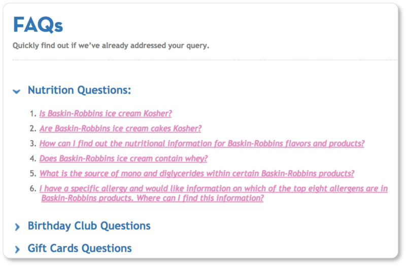
We’re going to bet, for example, that Baskin Robbins has received a ton of questions over the years about what ingredients are in its products. So many, in fact, that it’s the first set of questions they list on their FAQ page:

So take a tip from the world’s largest ice cream chain, and cater to the broadest inquiring prospect base first.
Keep it conversational
If you’re paying attention, you’ve probably noticed that you and your customers don’t speak the same way about the services you provide. You may call yourself a prosthodontist who specializes in dilacerations, but your prospective patients are probably talking about “tooth alignment,” “teeth implants,” and “braces.”
So no matter how specialized the service you provide is, cut the jargon. There are very few things in this world that can’t ultimately be explained in simple terms. And there’s always a chance that your prospects have arrived at your FAQ page already in a state of anxiety. You don’t want to run the risk of further frustrating or alienating them and losing a sale.
It may feel like you’re “talking down” to your prospects; but from their perspective, it makes you appear familiar, friendly, and approachable—as though there’s a real human being on the other side of the computer screen (which, incidentally, there is).
Keep in mind, too, that the majority of internet users search as though they were in a conversation, with queries such as “i have a missing tooth what are my options,” and “what to do if my teeth aren’t straight.” Using conversational language increases the chances that your FAQ page will be discovered through Google searches.
Write your questions and answers in dialogue form. Use first-person pronouns in your questions (“How do I…?) and answer from the perspective of your business (“You should…” or “We offer…”).
Here’s an example of the kind of conversational model we’re talking about:
Q: Do you offer a free trial of SalesIQ at Zoho?
A: We were hoping you’d ask that! We absolutely do. You can try us out for free for fifteen days. Get the details here.
That said, it’s possible that the content on your site is geared toward customers with more technical know-how. While you don’t want to alienate a customer base that doesn’t know—or use—your jargon, you also don’t want to talk down to a customer base whose technical level is equal to yours. The key is to make your website visitors feel part of the conversation they’re already having—whether with their colleagues or in an internal monologue.
You’re essentially ventriloquizing your prospects… and you’ve got to know them well in order to do this. If you’re still figuring out your customer persona, we’ve got some suggestions and examples in our blog content section that are just as applicable to your FAQs.
Just because you run a serious business doesn’t mean your FAQ has to be boring or tedious. This page is a great place to inject personality and build your brand’s voice. So—assuming it doesn’t stray far from the tone of the rest of your website—avoid being dry and dull. Of course, You don’t want a mismatch between the subject matter of your site and the tone of your FAQ page. But the best possible outcome of your FAQ will be a customer who is engaged and getting educated at the same time.
Here are two distinct examples of FAQ tone from the corset company Scoundrelle’s Keep and the funeral home Austin & Bell (note that both businesses keep their answers conversational, though their tones are radically different):


Scoundrelle’s Keep can obviously be playful with their responses in a way that Austin & Bell can’t. We appreciate the humor here—it kept us engaged right through to the end of the answer—but we also appreciate that turn to “all seriousness” in the final line.
Austin & Bell, on the other hand, doesn’t have a particularly easy task—either in their business or in their FAQ. Each of the answers on their FAQ page is offered in short sentences: Their visitor is probably grieving, after all, and can only take in information in small chunks. What’s more, the tone of their entire FAQ page is one of acknowledgment, gentleness, and respect. They refer often to the value of the life that’s just passed… but they do all of it in a matter-of-fact way. This tone—at once compassionate and practical—helps their prospects trust that Austin & Bell will be a steady presence for them, both during the funeral preparations and beyond.
Keep your answers short and to the point
When we say “Keep it conversational,” we mean the kind of friendly conversation you’d have with a prospect over the phone, not the kind of all-night-long conversation you’d have with an old college friend over dinner. Users often come to an FAQ page because they don’t have time to scour your entire website for specific information—nor do they have time to call your business and risk being juggled or put on hold.
That means they probably don’t have time to scroll through a bunch of long-winded answers, either.
We sympathize with how excited you might get about your product or service, and how easy it might be to get carried away in your answers. But your readers will be skimming for precisely the information they turned to your FAQ for.
So do them a favor and simply answer each question—without digressions—in as few words as possible. If they want to learn everything there is to know about a particular field or subject, you can provide them with those resources elsewhere. (That’s what a knowledge base or support pages are for, after all.)
Keep your paragraphs short and concise—no more than 4-5 lines. Don’t use complex sentences: One idea per sentence will make the whole thing much easier to digest. Consider bullet points for longer strings of information.
If your answer does require a detailed explanation or a lot of context, include a link to one of your support pages that’s dedicated to that topic. (This is also a great SEO strategy.) This way your FAQ page won’t look cluttered.
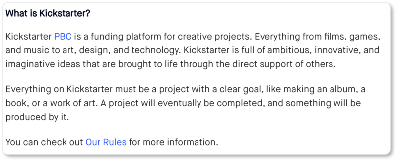
Kickstarter’s FAQ page exemplifies this strategy of linking out to more detailed information elsewhere on their website. Their rules for inclusion and their fee breakdowns would’ve taken up too much valuable space on the FAQ page itself, frustrating visitors who were skimming for answers to their own questions. So Kickstarter created separate pages for these subjects:


Don’t ignore negative or difficult questions
… just frame them positively and provide straightforward answers.
There may very well be issues you’d rather not discuss—such as why your product costs more than your competitors’—but if your prospects are asking these questions, you can’t ignore them. Indeed, your silence might cause them to turn to social media to ask their questions, which could lead to conjecture or incorrect answers.
Remember, the FAQ is there to assure your prospect in the absence of a real, human encounter, where you wouldn’t have the option of sidestepping the question. So use those difficult FAQs to demonstrate how your product is more valuable than your competitors’. Point out its unique features, rather than avoiding the question of price. Your prospects’ trust will deepen when they see you’re not afraid to confront the stickier questions.
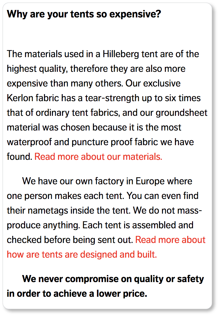
Here’s a genially-answered “negative question” from the tent company Hilleberg:

Hilleberg has risen to the challenge posed by “the price question.” Indeed, they use the question as an opportunity to highlight their tents’ most impressive features (their fabric’s tear-strength and its waterproof character), the level of attention each tent receives in the factory (“You can even find their nametags inside the tent”), and their company values (“We never compromise on quality”).
Krispy Kreme, on the other hand, uses the question raised by its customers about the disappearance of their favorite donut (we’d be upset, too!) to do a few smart things. In the first place, they honestly explain their limitation (“We only have space for 16 varieties at any one time”); and we appreciate their candidness here:

In the second place, they offer a company value (“We like to keep our doughnut range fresh and interesting and continually offer new flavours and varieties”), which is a difficult value to protest. And thirdly, they wisely keep their customers waiting patiently and hopefully (their favorite flavor is only on “a holiday” after all), and suggest another donut in the meantime. They clearly don’t plan on losing any customers from a flavor change.
Use multimedia
We mentioned above that there’s no law that declares FAQs must be boring. Well, there’s also no law that declares they have to be entirely text-based.
In fact, many questions may be better answered through a different medium. Concepts (like your shipping process) might be more easily explained through an infographic. Instructions (like how to return a product online) might be better illustrated through screenshots or GIFs. Processes (like how to set up your product) might be better demonstrated through video.
There are many benefits to multimedia. We’re a highly visual generation, with a dwindling patience for words and an increasing demand for images. Offering your visitors the latter makes them more willing to sit through the answer, and less likely to pick up the phone to call your support team. Graphics, charts, and videos are also great ways to break up big chunks of text, allowing your prospect to better digest the information you’re offering about your product.
In particular, video—whether it takes the form of a demo, a tutorial, or an interview with an expert—establishes connection in a way that words simply can’t. It reveals the actual humans who are behind your company’s website, making it an effective tool for creating credibility and trust.
The product demo on Wistia’s FAQ page (which Wistia calls a “Pre-Customer Help Desk”) exemplifies how a short video can outshine several pages of instruction—and be a great opportunity to market your product:
The takeaway? Don’t be afraid to get creative on your FAQ page. Consider the best possible medium through which you could productively answer each question, and experiment with that option.
Knowing when to stop
We can’t tell you with any certainty “how much is too much” when it comes to your FAQs. It’ll be up to your business to determine exactly how many times a question has to be asked before it’s considered “frequent.” The answer will probably be contingent on factors such as the size of your support team and the wealth of other things those employees could be doing with their time. The point is that your team should be documenting the inquiries they receive and sharing them with each other on a regular basis. The decisions can then get made as a collective.
Keep your FAQ current
If the information—or your offering—is complex enough, your FAQs will be folded into your support pages, where you’ll offer more detailed answers to those questions. What’s more, there may come a point at which you answer a customer or prospect question often enough that you’ll have to consider answering it more conspicuously elsewhere on your site: on your homepage or your product pages, for example.
If your business is evolving, new customer concerns are bound to arise. So are new opportunities to respond to evolution in your industry. What’s more, you should be regularly creating new site content—which means continually adding internal links from your FAQs to that content. And each time you launch a new product, it means a whole new set of questions.
Questions that are initially asked sporadically may become common over time: Add them to your FAQ page as they become more “frequent.” Remove the ones that go out of date.
For now, your FAQ should answer only those questions that you receive on the regular (remember, this is a living document and a work in progress), and only those questions that can’t be logically positioned anywhere else on your site.
Updating your FAQ on a regular basis keeps it relevant to your customers and prospects. Go back to the best practices we listed in our FAQ introduction every few months to produce new questions.
Your site visitors will thank you for this. So will your support team.
Now that you’re on your way to writing the most useful FAQ content you can offer your site visitors, it’s time to consider design. In the next section, we offer recommendations to help ensure your site visitors can navigate your FAQ page with ease. User experience (UX) will ultimately be one of the most important elements of your FAQ page.