- HOME
- Website Building
- About Us Pages
- 4 Examples of Stellar About Us Pages
4 Examples of Stellar About Us Pages
- 7 Mins Read
- Posted on January 28, 2020
- Last Updated on October 8, 2024
- By Mason
Your About Us page is where you get to tell the story of your brand. In a competitive market, a story can set you apart. But you can’t rely on your product pages alone to showcase that story.
After all, price and feature comparisons are only so motivating. If you can sell customers on your brand values and philosophy, they feel like they’re doing something more than just making a purchase. The secret is to learn how to tell your brand story to your customers, while also speaking to their unique wants and needs.
We’ve picked a few of our favorite examples of About Us pages that show how to build a narrative around your brand:
Honey
Honey is a software company with a Chrome extension that automatically finds coupons when online shopping. Anyone who shops online is a potential customer for Honey.
One of the challenges of selling software is convincing users that you’re trustworthy enough to handle their data. When it comes to Honey, their extension is free to download and use. That makes persuading users to try it easier in some ways, but it may also make users wonder how Honey actually makes money from their product.
Best elements of Honey’s about us page:
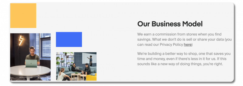
They’re transparent about their business model.
They know the first question potential users will have is, “How do you make a profit, when this product is free?” Their About Us page confronts this head-on.
Under a section titled “Our Business Model”, they explain: “We earn a commission from stores when you find savings. What we don’t do is sell or share your data”. Their transparency demonstrates they have nothing to hide and creates a compelling case for using their service.

They back up their claims with statistics.
When someone offers you free money (here, in the form of discounts), it’s easy to be skeptical. Honey lays out three of their most compelling stats in eye-catching print on their About Us page, right below their mission statement.
This backs up their brand story with cold, hard data. If you want to save money while shopping, it’s pretty difficult to argue with “more than $1 billion savings found”. Honey is wise to emphasize this stat in particular because it highlights what makes their business unique. Unlike most businesses online, Honey is saving online shoppers’ money.
The way they phrase these stats is also significant.
Take for instance, “trusted by 17+ million members worldwide.” There’s no shortage of unease around issues concerning users’ data and privacy—especially with free software. Honey knows this, and chooses to address it directly. The knowledge that millions of other people have put their trust in Honey can go a long way to reassure readers. Highlighting these statistics works especially well here, but any business with substantial sales figures can use this technique.
Hundred
Hundred is an online vitamin company that promises high-quality nutritional products. They also offer personalized supplement recommendations based on their customers’ health goals.
One of their big hurdles is the competitive market they’re in. The supplement industry is a crowded market, with supplement usage reaching an all-time high in 2019. Supplement businesses also have a reputation for questionable claims. All of this means that Hundred has a lot of work to do on their about page. They need to prove their legitimacy, while also standing out in a sea of competitors.
Best elements of Hundred’s about us page:
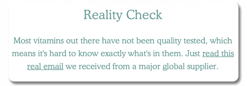
They give customers a look behind the curtain.
A big part of Hundred’s brand story is how much they care about finding the best quality supplements. One way they showcase this commitment is by doing something a little risky: pulling back the curtain on dodgy industry practices.
In the Transparency section, they include a screenshot of an email from an anonymous supplier. Addressed to their CEO, the email suggests using smaller portions of active ingredients in their products to make higher profits. It’s a bit shocking how brazen it is, which makes it all the more effective.
This disclosure instills confidence in Hundred’s integrity and casts doubt on their competitors. For many businesses, this is a risky move – you may not want to burn bridges in your industry. With potential customers, though, it can go a long way to establishing credibility, which is what Hundred is betting on.

They spotlight their founder story.
The lack of honesty and regulation in the supplement industry makes it difficult for a new brand to make waves. Hundred addresses this by highlighting the human element in their business—the founder, Dario. They tell the story of the company’s origins through Dario’s life experiences (a childhood passion for food leading him down the path to nutrition). This encourages readers to relate to the business on a personal level.
Hundred made an interesting choice by having this section written in first-person perspective. It’s more relatable than a blurb written by an anonymous employee. It also allows Dario to tie the company story directly into his own. As he says, “The lack of transparency amongst the biggest industry players only fueled my motivation to create a better solution that actually brings results.”
For most businesses, including a founder bio is a good strategy. It works especially well in situations like this, where there’s a trust gap to bridge.
Burren Perfumery
Burren Perfumery sells a selection of in-house organic perfumes and beauty products. Burren is a small operation, meaning their main appeal is having a unique product you can’t get anywhere else. Since their products aren’t distributed to stores, Burren also has the unique challenge of selling their scents sight unseen (unsmelled?).
Best elements of Burren Perfumery’s about us page:
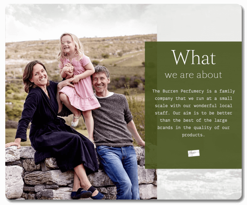
They turn their limitations into positives.
Perfume is often seen as a luxury product, associated with recognizable designer brands. As a boutique operation, Burren needs to overcome the expectations of consumers who associate prestige with quality. They use their About Us page to counter this idea, by presenting their smaller scale as an advantage rather than a liability.
In the first section, they open by emphasizing they are a family business. This is next to a family photo of the owners. This combination is charming and puts a human face to their brand. They close with a statement that they believe they can “be better than the best of the large brands in the quality of our products.” By showcasing a quality over quantity philosophy and a focus on the family, they’re able to appeal to readers by casting themselves as a sympathetic underdog. This is a brand customers can congratulate themselves on discovering.
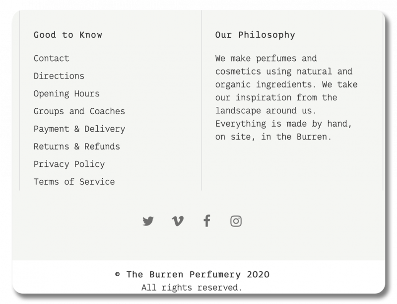
They represent their values in multiple places throughout their website.
While Burren Perfumery’s dedicated About Us page does a great job of selling their unique story, its effectiveness relies on customers choosing to click on it. However, this doesn’t necessarily have to be the case. Burren knows their story is important enough to their pitch to display it elsewhere as well.
On the site footer, they have a condensed version of their brand story, titled “Our philosophy”. In a short blurb, they restate their commitment to making their products by hand, using only natural and organic ingredients. Since it’s visible on every page, visitors are more likely to see it. It also demonstrate’s Burren commitment to their core values, creating a strong sense of identity.
Patagonia
Patagonia is a popular company, primarily known for selling outdoor recreational apparel. Where Patagonia differs from similar clothing brands is their reputation for environmental activism. With all this good PR, one might assume their About Us page would write itself, but that’s not the case. Given the sheer volume of environmental work Patagonia does in their business, they face a unique challenge:
- They need to communicate the sheer breadth and volume of their activism
- They need to do so without overwhelming the reader with too much information or large blocks of dense text
Best elements of Patagonia’s about us page:
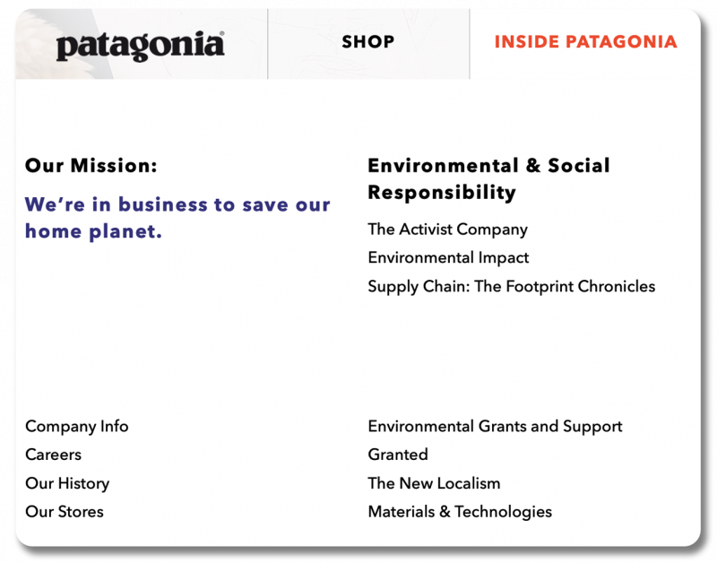
They devote an entire navigation tab to their environmental work.
Patagonia puts almost as much effort into their social and environmental work as they do into actually selling their clothes. On their site, they dedicate one of the two tabs in their navigation bar to their activism—the other tab belonging to the store. This makes it easy to explore the different facets of Patagonia’s environmentalism. It’s also a visual representation of how seriously they take their environmental activism.
All in all, the content is segmented into 12 unique links, including everything from the company history to a documentary series on conservation. Depending on their level of interest, visitors can read the one sentence summary of the mission statement, or they can take a deep-dive into Patagonia’s environmental grant programs.
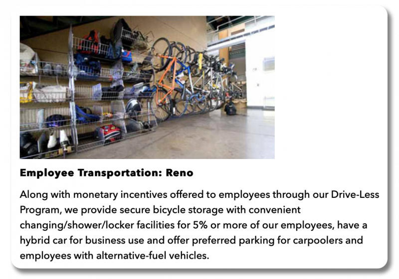
They publish an environmental impact report.
In recent years, businesses have started using trendy labels like “eco-friendly” and “organic” as a PR boost and branding exercise. This trend has diluted the value of these terms from over-use. Now, businesses that actually make an effort to implement more ethical practices have to prove they’re legitimate and show they aren’t “greenwashing.”
One way Patagonia rises above this is by publishing an environmental impact report. Where many businesses would have focused on products in such a report, Patagonia’s report covers virtually every aspect of their business. By covering unexpected aspects of their business, like energy use and employee transportation, they that they’re serious about reducing their impact. The report also invites readers to compare Patagonia to others, discouraging them from switching to a less ethical competitor.
When shopping online, the effort required to compare similar products is close to zero. It’s a good idea to jump on any chance you have to differentiate yourself from competitors. A strong brand story is as much of a selling point as the product itself, so make sure you’re making the most of yours. Your About Us page is an invaluable opportunity to tell your brand’s story, and win the battle for your customers’ hearts and minds.