- HOME
- Quick Reads
- Five Examples of Customer-Focused Email Campaigns
Five Examples of Customer-Focused Email Campaigns
- 7 Mins Read
- Posted on October 14, 2020
- Last Updated on October 29, 2024
- By Mason
It’s easy to grasp the basics of an email marketing flow, but writing and designing marketing emails that get results can be a real challenge.
Below, we have examples of real, customer-focused marketing emails. They’re arranged in the order that they fit in the customer lifecycle. From introductory welcome emails to late-game re-engagement campaigns, we’ve got it all:
Welcome emails
Welcome emails are, as the name implies, the first emails sent out when someone joins your email list. This is often a period of high enthusiasm among subscribers. After all, they’ve either subscribed your list in the process of making a purchase, or they’ve filled out a signup form because of interest in your brand. This is a chance to reward their decision and push them along in the customer journey.
Vega
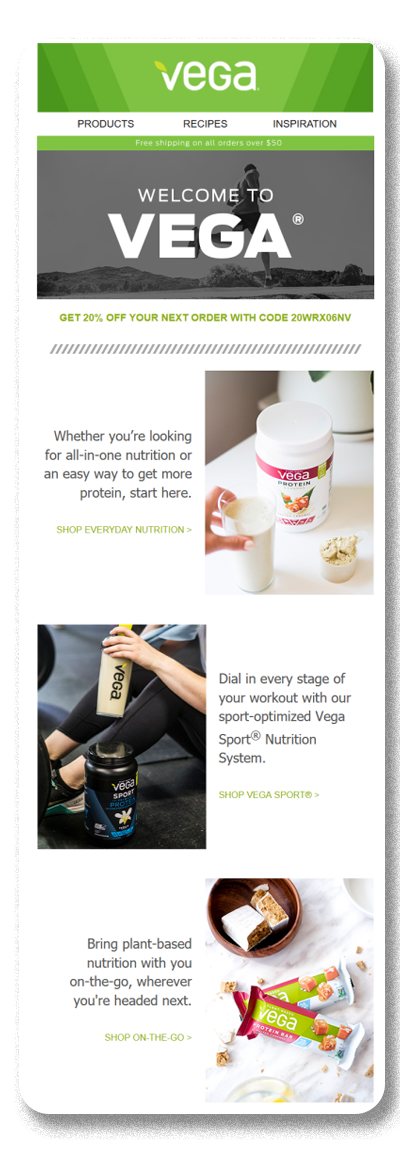
Vega is a fitness supplement retailer that offers a vegan line of protein shakes, nutrition bars, and more. Customers for this market tend to make recurring purchases as part of a regular fitness regimen. This means the main obstacle is convincing them to make that first purchase and incorporate Vega’s products into their life.
Vega opens their welcome email with both a deal on free shipping and a 20% off coupon code. This one-two combo strongly encouraging new subscribers to become customers. Since this comes early in their relationship with these leads, Vega likely doesn’t have much information on their specific interests yet. As Vega has a broad product catalog, the rest of the email has multiple CTAs designed to appeal to different customer segments (nutrition products, workout supplements, and vegan snacks). This allows their readers to self-select their preferred product category within the Vega store.
Abandoned cart
Abandoned cart emails are sent out at a crucial point in the customer journey. The prospect has already moved past the consideration phase. They’ve chosen which products they want to buy. All that’s left is to actually make the purchase.
But for some reason, they’ve delayed their decision. The abandoned cart email gives a little push to these prospects, reminding them to actually buy the products they’ve put in their cart. On average, 75.2% of all online shopping carts are abandoned, which means you’re leaving a lot of money on the table if you aren’t reaching out to these customers.
Rudy’s Barbershop
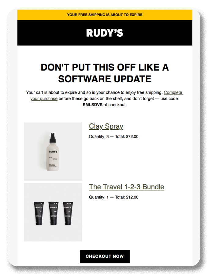
Rudy’s Barbershop sells their own brand of haircare products on their online store. Within the online beauty industry, one of the biggest obstacles is window shoppers. Compared to a physical barbershop or salon, the abstraction of online shopping makes it easy for prospects to browse indefinitely without ever making a purchase.
The copy helps to create a sense of urgency: “Don’t put this off like a software update.” They follow up by informing the reader that their shopping cart is about to expire.
By putting a limit on their time left to purchase, Rudy’s aims to make the decision more concrete and spur indecisive shoppers into action. Adding an expiration to carts also helps keep a realistic picture of their inventory, since many stores earmark products placed in shopping carts as unavailable to other customers. Rudy’s uses product images of their customers’ cart items along with a “checkout now” CTA to let them pick right back up where they left off.
Survey
Survey emails are sent out after a customer has already purchased your products or services. The purpose of these emails is simple: collect feedback to improve on failures and/or to publish praise. The main challenge here is convincing your customers to take the time to fill a survey out.
Bellroy
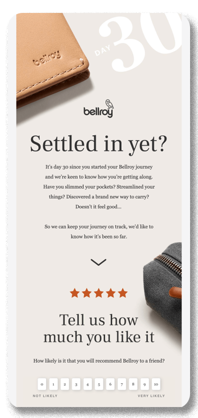
Bellroy manufactures and sells fashionable wallets and bags. Since these are durable, single-purpose goods, Bellroy can’t rely on frequent repeat business. This means they need to attract new customers on a regular basis. As the saying goes, word of mouth is king. It would be a big asset to their business if they could efficiently collect a large volume of positive, detailed testimonials from their customers.
The first thing readers see when opening Bellroy’s survey email is two pieces of large text: “Day 30” and “Have you settled in yet?”, next to an image of a wallet. This reminds customers that it’s been a month since their most recent Bellroy purchase, prompting them to recall their experiences with the product.
They follow up this prompt with a list of leading questions (and a graphic showing five gold stars). The questions are carefully framed to evoke positive feelings: “Have you slimmed your pockets? Streamlined your things? Discovered a brand new way to carry?”.
However, rather than immediately requesting a full testimonial, Bellroy is careful to first ask their customers to rate their likelihood of recommending their purchase to a friend. This allows them to filter out strong negative responses and direct low or neutral scores to a customer service form. Of course, they’d also request testimonials from high-scoring respondents.
Depending on what kind of marketing automation software they use, Bellroy could also tag the subscribers with different labels based on their responses. From there, they might put people who are less satisfied into an email workflow aimed at boosting satisfaction. Or, they might put satisfied customers onto a specific list where they’ll get VIP access to sales and products before the general public does. This kind of email segmenting can do wonders for improving your overall ROI from email marketing.
Customer appreciation
Customer appreciation emails are sent to long-term customers to strengthen the relationship between a brand and their customers. This approach relies on simple but effective principles of emotional psychology. When you candidly express gratitude to your customers, they’re prompted to reciprocate. This improves their lifetime appreciation towards your business. In fact, it’s even been shown that 91% of customers prefer to buy from companies that show their appreciation.
GoDaddy
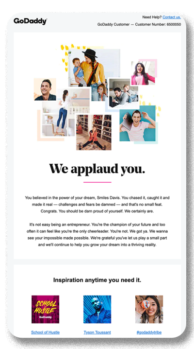
GoDaddy is a popular domain registrar and web host. Their customers are largely new business owners and content creators who use GoDaddy to purchase and host their own websites, often on a subscription basis. As a largely passive, service-based business, GoDaddy has an interest in maintaining brand loyalty over time.
GoDaddy deploys clever copy and inspirational images in their appreciation email. This helps to frame the relationship with their customers as more than just business. In their copy, they congratulate their customers for “believ[ing] in the power of your dream” in choosing GoDaddy. Using this framing is both flattering to their customers and also subtly links their sense of entrepreneurial pride with the GoDaddy brand.
The next line, “We got ya. We wanna see your impossible made possible,” gives a powerful boost to customers who are working hard to get their businesses up and running. They follow this emotional appeal with 3 external links:
- An entrepreneur video series
- A customer success story
- A social media community hashtag
The first two links push their customers to more “inspirational” themed content. The third offers them a potential networking opportunity that also ties them to the GoDaddy user base more strongly.
Re-activation
Re-activation emails are sent to customers who haven’t purchased your products or engaged with your emails in a while. The specific timeframe will depend on your product/services, industry, and customers. Regardless of timeframe, these emails are sent because these recipients are likely to fall out of your funnel entirely. A re-activation email is a last-ditch effort to try to engage them, before slowing down your engagement or potentially removing them from your list.
Clear
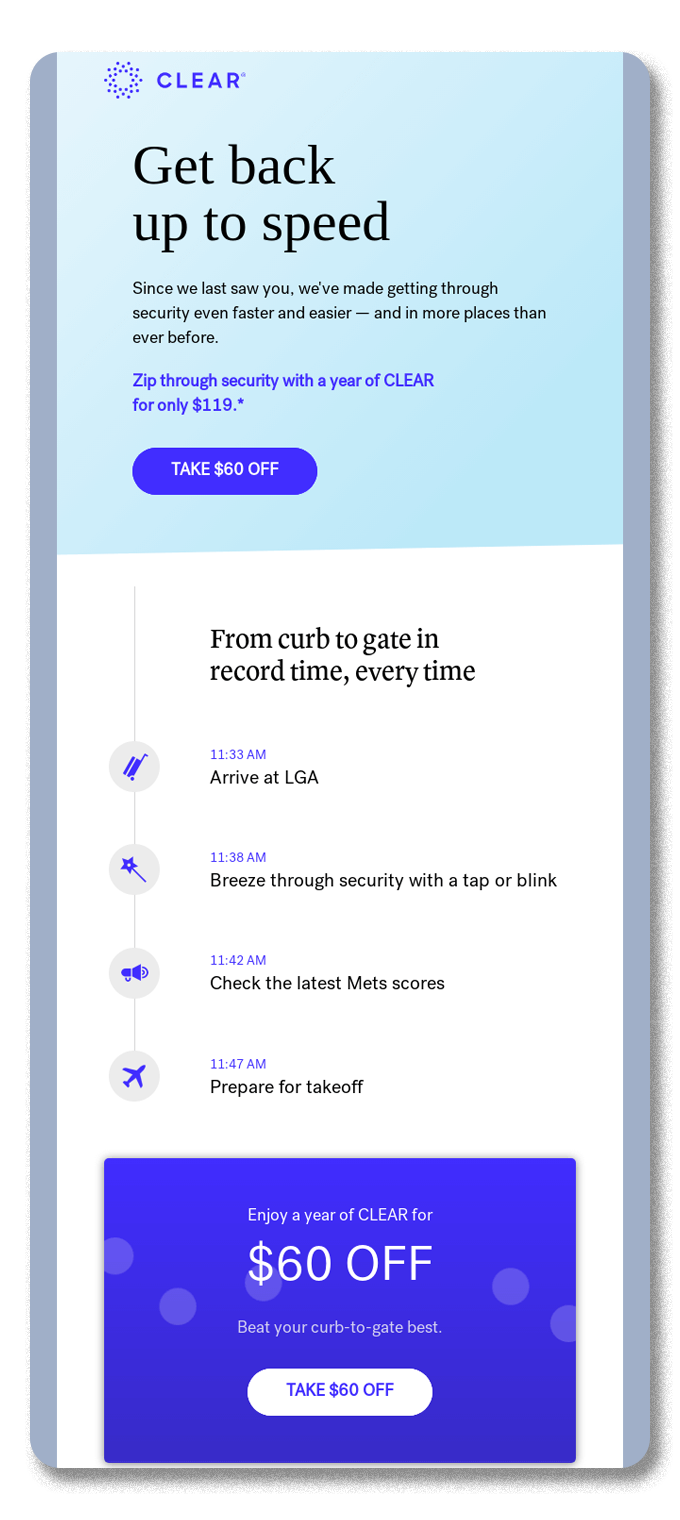
Clear offers traveler registration services to airline passengers in the US. Their services let travelers skip long security lines by being pre-registered.
Clear is in an interesting position–the value of their service is obvious to anyone who has been stuck in the middle of a stressful travel situation. However, the user’s appreciation for that service is unlikely to last long after leaving the airport. Depending on how frequently they travel, Clear customers may opt out of renewing their membership.
Clear opens their re-activation email by emphasizing improvements in their service: “Since we last saw you, we’ve made getting through security even faster and easier.” They combine this statement with a CTA that directs to a special discount. These two appeals work together to tempt lapsed customers to re-engage by offering an improved value proposition, in both quality and price.
They’ve also made good use of visual design. The email has a hypothetical travel itinerary, inviting the reader to imagine a trip through LaGuardia. In this trip, they go from the entrance to their gate in less than 15 minutes. Of course, this is only possible with the help of Clear. This allows Clear to remind their customer when and how their service is most useful, which hopefully convinces them to renew their membership.
Crafting effective email campaigns can be a challenge, even for seasoned marketers. However, we hope we’ve inspired you to take try new ways to connect with your audience and push your business forward. And if you’re looking for more inspiration, you can check out our list of email marketing automation workflows, or take a look at our Essential Guide to Marketing Automation.