- HOME
- Quick Reads
- 5 Important Elements to Put Below the Fold on Your Company Homepage
5 Important Elements to Put Below the Fold on Your Company Homepage
- 5 Mins Read
- Posted on September 24, 2019
- Last Updated on October 29, 2024
- By Natalie

Hopefully the space above the fold on your business’s homepage already features a strong benefit-oriented headline that tells visitors just enough about your offering—and in such powerful language—that they’ll want to know more.
They’ll scroll down because you’ve piqued their interest… and you’ll want to sustain that interest. The rest of your homepage doesn’t need to be long; but it does have to follow up on the promise that the area above the fold offered them. Here’s what to give them:
Social proof
Social proof taps into the psychological phenomenon by which people rely on the actions and evaluations of others to determine the “right” choice for them in a given situation. It invokes a they-did-it-(and-they’re-thriving)-so-I-should-do-it-too mentality… and it’s remarkably persuasive. Social proof can come in the form of:
- Client or customer testimonials (more on these below)
- Client logos
- Case studies
- Press mentions
- Awards and other accolades
- Reviews and ratings
- Statistics (subscribers, followers, etc.)
- Trust seals (affiliations, certifications, etc.)
Social proof builds prospect trust by lending credence to your claims, validating your reputation, and overcoming any objections prospects might have to your product or service. You don’t have to limit yourself to a single form of social proof! Just choose the most impressive examples, and find a way to tastefully incorporate them into your homepage design.
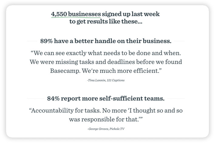
Here’s how Basecamp uses social proof on its homepage:

The project management software company switches between two different kinds of social proof here: statistics (the number of new clients who signed up last week; client benefits in the form of percentages) and testimonials.
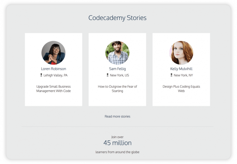
Codecademy’s homepage combines a single piece of data (over 45 million users to date) with links to case studies for its social proof. Visitors can click into these stories to learn more about how Codecademy specifically benefitted each individual. This strategy is valuable insofar as visitors are likely to resonate with some of Codecademy’s students more than others; and they’ll be able to imagine reaping the same benefits as those students they resonate with:

Testimonials
Testimonials are one aspect of the social proof strategy we discussed above; but they’re powerful enough that they’re worth their own section. Your homepage’s job is to convey to visitors how awesome your product or service is. The best way to support these claims is to have your past and current customers confirm them.
Choose testimonials that are reflective of your buyer persona (that “ideal customer”) for each service you offer. Make sure they mention the key benefits your prospects will receive from the service. And if you’ve got some compelling case studies about specific services, use them on your dedicated service pages.
The web design company Wood Street includes a single testimonial at the bottom of its homepage (Wood Street clearly understands the power of testimonials; they include one at the bottom of every page of their site):
Social links
A/B testing will determine whether these links are more effective in the header of your homepage or in its footer, but without doubt they should be on your homepage. The more followers you have on social, the more eyes will see your content. (Of course, this means you’ll have to consistently produce new content for both your site and those social media platforms). And the more eyes that see your content on social, the more clicks you’ll have into your website… you see the virtuous circle here.
Use recognizable icons to make it easy on users. Links to Facebook, Instagram and Twitter are essential at this point; you might consider LinkedIn and Pinterest as well. And of course, there may be other social platforms specific to your industry that you’ll want to link to as well.
Here are two examples of social media linking: one from the footer at Wistia, the other from the header at IMPACT:


Your CMS should make social media linking easy for you through widgets and plugins.
Contact information
Underscore your legitimacy by giving visitors a real phone number to call… as well as your email address and physical address. Not only does this show that you have nothing to hide; it also makes it as easy as possible for prospects to get in touch with any and all queries.
Even better, enable a live chat option for visitors who tend to shy away from the phone, or who are too impatient to await an email response or wait on hold for customer support. Live chat is your solution to the virtual dilemma of not having an in-person sales or customer service rep to address on-the-spot pre-purchase questions and concerns.
What’s more, tracking your live chat conversations may give you a better idea of why some prospects bounce from your site (What were their questions and concerns? How were they answered?). This information will help you get the next set of prospects off the fence and into a purchase decision.
Forrester claims that 44% of online customers say live chat is one of the most important features an ecommerce website can offer. Or you might take the tip from Intuit, who increased their conversion rates by 211% by adding proactive chat to their site.
Footer
We just showed you Wistia’s footer as an example of good social media linking; but it’s worth looking at its other elements as well. One thing Wistia has done particularly well is divide its footer links into four basic categories that are intuitive and small enough to actually be navigable. (In other words, good UX is as important in your footer as it is elsewhere on your site).
Of course, footer links for enterprises are bound to be more complex, and Apple’s footer is hardly an exception (though it exemplifies skillful categorization as well):

Footer links will vary widely depending on the nature of your business. There are certain elements that many enterprises don’t include in their footers that you should include if you’re a smaller business. The elements we’d recommend—some of which we mentioned above—include:
Contact information
Social media icons
Trust badges
Email signup forms
Privacy policy
Terms
Sitemap
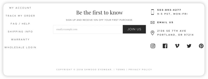
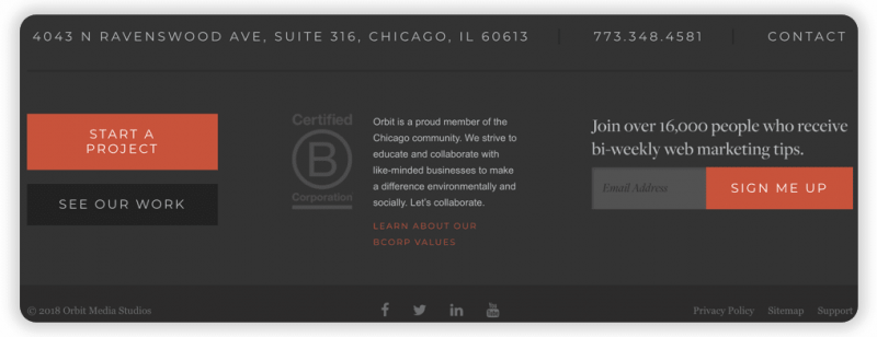
It’s possible to include all (or most) of these elements and keep it clean, as Shwood Eyewear and Orbit Media prove:


Orbit Media has compiled a list of 27 elements that make good candidates for your homepage footer, and it’s worth browsing this list for the elements that suit your business. It’s also worth taking a look at the homepages of other (successful) businesses in your industry, to see what their footers are offering visitors.
With these five elements (along with the hero image, value proposition, and navigation menu you’ll offer site visitors above the fold), your homepage will offer your visitors a complete “front door” experience, a sense of your professionalism, and a ready entryway into their journey on your site.
